The Baseline and Working with Time Series in R
A big part of statistics is comparisons, and perhaps more importantly, to figure out what to compare things to. Perspective changes with the baseline.

A big part of statistics is comparisons, and perhaps more importantly, to figure out what to compare things to. Perspective changes with the baseline.
The left lane on the freeway, commonly known as the fast lane, is sometimes mistaken as the slowest lane on the planet. It’s especially weird when there aren’t many cars on the road, and you’re driving in the fast lane only to find yourself slowed down by the person in front of you who moves at 60% of the speed limit.
The decent thing to do is for the slow person to switch to the right lane so that you can pass. But instead, he carries on with his slowness, so after a mile or two, you switch lanes to pass. You speed up, and then all of a sudden he speeds way up, only to make you the slow one.
I bet I’m the slow one in front more than I am the annoyed one in the back.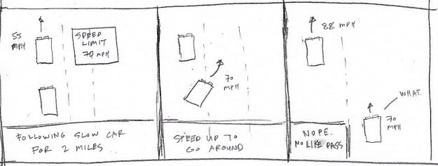
Some people are just jerks, but speaking from experience, I think this happens because your baseline for the speed limit is compoased of inanimate objects, such as the road, trees, and signs. It feels like you’re going fast until you see someone drive much faster behind you. The baseline for your speed moves up, and your current speed suddenly feels slow.
I’ve noticed this baseline shift a lot recently with a baby in the house. I used to sleep around 1am, and now 9:30pm seems late; a television with the volume at 15 seemed just right, and now the baseline is at 9; and an everyday errand like grabbing donuts morphed into an adventure.
Nothing changed physically. The clock still ticks at the same speed, the television volume hasn’t gone haywire, and the donut shop is in the same place at it’s always been. But, everything looks and feels different.
It’s kind of like the classic Powers of Ten clip that starts tiny and zooms out farther and farther. Everything looks significant when you look at it from the right angle.
The Known Universe is also a good one, as is The Simpsons parody.
Although the source data is time series in the examples that follow, this is applicable to other data types.When you look at data, it’s important to consider this baseline — this imaginary place or point you want to compare to. Of course, the right answer is different for various datasets, with variable context, but let’s look at some practical examples in R.
You don’t have R on your computer yet?You can just follow along loosely, or you can download and install R, download the source linked above, and follow the code snippets.
So first you have to load the data, which is in CSV format. Use read.csv() to bring it in. We’re going to look at the cost of gas, eggs, and the Consumer Price Index, as published by the Bureau of Labor Statistics.
# Load the data.
cpi <- read.csv("data/cpi-monthly-us.csv", stringsAsFactors=FALSE)
eggs <- read.csv("data/egg-prices-monthly.csv", stringsAsFactors=FALSE)
gas <- read.csv("data/gas-prices-monthly.csv", stringsAsFactors=FALSE)
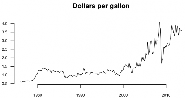
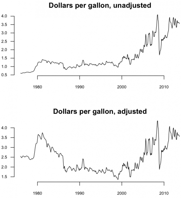
Say you’re interested in how gas prices have changed over time. A time series chart is the most straightforward thing to do.
# Regular time series for gas price
par(cex.axis=0.7)
gas.ts <- ts(gas$Value, start=c(1976, 1), frequency=12)
plot(gas.ts, xlab="", ylab="", main="Dollars per gallon", las=1, bty="n")
As you might expect, the price rises with a dip in the 2000s. Your concept of the current dollar and historical prices make up your baseline.
Maybe you only care about the monthly percentage changes though more than you do about the actual price. You want to shift the baseline to zero and look at percentages. The code below takes the gas prices, except for the first value (curr), then the prices except for the last value (prev), and then subtracts and divides. If the change is negative — the price dropped from the previous month — a bar is colored green. Bars are gray otherwise.
# Monthly change
curr <- gas$Value[-1]
prev <- gas$Value[1:(length(gas$Value)-1)]
monChange <- 100 * round( (curr-prev) / prev, 2 )
barCols <- sapply(monChange,
	function(x) {
		if (x < 0) {
			return("#2cbd25")
		} else {
			return("gray")
		}
	})
barplot(monChange, border=NA, space=0, las=1, col=barCols, main="% change, monthly")
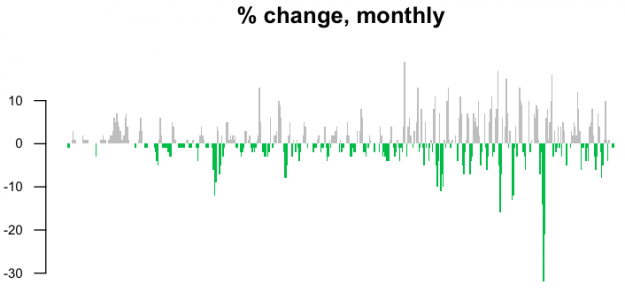
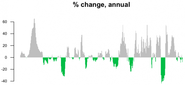
This is noisy though. Maybe a year-over-year change would be more useful.
curr <- gas$Value[-(1:12)]
prev <- gas$Value[1:(length(gas$Value)-12)]
annChange <- 100 * round( (curr-prev) / prev, 2 )
barCols <- sapply(annChange,
	function(x) {
		if (x < 0) {
			return("#2cbd25")
		} else {
			return("gray")
		}
	})
barplot(annChange, border=NA, space=0, las=1, col=barCols, main="% change, annual")
The magnitude of drops in price are more visible this way.
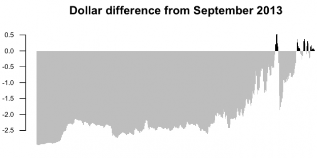
Maybe though your baseline is the current gas price, and you want to know how all past prices compare to now. Take the most recent price and subtract from all others.
curr <- gas$Value[length(gas$Value)]
gasDiff <- gas$Value - curr
barCols.diff <- sapply(gasDiff,
	function(x) {
		if (x < 0) {
			return("gray")
		} else {
			return("black")
		}
	}
)
barplot(gasDiff, border=NA, space=0, las=1, col=barCols.diff, main="Dollar difference from September 2013")
Black bars, or a positive difference, show when gas was more expensive relative to the present.
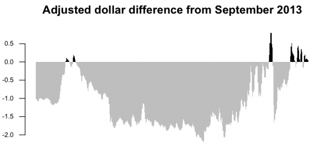
There’s a problem though. When you compare historical prices, you have to account for inflation. The baseline is not only how much gas costs now, but how much a dollar is worth. A dollar today isn’t worth the same as a dollar thirty years ago.
This is where the Consumer Price Index comes into play. It represents how much households have to pay for goods and services. Divide the CPI today with the CPI during a different time and you get a multiplication factor to estimate the adjusted price per gallon of gas. In other words, you want to know how much as gallon of gas during a past year would cost in today’s dollars.
The code below provides adjusted cost.
# Adjust gas price for inflation
gas.cpi.merge <- merge(gas, cpi, by=c("Year", "Period"))
gas.cpi <- gas.cpi.merge[,-c(3,5)]
colnames(gas.cpi) <- c("year", "month", "gasprice.unadj", "cpi")
currCPI <- gas.cpi[dim(gas.cpi)[1], "cpi"]
gas.cpi$cpiFactor <- currCPI / gas.cpi$cpi
gas.cpi$gasprice.adj <- gas.cpi$gasprice.unadj * gas.cpi$cpiFactor
Now you can make the same graphs as before, but with adjusted prices.
curr <- gas.cpi$gasprice.adj[dim(gas.cpi)[1]]
gasDiff.adj <- gas.cpi$gasprice.adj - curr
barCols.diff.adj <- sapply(gasDiff.adj,
	function(x) {
		if (x < 0) {
			return("gray")
		} else {
			return("black")
		}
	}
)
barplot(gasDiff.adj, border=NA, space=0, las=1, col=barCols.diff.adj, main="Adjusted dollar difference from September 2013")
The price per gallon of gas is relatively higher these days, but now you see something else in previous decades. Gas was relatively more expensive for a short while. Price hasn’t been just a steady increase.
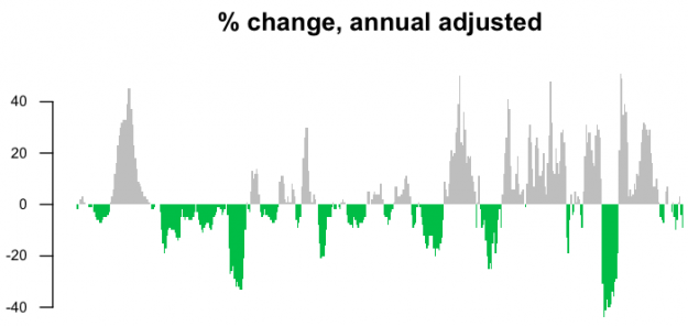
Let’s try the same thing with the annual percentage change.
# Adjusted annual change
curr <- gas.cpi$gasprice.adj[-(1:12)]
prev <- gas.cpi$gasprice.adj[1:(length(gas.cpi$gasprice.adj)-12)]
annChange.adj <- 100 * round( (curr-prev) / prev, 2 )
barCols.adj <- sapply(annChange.adj,
	function(x) {
		if (x < 0) {
			return("#2cbd25")
		} else {
			return("gray")
		}
	})
barplot(annChange.adj, border=NA, space=0, las=1, col=barCols.adj, main="% change, annual adjusted")
Again, you see a different pattern during the 1980s, because the baseline is properly shifted.
Finally, compare the straightforward time series chart for adjusted and unadjusted dollars.
# Adjusted time series
par(mfrow=c(2,1), mar=c(4,3,2,2))
gas.ts.adj <- ts(gas.cpi$gasprice.adj, start=c(1976, 1), frequency=12)
plot(gas.ts, xlab="", ylab="", main="Dollars per gallon, unadjusted", las=1, bty="n")
plot(gas.ts.adj, xlab="", ylab="", main="Dollars per gallon, adjusted", las=1, bty="n")
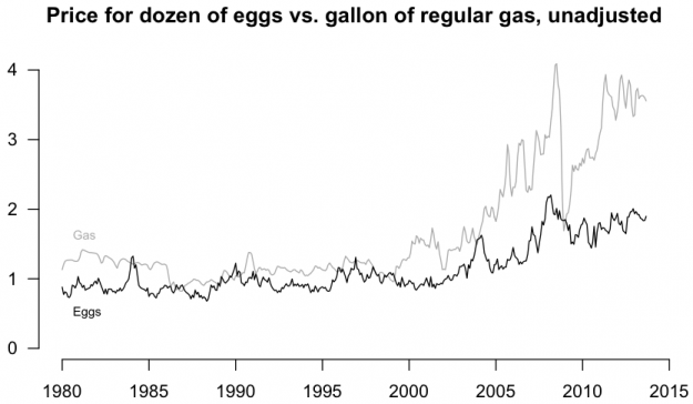
Inflation adjustment isn’t the only way to gauge the magnitude of change though. You just need something to compare against. The price of gas increased. Did everything else increase in cost? Try a comparison of gas price and the price of a dozen of eggs.
# Gas versus eggs merge data
gas.eggs.merge <- merge(gas, eggs, by=c("Year", "Period"))
gas.eggs <- gas.eggs.merge[,-c(3,5)]
colnames(gas.eggs) <- c("year", "month", "gas", "eggs")
gas.ts <- ts(gas.eggs$gas, start=c(1980, 1), frequency=12)
eggs.ts <- ts(gas.eggs$eggs, start=c(1980, 1), frequency=12)

# Plot it
par(bty="n", las=1)
ts.plot(gas.ts, eggs.ts, col=c("dark gray", "black"), ylim=c(0, 4), main="Price for dozen of eggs vs. gallon of regular gas, unadjusted", ylab="Dollars")
text(1980, 1.6, "Gas", pos=4, cex=0.7, col="dark gray")
text(1980, 0.5, "Eggs", pos=4, cex=0.7, col="black")
This gives you a better sense of the magnitude of gas price changes than if you were to look at it without any other context.
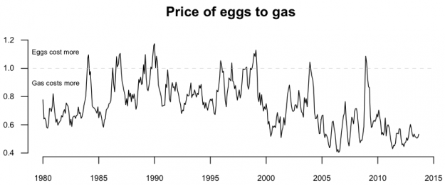
Here’s one more look, but this time as a ratio of egg price to gas price.
# Eggs to gas ratio
eggs.gas.ratio <- ts(gas.eggs$eggs/gas.eggs$gas, start=c(1980, 1), frequency=12)
par(cex.axis=0.7)
plot(eggs.gas.ratio, bty="n", las=1, ylab="", main="Price of eggs to gas")
lines(c(1970, 2015), c(1,1), lty=2, lwd=0.5, col="gray")
text(1979, 1.11, "Eggs cost more", cex=0.6, pos=4, offset=0)
text(1979, 0.89, "Gas costs more", cex=0.6, pos=4, offset=0)
The 1.0 baseline makes it easy to spot when gas was more expensive and vice versa.
Wrapping up
Whether you work with temporal data, categorical, rankings, etc, always consider your baseline. Does it make sense? Are your comparisons valid? The wrong baseline can lead to exaggerated results or underrepresented ones, so you must be careful. And, if we haven’t even touched on uncertainty yet.
Made possible by FlowingData members.
Become a member to support an independent site and learn to make great charts.
About the Author
Nathan Yau is a statistician who works primarily with visualization. He earned his PhD in statistics from UCLA, is the author of two best-selling books — Data Points and Visualize This — and runs FlowingData. Introvert. Likes food. Likes beer.
3 Comments
Add Comment
You must be logged in and a member to post a comment.


Hello, I downloaded the sources, but the files used in these examples aren´t there.
Greetings,
Esther
Sorry! I was in a mistake, I had downloaded previous files.
Glad it worked! Just let me know if have issues with current files.