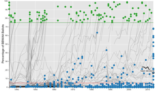
Carlos Scheidegger and Kenny Shirley, along with Chris Volinsky, visualized Major League Baseball Hall of Fame voting, from the first class in 1936 (which included Babe Ruth) up to present.
All a fan can do is accept that Baseball Hall of Fame voting, conducted by the Baseball Writers Association of America (BBWAA), is a phenomenon unto itself. If we can’t understand baseball Hall of Fame voting, though, maybe the next best thing is visualizing the data behind it. The set of interactive plots on this webpage is our attempt to do that. We were especially interested in two things: (1) viewing the trajectories of BBWAA vote percentage by year for different players throughout history, and (2) simultaneously viewing the career statistics of these players, to help find patterns and explain their trajectories (or to reassure ourselves that the writers really are crazy).
The interactive is on the analysis side of the spectrum, so you might be a bit lost if you don’t know a lick about baseball. However, if your’re a baseball fan, there’s a lot to play around with and dimensions to poke around at, as you can filter on pretty much all player stats such as home run count, batting average, and innings played. At the very least, you’re getting a peek at how statisticians pick and prod at their data.
Start at the examples section for quick direction. I eventually found myself looking for downward trajectories. Poor Mark McGwire. [Thanks, Chris]
 Visualize This: The FlowingData Guide to Design, Visualization, and Statistics (2nd Edition)