
Map of every person counted in 2010 US Census
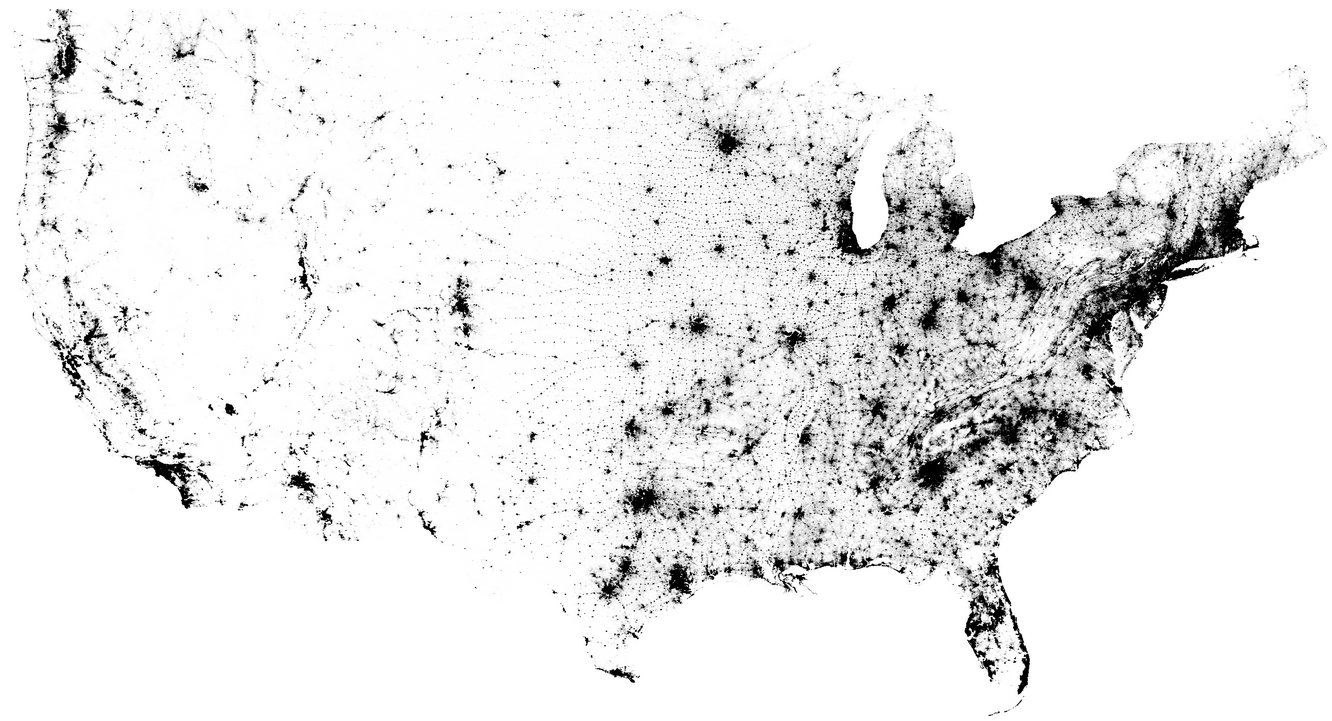
In the 2010 United States Census, 308,745,538 were counted, and Brandon Martin-Anderson from the MIT Media Lab mapped almost all of them (308,450,225 points to be exact). I like the flow-like pattern in the east, which you can see matches the terrain by comparing against a geographic map.
See here for more on the methodology. In a nutshell, he used block-level data as the starting point, uniformly filled blocks with points, and the rest was image processing.
Chart Type Used
1 Comment
Become a member. Support an independent site. Get extra visualization goodness.
See What You Get


Excellent visualization of non-geographic data from 2010 census. Can I use this map in my geospatial course?