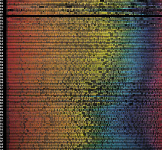
We’ve seen a number of looks at movie poster cliches, but this is the first time I’ve seen how the color of movie posters have changed over time. Vijay Pandurangan downloaded 35,000 poster thumbnails from a movie site, counted the color pixels in each image, and then grouped them by year and sorted by hue.
Some thoughts from Pandurangan’s designer friend Cheryle Cranbourne:
The movies whose posters I analysed “cover a good range of genres. Perhaps the colors say less about how movie posters’ colors as a whole and color trends, than they do about how genres of movies have evolved. For example, there are more action/thriller/sci-fi [films] than there were 50-70 years ago, which might have something to do with the increase in darker, more ‘masculine’ shades.”
There’s no mention of the blanked out 1924. That must’ve been a sad year. Oh wait, there were movies during that year, so there was either a massive ink shortage or it’s just missing data.
[via @DataPointed]
 Visualize This: The FlowingData Guide to Design, Visualization, and Statistics (2nd Edition)
One odd thing is the band of less saturated colors at the extreme red end. Is that an artifact of how hue is calculated? Why would the most extreme hues be consistently unsaturated?
Interesting data set and presentation.
I’d love to see this in a form we could analyze more precisely. As a series of 100% Stacked bar graphs, it suffers the common baseline issue. Grouping by major color groups and separating those into multiple line or bar graphs with common baselines could provide a much clearer picture of the changes over time. Generalizing further: splitting it into two sets by grouping by warm and cool colors could make the “increase in darker, more ‘masculine’ shades” shift stand out even more.
Adding to my previous comment – there appears to be unsaturated bands that hit the red/orange transition, and the yellow/green transition, and maybe also some other points. Seems like an artifact to me.
Hi — thanks for discussing my work on here! The band of less saturated colours at the red end is an artifact of the way analysis was done. For each hue “bin”, (each hue’s size in the graph is determined by normalized % of the non-grey/white/black image) I display the average lightness/saturation. Since some hues are used primarily with darker colours (there must be some default in some commonly-used program) you see this effect.
I will try to make the data available in a more easy-to-analyse format; this was more of a side project — but I do have some followup work to do.
1924 is indeed a data error; I’m not sure why I didn’t get data for that year. I will try to spend a couple of hours this weekend to do a followup analysis on it.
If you look at the graphs that ignore sat and lightness, one can see the colour distribution more clearly:
http://www.vijayp.ca/movies/new_page.html#nondetail
but it ignores the lightness aspect of this. I’m not a data viz expert, so I wasn’t sure how best to control for this artifact in a way that everything can be expressed in 2 dimensions. Tyler Neylon’s done some interesting work on this but I wasn’t sure how best to integrate that also. Maybe I should separate light versus medium versus dark colours into three separate graphs.
Thanks for the explanation of the artifact, and the re-visualization is interesting. I like the aesthetic of the original better, but the new version really emphasizes the swoosh of blue. I think functionally the original does have an advantage in that it shows actual colors used on posters. I can look at it and imagine posters that have those average colors.
I wonder if you could actually display the posters themselves, squashed down to the right height, and stretched so each poster in a given year fills an equal portion of the horizontal space (ordered in the same way you have here.) This would add character to the plot. Alternately you could give each poster constant aspect ratio and leave empty or average-color space between them in years with sparse data.
First, this is amazing.
How big of a part does content play in this work? It was implied that this is a look across the entire span of movie poster history, but many of the unbelievably important ones are missing. 1939 Wizard of Oz, 1944 Double Indemnity, and so on. I love this, but it’s hard to consider the sincerity of the concept when the data (and missing data) is inherently rooted in meaning.
Maybe I’m just thinking too subjectively and missing the point or don’t fully understand the rules and parameters of how you gathered data.
Well I don’t think it could possibly be based on a sample of all movies ever released, I don’t know what method he has used to come up with a representative sample, but it probably implies that he has a good quality method that he isn’t singling out particularly ‘important’ movies. When you’re creating a sample, if you start hand-picking items and saying that this one has to be in the sample you run the risk of ending up with a biased sample.
If the data is indeed complete, it would be interesting to examine any correlations to other annual metrics, like economic indicators or necktie width / skirt length.
Ok is anyone else skeptical of this poster i mean if even follows the perfect pattern of a prism of light or a rainbow as in ROYGBIV
I sense you don’t quite get it.
I’m skeptical of what this actually says.
There are 5 movies in 1914 and 89 in 2011 (you can see the movies by clicking the link in his comment above). I think blockbusters or at least famous movies are overrepresented in the earlier years because only those movies would have had their posters preserved and scanned whereas today any movie’s poster will be available.
We think of blue as being masculine but this is has not always been the case. Red (and even pink) was considered masculine until the 1940s. If all movies are pitched at a “masculine” color level then what we could be seeing is the changing of the color red from masculine to feminine.
I’m also skeptical of the “more masculine movies” interpretation. The 50s and 60s would have seen a ton of WWII movies and monster movies as well as westerns (maybe the lack of reds and yellows is due to fewer deserts?)
Another question is whether the printing process itself has changed significantly over the intervening years (I suspect it has).
Still it would be at least interesting to do a secondary analysis on genre and color shifts.
all i can say is this stuff is so thought provoking…sort of tappng in to my inner geek lol. keep it up!