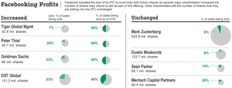
This Wall Street Journal graphic shows who’s selling (or sold) a percentage of their Facebook stocks and who’s holding steady.
This graphic is the perfect example of why I’m a proponent of the pie chart. First, they stuck to two values per pie chart. That makes it easy to read. Next, they used the size of the pie to denote the number of shares. Finally, they used small multiples to easily compare both the shares owned by each entity as well as change in percentage of shares being sold.
I’m sure bar charts would be fine too, but WSJ really used all aspects of the pie chart very effectively.
[via Barry Ritholtz]

 Visualize This: The FlowingData Guide to Design, Visualization, and Statistics (2nd Edition)
But the problem with these pie charts is that you’re not sure if the amount of each entity’s stock holdings is proportional to the diameter or the area of the circle. That’s one of the major disadvantages of pie charts, at least when circle size is meaningful
Yes you are – it’s area, not diameter, unless they’ve done it wrong.
And if you’re worried they might have done it wrong (some do), just look at the values which are listed. Mark Z has around 500, Dustin M around 100. The difference in diameter is nowhere near 4 or 5 times – it’s more like a little over double. So it’s area.
But normally you don’t need to worry especially if it’s a reputable and experienced publisher. When inexperienced people do get it wrong (which happens), they increasingly get publicly shamed in places like this (for example https://flowingdata.com/2012/03/16/new-ipad-battery-size-is-huge/ )
In general, area representations suck for accurate *numeric* visual comparisons (like “X looks 3 times the size of Y, P looks 20% bigger than Q”), but numerals (as provided here) are better for accurate numeric comparisons anyway.
They’re good for impressionistic comparisons (“Gosh, X is much bigger than Y. P and Q are in a similar league…”) – which is useful for seeing at a glance what stands out among huge numbers of variables (then thinking numerically when you’ve found a few focus points of interest), or in cases where values are so varied that in one dimension, the lower end would barely be visible and/or the upper end would be off the screen, or where (like in this case) it’s showing a secondary variable that is not the primary focus of the visualisation, and is provided for context.
They’re almost always a bad idea If your aim is to make people focus on a variable and think about it numerically immediately, e.g. if your audience are analysts, who will almost always want to think in accurate numerical terms and almost never impressionistically. In these cases one-dimensional charts with log scales are usually better.
My point is that a better representation would be one that shows the number of shares linearly, as in a bar chart. The area-based chart does not indicate the much greater number of shares held by MZ. OTOH, it shows the %age of shares sold much better. Depends on which point your’e trying to make.
To me it still takes much more work than is necessary to get the information out of the chart.
While it’s a much better than normal use of a pie chart, that’s like saying it’s a much better than normal broken leg ;)
I would much prefer something along these lines (quick rough chart):
http://jsfiddle.net/jlbriggs/nQR7z/embedded/result/
Or, of course, you could switch the order – put the split bar chart on the left, sorted by the difference in shares sold, in order to focus on that aspect of the data.
Or add a third multiple showing the change in % being sold, which would more strongly highlight the actual difference between before and after
P
I’d prefer a horizontal bar whose thickness reflected # of shares, and split at % of shares sold. In that way the vertical dimension shows holdings, and the horizontal dimension shows % sold.
In the vast majority of cases I can’t see any benefit to that approach.
The thickness of the bars is much hard to decode than the length, and then you have the ever present confusion of ‘is the data encoded in the thickness, or the area’ which obfuscates things further.
People seem afraid of multiple charts somehow :)
I see a lot of charts that go to great lengths to put everything on one chart, when in many cases multiple charts would be the simpler and more concise approach.
FWIW
In general, you’re right. Before now I’ve caught myself creating complexity by combining charts that don’t naturally go together. But this particular case is actually a good one for combining.
Re. “is the data encoded in the thickness, or the area” – it’s intuitively both. Both the pies above, and MikeM’s suggestion, have appeal for a layperson thinking visually and intuitively because you can immediately see the amount of shares actually being sold – the focus of the story – by the total amount of green: more green on the page, more actual shares being sold. They can then see the details that make it up, and the way these fit together in the graphic helps them understand how they fit together in real life. They see visually and intuitively that X is a fraction of Y, that Z is determined by X and Y and that X changes over time but Y doesn’t so it is X that drives changes in Z. A bit of scaffolding like this helps people who aren’t naturally numerate to a) understand the relations between variables with less effort and b) be more confident they’ve understood it right.
Your chart is a good one for someone coming at this like an analyst, thinking numerically and analytically. In your chart, you see the raw variables accurately. Any analyst is then capable of figuring out the composite variable of the amount of shares actually being sold. The way these 3 variables fit together is trivially easy and obvious for a highly numerate experienced analyst: scaffolding and visual aids for this element of the story just get in the way. The other presentations are actually probably more difficult for an analyst than a layperson because you approach it analytically – “Which variables map to which dimensions, with what transformations applied?” – as opposed to simply “More on the page means more”.
(Of course it all goes to hell if a chart is badly made: if it doesn’t actually reflect how the real world variables fit together and if more on the page doesn’t actually mean more. This all assumes competence by the people making the chart. Shaming people who balls it up is a separate topic!)
Conclusion: different presentations for different audiences.
““is the data encoded in the thickness, or the area” – it’s intuitively both. ”
Well, it can’t be both, and it’s not intuitive. That’s the problem that I have with it.
The ‘layperson’ may feel that such a display is intuitive and walk away with a complete misunderstanding of the information as a result.
The creator of the chart may think it’s intuitive and completely misrepresent the data as a result.
It’s nearly impossible to actually understand the values encoded in such a way. The viewer gets some idea of the extra value that’s encoded but it is most often very misleading, and you really never know without closely studying the numbers whether the person making the chart properly encoded the values according to area, or radius, or thickness, or what have you.
Regardless of the audience, poorly encoded data is poorly encoded data. Better to present in a way that clearly shows the relevant data points in a clear concise manner. I don’t see how it could possibly be *more* difficult for the average viewer to understand clear concise data encoded simply…