How to Visualize and Compare Distributions in R
Single data points from a large dataset can make it more relatable, but those individual numbers don’t mean much without something to compare to. That’s where distributions come in.
There are a lot of ways to show distributions, but for the purposes of this tutorial, I’m only going to cover the more traditional plot types like histograms and box plots. Otherwise, we could be here all night. Plus the basic distribution plots aren’t exactly well-used as it is.
Before you get into plotting in R though, you should know what I mean by distribution. It’s basically the spread of a dataset. For example, the median of a dataset is the half-way point. Half of the values are less than the median, and the other half are greater than. That’s only part of the picture.
What happens in between the maximum value and median? Do the values cluster towards the median and quickly increase? Are there are lot of values clustered towards the maximums and minimums with nothing in between? Sometimes the variation in a dataset is a lot more interesting than just mean or median. Distribution plots help you see what’s going on.
Want more? Google and Wikipedia are your friend.Anyways, that’s enough talking. Let’s make some charts.
If you don’t have R installed yet, do that now.
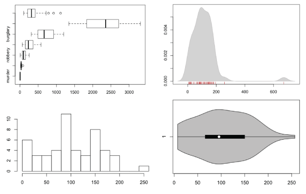
Box-and-Whisker Plot
This old standby was created by statistician John Tukey in the age of graphing with pencil and paper. I wrote a short guide on how to read them a while back, but you basically have the median in the middle, upper and lower quartiles, and upper and lower fences. If there are outliers more or less than 1.5 times the upper or lower quartiles, respectively, they are shown with dots.
The method might be old, but they still work for showing basic distribution. Obviously, because only a handful of values are shown to represent a dataset, you do lose the variation in between the points.
To get started, load the data in R. You’ll use state-level crime data from the Chernoff faces tutorial.
# Load crime data
crime <- read.csv("http://datasets.flowingdata.com/crimeRatesByState-formatted.csv")
Remove the District of Columbia from the loaded data. Its city-like makeup tends to throw everything off.
# Remove Washington, D.C.
crime.new <- crime[crime$state != "District of Columbia",]
Oh, and you don’t need the national averages for this tutorial either.
# Remove national averages
crime.new <- crime.new[crime.new$state != "United States ",]
Now all you have to do to make a box plot for say, robbery rates, is plug the data into boxplot().
# Box plot
boxplot(crime.new$robbery, horizontal=TRUE, main="Robbery Rates in US")

Want to make box plots for every column, excluding the first (since it’s non-numeric state names)? That’s easy, too. Same function, different argument.
# Box plots for all crime rates
boxplot(crime.new[,-1], horizontal=TRUE, main="Crime Rates in US")
Multiple box plot for comparision.
Histogram
Like I said though, the box plot hides variation in between the values that it does show. A histogram can provide more details. Histograms look like bar charts, but they are not the same. The horizontal axis on a histogram is continuous, whereas bar charts can have space in between categories.
Just like boxplot(), you can plug the data right into the hist() function. The breaks argument indicates how many breaks on the horizontal to use.
# Histogram
hist(crime.new$robbery, breaks=10)
Look, ma! It’s not a a bar chart.
Using the hist() function, you have to do a tiny bit more if you want to make multiple histograms in one view. Iterate through each column of the dataframe with a for loop. Call hist() on each iteration.
# Multiple histograms
par(mfrow=c(3, 3))
colnames <- dimnames(crime.new)[[2]]
for (i in 2:8) {
	hist(crime[,i], xlim=c(0, 3500), breaks=seq(0, 3500, 100), main=colnames[i], probability=TRUE, col="gray", border="white")
}
Using the same scale for each makes it easy to compare distributions.
Density Plot
For smoother distributions, you can use the density plot. You should have a healthy amount of data to use these or you could end up with a lot of unwanted noise.
To use them in R, it’s basically the same as using the hist() function. Iterate through each column, but instead of a histogram, calculate density, create a blank plot, and then draw the shape.
# Density plot
par(mfrow=c(3, 3))
colnames <- dimnames(crime.new)[[2]]
for (i in 2:8) {
	d <- density(crime.new[,i])
	plot(d, type="n", main=colnames[i])
	polygon(d, col="red", border="gray")
}
Multiple filled density plots.
You can also use histograms and density lines together. Instead of plot(), use hist(), and instead of drawing a filled polygon(), just draw a line.
# Histograms and density lines
par(mfrow=c(3, 3))
colnames <- dimnames(crime.new)[[2]]
for (i in 2:8) {
	hist(crime[,i], xlim=c(0, 3500), breaks=seq(0, 3500, 100), main=colnames[i], probability=TRUE, col="gray", border="white")
	d <- density(crime[,i])
	lines(d, col="red")
}
Histogram and density, reunited, and it feels so good.
Rug
The rug, which simply draws ticks for each value, is another way to show distributions. It usually accompanies another plot though, rather than serve as a standalone. Simply make a plot like you usually would, and then use rug() to draw said rug.
# Density and rug
d <- density(crime$robbery)
plot(d, type="n", main="robbery")
polygon(d, col="lightgray", border="gray")
rug(crime$robbery, col="red")
Using a rug under a density plot.
Violin Plot
The violin plot is like the lovechild between a density plot and a box-and-whisker plot. There’s a box-and-whisker in the center, and it’s surrounded by a centered density, which lets you see some of the variation.
# Violin plot
library(vioplot)
vioplot(crime.new$robbery, horizontal=TRUE, col="gray")
I bet this violin sounds horrible.
Bean Plot
The bean plot takes it a bit further than the violin plot. It’s something of a combination of a box plot, density plot, and a rug in the middle. I’ve never actually used this one, and I probably never will, but there you go.
# Bean plot
library(beanplot)
beanplot(crime.new[,-1])
A little too busy for me, but here you go.
Wrapping Up
If you take away anything from this, it should be that variance within a dataset is worth investigating. Picking out single datapoints or only using medians is the easy thing to do, but it’s usually not the most interesting.
Made possible by FlowingData members.
Become a member to support an independent site and learn to make great charts.
About the Author
Nathan Yau is a statistician who works primarily with visualization. He earned his PhD in statistics from UCLA, is the author of two best-selling books — Data Points and Visualize This — and runs FlowingData. Introvert. Likes food. Likes beer.
26 Comments
Add Comment
You must be logged in and a member to post a comment.
Hi, does anybody know if there is a package that combines the violin plot with a scatter plot? This would help people see the actual data used.
I coded a small example:
vPlot<-function(x)
{
plot(0,0,type='n',xlim=c(0.5,ncol(x)+0.5),ylim=range(x),xaxt='n',ylab='Score',xlab='')
axis(1,c(1,2),c('GNTP a','GNTP b'))
for (r in 1:ncol(x))
{
d<-density(x[,r])
BinVals=(d$y[-1]+d$y[-length(d$x)])/2
jitt=BinVals[cut(x[,r],d$x)]
y=rep(NA,N)
for(i in 1:N) y[i]=runif(1,-jitt[i],jitt[i])/2
points(r+y,x[,r])
}
}
N=150
x<-log(0.3+exp(rnorm(N)))
y<-rnorm(N)
par(mfrow=c(2,2))
plot(c(rep(1,N),rep(2,N)),c(x,y))
hist(x)
boxplot(x,y)
vPlot(cbind(x,y))
Nathan — with the multiple box plot, it might be nice to force horizontal axis labels so you can see all the categories. It worked for me if I run this right before calling boxplot():
par(mar=par()$mar+c(0,5,0,0), las=1)
Sven — that’s pretty cool. Jittered scatterplots are a quick-and-dirty approximation to that (not as nice as yours, but less code):
GroupNr <- rep(c(1,2),length(x))
plot(jitter(GroupNr), c(x,y))
Thanks, Jerzy. I guess I’m so used to post-processing that I don’t change parameters much.
Here’s a simple example of adding transparency to colors in order to visualize the relationships between multiple distributions:
require(“RColorBrewer”)
#generate a bunch of normal distributions around different means
x1=seq(-4,4,length=200)
y1=1/sqrt(2*pi)*exp(-x^2/2)
x2=seq(-2,6,length=200)
y2=1/sqrt(2*pi)*exp(-x^2/2)
x3=seq(-6,2,length=200)
y3=1/sqrt(2*pi)*exp(-x^2/2)
x4=seq(-8,0,length=200)
y4=1/sqrt(2*pi)*exp(-x^2/2)
x5=seq(0,8,length=200)
y5=1/sqrt(2*pi)*exp(-x^2/2)
x6=seq(-10,-2,length=200)
y6=1/sqrt(2*pi)*exp(-x^2/2)
x7=seq(2,10,length=200)
y7=1/sqrt(2*pi)*exp(-x^2/2)
#assign colors, paste on a number between 10 to 99 to add transparency
col <- brewer.pal(7, "RdBu")
alpha <- 50
col <- paste(col, alpha, sep="")
#plot
plot(x1,y1,type="n",lwd=2, xlim=c(-4,4))
polygon(x1,y1, col=col[7])
polygon(x2,y2, col=col[6])
polygon(x3,y3, col=col[5])
polygon(x4,y4, col=col[4])
polygon(x5,y5, col=col[3])
polygon(x6,y6, col=col[2])
polygon(x7,y7, col=col[1])
You could add transparency as percent value by adjustcolor function:
col <- adjustcolor(brewer.pal(7, "RdBu"), alpha=0.75)
All of these examples could be improved by comprehensive titles and labelling. Intelligible wording on a chart or graph makes the difference between confusion and coherence.
I know you’re just trying to find a design that works, but if the readers don’t understand your message, then your design, regardless of originality and creativity, has failed. For example, the Multiple box plot shows 7 indicates but only 3 labels?!? The Bean plot shows 7 indicators are only 5 labels?!? It would only take a few seconds to ensure that each indicate was labeled.
BTW, histograms are distinguished from bar charts because they show the distribution of data – often the values within ranges or class intervals. There are no spaces between the columns on a histogram but that’s just a convention, not the essential difference.
Hey friends, pay no attention to that last paragraph of my previous comment. Obviously having a demented morning to be followed by a demented afternoon.
I second Sally’s comment – this whole post is really hard to grasp due to lack of proper legend, labels and titles on the graphs. I would really like to understand this better, but can’t figure what exactly is being plotted on either the x or y axes of any of these graphs. At the risk of appearing stupid, can someone please explain.
Thanks
Mark
Hey Mark,
I think he explained the boxplot’s notable points on the x-axis. There is no significance to the y-axis in this example (although I have seen graphs before where the thickness of the box plot is proportional to the size of the sample; it makes the multiple box plot chart more informative.) Also, most of the time I see box plots drawn vertically.
The histogram is pretty simple, and can also be done by hand pretty easily. The data points are “binned” – that is, put into groups of the same length. It looks like R chose to create 13 bins of length 20 (e.g. [0-20), [20-40), etc.) Then the y-axis is the number of data points in each bin. That’s what they mean by “frequency”.
The density plot uses some kind of estimation of frequency, although it’s similar to the histogram. Not sure what the heck that violin plot is, though…
Hi Nathan,
Great tutorial. I’ve been thinking about learning R for a while and this post is giving me the inspiration to finally take a crack at it. One related question for you – I have both a PC and Mac at my disposal – would you recommend one over the other for using R?
Thanks so much!
Cole
Nope, R should be the same on both.
Hey Nathan
Thanks for this. I quite like strip plots where each dot is hollow. This is good for limited space, where you’re only trying to show broad spread and outliers. Obviously spikes in the tail are not observed this way, but it’s a quick snap shot.
What would be good is a tutorial on box plots, where you can over-ride the 1.5 * IQR defaults, which determin the default whisker length. I often need to show simulated output from a stochastic monte carlo model, so I’d like whiskers at the 10th and 90th percentile, with dots at the 1 and 99th percentile.
The advantge of strip and box over historgram, is that you avoid discussions about the height of histograms.
How are outliers handled?
What do you intend showing when you plot histogram?
In the for loop for multiple histograms I believe it should be crime.new[,i] and not crime[,i]
Hallo Nathan, thanks for this great tutorial! I think too, that for the loop it should be crime.new[,i], is that right? Or am I making a mistake?
Thank you so much!
Alice
Ah, yes. It should be crime.new. I’ve edited the code to use the correct data frame.
Hi Nathan,
It seems there is a problem with the source code file. For some reason, I wasn’t able to download it.
Seems to work for me. What happens when you try to download:
http://media.flowingdata.com/tutorials/show-distributions.R
Maybe try right click and save?
hi Nate, I cannot get vioplot to install to my computer. Could you assist me?
Nathan***
What happens when you enter the following in the console?
install.packages("vioplot")Hi Nathan, thanks for the tutorial – am enjoying this course greatly.
In the code for ‘Histograms and density lines’, should it be crime.new[,i] as well and not crime[,i]?
Hi Nathan,
I love the tutorials so far, but like someone before me, I cannot get vioplot to work. I followed your instruction to install the package:
install.packages(“vioplot”)
and I’m able to download it. However, when I then copy-paste the Violin plot instructions:
library(vioplot)
vioplot(crime.new$robbery, horizontal=TRUE, col=”gray”)
I get the following result:
> library(vioplot)
Loading required package: sm
Error: package or namespace load failed for ‘sm’:
.onLoad failed in loadNamespace() for ‘tcltk’, details:
call: fun(libname, pkgname)
error: X11 library is missing: install XQuartz from xquartz.macosforge.org
Error: package ‘sm’ could not be loaded
> vioplot(crime.new$robbery, horizontal=TRUE, col=”gray”)
Error in vioplot(crime.new$robbery, horizontal = TRUE, col = “gray”) :
could not find function “vioplot”
I’ve tried downloading the sm package as well to see if I could get it all working, but then I get hit by even more errors.
I was wondering if you had any suggestions to get it to work? Thanks :)
Hi Margaret – It looks like the vioplot package might be dated. I’d try the
violin_plot()function from the plotrix package.Thank you.