Kirk Goldsberry, an assistant professor of geography at Michigan State, applies his skills to the basketball court.
In the quest to better understand the “average” NBA shooter I have begun making composite shooting charts for each position in the league. My eventual goal is to establish a spatially informed baseline and to map every shooter in the league against an average shooter. These charts are not good for that task, but they’re interesting nonetheless. Here are composite shooting charts for each of the 5 conventional basketball positions. I combined the shooting data for every player in positional groups. There are some bizarre trends including some fascinating asymmetries.
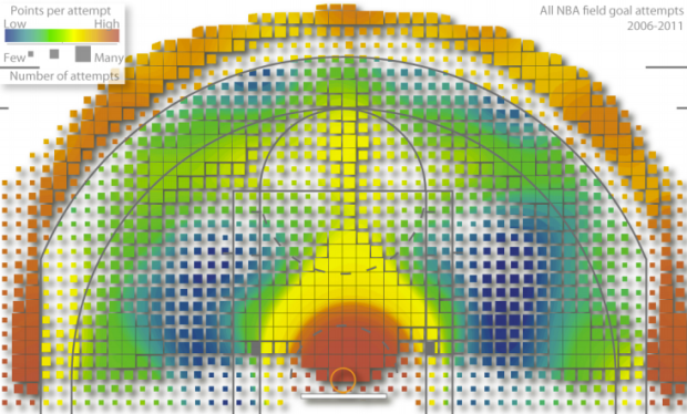
Above shows points per field goal attempt for all NBA field goal attempts from 2006 to 2011. Red means more points and blue means fewer points, so as expected it’s orange-red outside the three-point line and dark red in the high percentage key. It starts to get interesting as Goldsberry breaks things down by player and position. Read the full paper [pdf] to really get into it.
For the record, my personal basketball scoring map would be all red. Don’t let my one-inch vertical leap or my low fantasy basketball ranking this season fool you. I can light it up.
[via Slate | Thanks, Kevin]


I was 2nd string on my high school b-ball team full of a bunch of 5 foot tall Asians and white guys