While we’re on the topic of academic papers and how they’re linked, Johan Bollen et. al used clickstream data to draw detailed maps of science, from the point of view of those actually reading the papers. That is, instead of relying on citations, they used log data on how readers request papers, in the form of a billion user interactions on various web portals.
Maps of science derived from citation data visualize the relationships among scholarly publications or disciplines. They are valuable instruments for exploring the structure and evolution of scholarly activity. Much like early world charts, these maps of science provide an overall visual perspective of science as well as a reference system that stimulates further exploration. However, these maps are also significantly biased due to the nature of the citation data from which they are derived: existing citation databases overrepresent the natural sciences; substantial delays typical of journal publication yield insights in science past, not present; and connections between scientific disciplines are tracked in a manner that ignores informal cross-fertilization.
Cross-fertilization. Saucy.
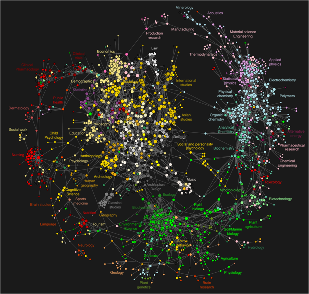
Each circle represents a journal and edges represent connections between journals, according to Johan Bollen et. al’s clickstream model. Circles are color-coded by journal classifications from the Getty Research Institute’s Art and Architecture Thesaurus.
So you have most of the engineering and physical sciences on the perimeter, medical-related areas to the left, and liberal arts is that middle cluster. Statistics is towards the top left, mixed in with demographics, philosophy, and sociology. There aren’t many surprises in the clusters, but there are interesting, albeit weaker, links in the open spaces, such as religion and chemistry or music and ecology.
[PLoS ONE | Thanks, @drewconway]
 Visualize This: The FlowingData Guide to Design, Visualization, and Statistics (2nd Edition)
The picture is interesting, but also odd in several respects. For example, the biomedical sciences, which dominate most citation databases, hardly appear in the graphic. Nursing and public health (red) are not connected to biology (green), and physiology and brain research are outliers not connected to chemistry.
The main reason for the oddity seems to be that the data is based mainly on the (proprietary) clickstream database of the publisher Elsevier. Over the past decade, Elsevier has made it a policy to introduce large numbers of new journals in every available niche, and then to offer bundles of huge numbers of journals for sale to university libraries. On this map, each journal appears as one dot. Thus, the more journals, the more space on the map, regardless of the importance of these journals.
This is one reason that highly cited technical journals that dominate their fields, such as the Journal of Biological Chemistry, the American Journal of Chemistry, and the Physical Review are not visible in the map (although some of these do appear in the list of journals with high page rank). Another reason is that the authors did not include clickstream data from the publishers of these journals. Whereas the Elsevier data has the world compilation of data for its journals, the data for other publishers is limited to cicks from Cal State University and the University of Texas. The author did use the clickstream database of JSTOR, a repository mainly used by social science journals. This may explain the large area on the map taken up by the social sciences. Probably most of the yellow dots on the map are in journals in JSTOR, and so it is no surprise that these are highly interlinked.
The authors ought to present a map that does not favor a single publisher and includes all important journals fairly before representing their work as a map of science.
That looks a lot like it was drawn with d3.js. I’d love to see their code, if it’s available. A quick skim of the article didn’t seem to indicate that it was.
Surprising that statistics is not dead center in the graph, connecting to all branches of science. Or have I missed it?
The graph is based on what kinds of papers people read and statistics is a pretty big field in which several books have been written. I’m guessing that it isn’t represented accurately there because most people would look up the stats either in a book or online rather than a paper which would only contain unnecessarily detailed work.
Great idea and realisation! Still I am wondering why I cannot find maths or computer sciences. Am I missing it or is there a certain reason?
I agree with Michael Peskin’s comment. It is odd that, e.g., dermatology (on the left side of the map) is not linked with pharmaceutical research, biochemistry (on the right side) or genetics (bottom). Maybe, once the authors completed their work using more than Elsevier’s data, a better representation would fit on a 3D sphere…
The centrality of social science and humanities in this projection probably reflects the fact that these are the largest undergraduate majors. These are the kids in giant lecture classes looking up the articles listed on their syllabi.
I think it’d be interesting if there were a way to control for the number of active researchers and/or the amount of research funding in a particular discipline. This would allow a comparison of just how interactive (chatty?!) a given field may be.