There are a lot of words to describe visualization and visualization-related things. It can be confusing. You just came across this thing with data and stuff, but what do you call it? Here I define what all those words mean. Keep in mind, I’m not so, uh, good with words and, uh, stuff, so yeah.
Disclaimer: This is how I perceive the words. They are not official dictionary or academic definitions. Don’t use these in your next report or paper, unless you want to be laughed at.
data visualization — Graph-like image or interactive, usually tied with data exploration and analysis.
visualization — Similar to data visualization and often is, but can also be the later described information visualization.
viz — A shorter version of visualization in both length of word and thoughtfulness in design and data.
vizzes — Plural of viz and evokes an image of urinals.
information visualization — Usually encapsulates what data visualization is about, but usually makes an effort to provide “actionable insights.”
InfoVis — An annual conference that most visualization researchers go to.
infovis — Research of information visualization that people talk about at InfoVis
infoviz — Often a crappier version of infovis and closer to what will follow shortly. However, it could just be an indicator of the person using the word, and the work might be good.
information graphic — Serious work from journalist-type folks who provide a narrative with data.
infographic — A toss-up between information graphic and [INFOGRAPHIC], but usually the latter and often unnecessarily big.
[INFOGRAPHIC] — A gigantic graphic with lots of graphs, numbers, icons, and fancy-ish typefaces. Often used in blog post title. Always useless.
infograph — No idea who started using this term, but it’s dumb. Stop it.
chart — Typically looks very statistical and close to a table.
data chart — Even closer to a table of numbers. And kind of redundant.
graph — It’s like a chart, but it sounds more visual, because it’s the root of “graphic.”
data graphic — It’s an ambiguous term I like to use that doesn’t upset people who like to argue what visualization is and what it’s for, but clear enough that most people know what it is. Also implies that data comes first and is the driving force behind the graphic.
Did I miss anything?
I have seen “dataporn” used on twitter.
“Infoporn” is classic. (origin: Wired)
Worst ever must be ‘charticle’.
Haha funny AND instructive post.
‘data presentation’ Nathan – we receive 100’s of site visits related to this term
some proposals: map, scheme, depiction, infochart
These are perfect. Nicely done. Reminds me of the “Dictionary of Analytics Terms” Juice did a few years back: http://www.juiceanalytics.com/writing/analytics-sniglets-contest-winners/
Chartoon!
What about “data viz”, “data vis”, and their cousins “dataviz” and “datavis”?
Thanks Nathan. I thought this was interesting – here’s “data visualization” vs. “information graphic” comparative Google search interest over time: http://bit.ly/og69MK
Interesting that both terms have been in decline since records began.
Here’s something you won’t like: http://www.google.com/insights/search/overviewReport?cat=&q=data+visualization,information+graphic&geo=&date=&gprop=&cmpt=q#q=data%20visualization%2Cinformation%20graphic%2Cinfographic&cmpt=q
Good point – looks like “infographic” is winning the comboword search popularity contest vs. “dataviz”… http://www.google.com/insights/search/overviewReport?cat=&q=data+visualization%2Cinformation+graphic&geo=&date=&gprop=&cmpt=q#q=dataviz%2Cinfographic&cmpt=q
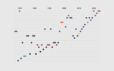
…or another way to look at term usage over time via Google Books Ngram viever http://ngrams.googlelabs.com/ngrams/graph?content=data+visualization%2Cinfographic%2Cinformation+visualization%2Cinformation+graphic&year_start=1970&year_end=2008&corpus=0&smoothing=3
Interesting, shame it doesn’t continue to the point in 2010 when infographics really took off as a search term.
It’s interesting that it’s not only searches on data vis topics that are going down since 2005, but also less books seem to be being published since then…
What went wrong in 2005?!? http://www.perceptualedge.com/blog/?p=217 ? ;-P
We’ve been hearing the the terms “interactive infographic” and “animated infographic” a lot. Don’t like either.
I thought about this many times Nathan, and in fact it could be an interesting challenge to our visualization community to map out this evolving taxonomy of names. Visualization itself could be subdivided in a series of domains such as, scientific visualization, geo-visualization, educational visualization, knowledge visualization, music visualization, and even patent visualization (http://en.wikipedia.org/wiki/Patent_visualisation).
It would be great to have an holistic map of this structure and its implicit links and relationships.
i’d love to see this.
That could be fun.
Scientific visualization is already a term used to differenciate between it and information visualization. Scientific visualization includes those visualizations that show images or representations of biological entities.
— adding to the comment above.. IEEE VisWeek has IEEE Visualization Conference (Vis) for the scientific visualization, e.g. rendering 3D model of spaghetti, IEEE Information Visualization (InfoVis) Conference for information visualization stuffs, and VAST, which is also info.vis.+more analytics.
— “educational visualization, knowledge visualization, music visualization, and even patent visualization”
I think dividing it by domain may be not so useful, since what actually different is the data type: multi-dimensional, tree, network, text, numerical, temporal, spatial. The visualization techniques are more specific to data types than data domains. For example, the techniques used for temporal data in medical domain may be applied to stock market.
Ben Shneiderman. “The eyes have it: a task by data type taxonomy for information visualizations”
http://ieeexplore.ieee.org/xpl/freeabs_all.jsp?arnumber=545307&tag=1
“The beginning of wisdom is to call things by their right names” – Chinese Proverb
I know this list is done somewhat tongue-in-cheek, but there are infuriating parts to it and it makes me want to punch someone in the neck. That I get infuriated by those parts make me want to punch myself in the neck.
Which parts make you want to punch someone in the neck? I love this list but I can see a few candidates (though I personally think this is much better than most things like this).
Is it the mild, latent anti-americanism/anglophilia (e.g. “infoviz — Often a crappier version of infovis”)?
Or the implication that in 2011 it’s still the norm for analysts to have knee-jerk hostility towards the info designers they could be collaborating with?
Or does it just bring out your inner pedant and your carefully repressed urges to tell people on the internet that they are wrong?
Genuine question! :)
Heh, I probably skew to the last part of your list. :) I think I was part facetious and part not.
As for the part that was not.
This reminded me of an online debate several months back between two experts about what is and isn’t data visualization, info viz and all that.
I spent 20 years working as a newsroom infographics artist and editor. I’ve done data-driven RIAs, worked with CAR reporters among other things. And I’ve never heard of any of this stuff until recently, coincidently following along the same trend of “infographics” in google search trends.
And I just couldn’t help but think this had more to do with people taking things a little too seriously or it was upsetting someones little fiefdom. But to me its not creating clarity.
Maybe I’m just a troll or out of the loop. But lets consider some of these (afterwards I will be punching myself in the neck):
“data visualization — Graph-like image or interactive, usually tied with data exploration and analysis.”
Is data visualization a graph … er did you mean chart … er data chart or not? What does graphic-like mean? Are we talking about non-traditional graphs/chart/data-charts?
Are graphs/charts/data-charts not for data exploration and analysis?
And if information visualization is different than data visualization because it “usually makes an effort to provide “actionable insights,” whats the difference between actionable insight and “analysis”? If your analysis doesn’t provide actionable insight, is it really analysis?
“information graphic — Serious work from journalist-type folks who provide a narrative with data.
infographic — A toss-up between information graphic and [INFOGRAPHIC], but usually the latter and often unnecessarily big.”
Infographic came about because we were too lazy to say information graphic. And it has nothing to do with [INFOGRAPHIC].
“[INFOGRAPHIC] — A gigantic graphic with lots of graphs, numbers, icons, and fancy-ish typefaces. Often used in blog post title. Always useless.”
I’m not sure how or where these kinds of demon-spawned things came from but they keep me employed. I don’t care what you call them. But they sure have nothing to do with with the infographics I made in journalism.
“chart — Typically looks very statistical and close to a table.”
“data chart — Even closer to a table of numbers. And kind of redundant.”
graph — It’s like a chart, but it sounds more visual, because it’s the root of “graphic.”
I’m not sure if this is to be funny or serious. If its serious, its seriously funny then.
Anyways, my attitude towards this issue of creating clarity in what we ALL do is to go towards macro and simplicity rather than micro and detailed. I think when we go small it creates more confusion and misunderstanding.
At the end of the day, no matter your job title, industry or skillsets we take information (of which I include data in) and express it through some means of illustration (hand, mechanic, motion, whatever) and fit that within some design (set of conditions or problem solving, not making things look pretty) for the purpose of communication.
information+illustration+design=visual communication… or whatever you want to call it.
i love this. vizzes is the absolute worsest.
link-bait
info-poster (doesn’t actually contain any charts)
videographic (video info-mercials)
link-bait! (although the PC term is link-building) But THATs the correct term for [INFOGRAPHIC]
oh my god yes!
Based on the comments at Mashable, I thought I was the only one who feels that their “[INFOGRAPHIC]” posts are the most useless things ever.
A special nugget from their twitter-related [INFOGRAPHIC] today: “If the Twitter community were 100 PEOPLE, 20 of them would be DEAD (empty accounts).”
The study of visual information is “graphicacy”: “a literacy of pictorial encoding and decoding, and a roster of skills to comprehend optical inputs.” http://theasideblog.blogspot.com/2011/10/graphicacy-lessons-from-student.html
Pretty cool. Thanks
Guess I’m late to the party, but here goes anyway…
Nice way to stir up the inherent linguistic and semantic problems within this space, Nathan! I’m an information designer (where’s that on your list?), and I struggle with this issue of what this whole big field of study and practice actually is, how it’s organized, how non-practitioners understand it, and to what degree it should be formalized. When I began studying the field of information design broadly, there was very little guidance or instruction beyond Wurman and Tufte and the paper trail of sources they cited. A few companies existed, but they didn’t all promote themselves as information design agencies. Today, it seems everyone is an expert, but nobody is working towards clarity and understanding — they’re all just generating more and more stuff to satisfy this new and troubling appetite in the marketplace.
For those of us who care about this type of work — making sense of complex ideas, content, or data in a clear visual way — it’s important to bridge the understanding gap that exists today. Manuel Lima’s suggestion to map interrelationships of these disciplines is excellent, but I think the first step is really to take a serious look at what’s out there, what’s come before and where we are today (this is, after all, an information design problem, isn’t it?). Can we move past the web frenzy around infographics and define the field in earnest, instead of standing by and letting confusion reign? How might we identify and latch on to words that enhance understanding? How about an analysis of all the words used today, their origins, historical roots? Can we even reach any degree of professional consensus and establish professional standards around visualization work?
This isn’t an easy problem to solve, but I do think it’s one worth tackling. Whether we’re serious practitioners, educators, students, or enthusiasts, we should keep a constructive dialogue going. I’ve posted thoughts on this subject and on design in general here:
http://michaelbabwahsingh.com/2010/06/14/does-information-design-make-sense/
http://michaelbabwahsingh.com/2011/06/26/the-boundaries-of-design/
Keep up the great work, Nathan!
I guess I think about trying to articulate the differing entities in this space like this … http://www.cragindesign.com/matrix.jpg
I think each entity could be scored and find a spot in this chart.
I’m not sure the polars are right for the Z axis. This may be a changeable thing for different fields. But I do think audience, platform, UX, etc are considerations. Sum all those up into a range for the z axis and you get my vote.
Your axis diagram is interesting, Brian. It actually highlights part of the challenge, which is how to develop clear dimensions of comparison to tease out differences among visualization fields. Have you tried plotting in any fields to see where they fall? Can you actually show the plot without resorting to 3D software to rotate the model? ;)
At a simpler level, you could start by calling out each component of the picture and do an analysis with that framework. I can think of seven basic components of any visualization field:
1. PURPOSE (why you’re doing it, with regard to client)
2. AUDIENCE (who you’re doing it for)
3. CONTENT (what & how much material you’re working with: text, data, concepts, etc.)
4. PROCESS (how you work with the content)
5. TOOLS & TECHNIQUES (what you use to design/visualize, and how you use them)
6. PRODUCT (what end “deliverable” you’re creating)
7. OUTCOME (what the result is relative to purpose)
So, for instance, what would this look like if we plug in news information graphics, broadly speaking? (sorry if this is too vague an example):
1. PURPOSE: Explain person, place, thing, or event in the news
2. AUDIENCE: Average person or reader of newspaper
3. CONTENT: Text description, photos, drawings, verbal accounts, other information graphics, etc.
4. PROCESS: Define goal of graphic, do research & synthesize, create sketches of different views and approaches, “digitize,” refine, produce
5. TOOLS & TECHNIQUES: Hand sketching, Word, Excel, Illustrator, Photoshop
6. PRODUCT: 2D information graphic for print and web publication
7. OUTCOME: Better understanding of person, place, thing, or event
I’m curious to see how other fields look using this construct. Maybe the definitions we seek are more about qualitative comparisons than quantitative? When you craft the solution or product, then perhaps you can dial up or down other dimensions, such as words vs. pictures, static vs. dynamic presentation, etc. I might just write a whole post on this if nobody beats me to it… ;)
These are helpful, educational discussions. As teachers, we’ve been working on “infographics as literacy.” Here is a helpful graphic to capture the many working definitions of graphicacy and data visualization:
http://theasideblog.blogspot.com/2011/10/graphicacy-infographics-as-literacy.html