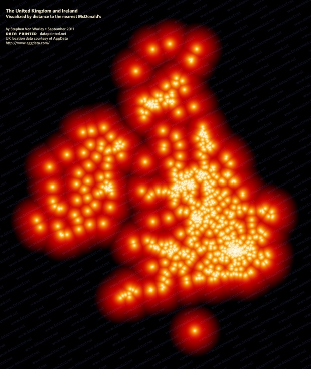
In a follow-up to his ever popular McMap that showed distance to the nearest McDonald’s in the United States, Stephen Von Worley does the same for the United Kingdom and Ireland.
By my calculations, to reach the McFarthest Spot in the United Kingdom — the place most distant from Maccy D’s as the crow flies, minus outlying or disputed territories — one must sail polewards through heaving swells to the Shetland Islands. There, at the tip of the archipelago, uninhabited Out Stack punctuates the north Atlantic, 379 kilometers from the nearest McDonald’s at Peterhead, Scotland.
I’m having trouble deciphering the location furthest south. What is that one location out there, shining like a beacon of hope? (Update: It’s the location in Saint Helier, Jersey.)


 Visualize This: The FlowingData Guide to Design, Visualization, and Statistics (2nd Edition)

Interesting map. Point farthest south is probably the States of Jersey.
It’s the McDonald’s in Saint Heller, Jersey
http://maps.google.com/maps/place?cid=8403332251385245755&q=mcdonalds&gl=us&hl=en&dtab=2&sll=49.043269,-2.070923&sspn=2.90402,2.249451&ie=UTF8&ll=50.473239,-3.194275&spn=0.001748,0.002747&t=h&z=9&vpsrc=0
One of the channel islands. Probably Guernsey
http://en.wikipedia.org/wiki/Channel_Islands
I’m far too slow to ID the island, so here’s a map:
http://maps.google.ca/maps?q=McDonalds&hl=en&ll=49.184635,-2.103517&spn=0.01209,0.020471&sll=49.716045,-2.195377&sspn=0.095675,0.163765&vpsrc=6&gl=ca&t=h&z=16&iwloc=A
You guys are fast. Thanks.
Being a resident of that far south point… I’d rather it wasn’t lit ;-)
Jersey – but then the legend is wrong. Neither Jersey nor the Isle of Man are part of the United Kingdom; they are crown dependencies.
I’ve been lately overwhelmed by visualizations that mainly reflect population density. While they look nice, I don’t think they add much value.
Visualization should help the reader towards action. What would McDonalds execs do with this visualization besides hanging it in reception area? Even a visualization showing number of McDonalds restaurants compared to population density would be more helpful.
Not bad. Could have taken into account average travel time on different terrains, such as road, rivers, hills, etc. Here’s a good example from 2009. http://discovermagazine.com/2010/jan-feb/092
These maps are perplexing. They are described as showing the DISTANCE to the nearest McDonald’s, yet they show short distances as bright dots.