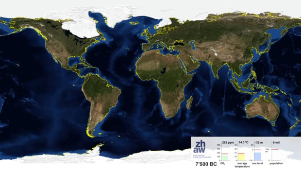
Adrian Meyer and Karl Rege of Zurich University of Applied Sciences visualize the melting poles, starting 21,000 years ago and advancing 1,000 years into the future.
End summer sea ice is shown. The yellow line shows the actual shoreline. The future projection is based on the assumption of complete cessation of carbon dioxide emissions in 2100 (IPCC A2). Because world population is rather uncertain we froze to its current value.
Check out the video below. Adding some speed could’ve made it more dramatic, but wow.
[Blue Marble 3000 | Thanks, Geoffrey]
 Visualize This: The FlowingData Guide to Design, Visualization, and Statistics (2nd Edition)
why would he add speed? the most dramatic part of this graphic is the dramatic increase in speed of melting ice caps in the 20th century and beyond!
It goes really slow in the beginning and it’s almost hard to see the changes. Maybe instead of speed, they should add some annotation during interesting points. Anything to add context to what’s going on.
I agree, the visualization doesn’t match the gradual decrease of the caps over thousands of years. This visual basically says that the caps will be almost completely gone in the next 50-100 years (that rate of depletion doesn’t match the previous 20,000 years of data), and then over the next 900 years it slowly finishes melting. Something’s off here.
Maybe if they used a different map projection http://en.wikipedia.org/wiki/Map_projection that does not distort the area as much, the visual story would be different.
This was a discussion on The West Wing some time ago: http://www.youtube.com/watch?v=n8zBC2dvERM
nice analysis but it should have used a different map projection to highlight the polar region
If one would take a longer time span the situation looks very different. This visualization gives a false impression by using a too small time period. Look at e.g. ice core proxy data http://en.wikipedia.org/wiki/File:Vostok-ice-core-petit.png and you see a clear repetition that translates into shrinkage and expansion of ice. Remain alert.
The Mercator projection is a really poor choice for a visualization of activity in polar regions.
The data processing and animation aspects are very cool, but the map projection is all wrong. Feature sizes in the polar regions are distorted massively in this video and, hence, so are the perceptions we are likely to build by watching these visual ice cap sizes change over space and time.
The Platte Carree map projection (equirectangular) is a lazy designers map projection for it treats longitude and latitude values as if they were x and y coordinates on a Cartesian grid. Yes, the advantage is clear, for it is easy to implement for use with geographic data and computer screens. The disadvantages are much worse, however, because it distorts the very area of interest the authors want us to watch.
The poles (zero dimensional point features) and the small (but thick) ice sheets that surround them are displayed as gigantic earth-covering polygons. Greenland, on earth, is approximately the same size as Saudi Arabia, but Greenland is shown to be almost as large as South America. Antarctica, on earth, is slightly larger than Australia, but is shown to be larger than Russia and span the globe. Therefore, the ice sheet sizes shown here are grossly exaggerated and, hence, so too are all the visual descriptions of ice retreat.
Please know that my comments are not critical of the supporting data or the science that indicates future melting will occur; rather, they are directed at the all-too-common use of the Platte Carree map projection as some kind of standard; it’s wrong, in general, but just absurd when used to show features or events in our polar regions.
what about the rise in the water level. the polar ice caps melting goes hand in hand with the sea level rise.
There is another movie, showing only the Arctic: http://www.youtube.com/watch?v=S5UuXfcDqX0
That’s very cool. Thanks for the update.
The vertical near-side perspective (?) map projection works much better than the Platte Carree, especially in this case. The ice mass now appears as a distinguishable entity on earth and not as a flapping curtain on a rectangular window. The white ice sheet is now placed into figure and the dark earth curves nicely into ground. Also, the whole animation now fits better into a single FOV and doesn’t require me to move my head to see (and mentally stitch together) what’s happening at the corners.
What becomes apparent via the animation is that the ice loses mass over the very long-term (trend) and “breathes” over relatively short space and time intervals (variation). Also evident is how the ice breathes and loses mass around its perimeter – asynchronously. Last, the ice ablates rapidly when all the edges become detached from the land masses. Thanks again.