Analyzing Facebook and Twitter updates to gauge happiness is all the rage these days, but Gallup has been doing it old school for the past three years. Every day, Gallup has called 1,000 randomly selected American adults and asked them a series of questions about their well-being such as, “Did you experience feelings of happiness during a lot of the day yesterday?” and “Do you smoke?”
Matthew Bloch and Bill Marsh for the New York Times mapped the responses for the past calendar year. Use the browser to quickly compare well-being in your area and across the country.
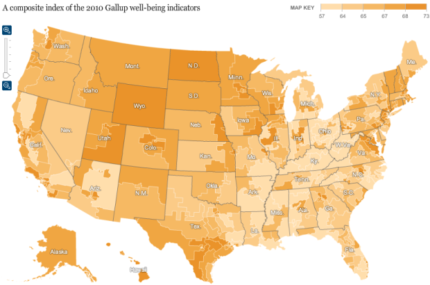
Above is the composite index of all the indicators. Looks like there’s some good stuff going up north. Maybe not so much in the southeast.
The interactive is most interesting when you start comparing areas (especially near your own) and indicators. For example, here’s the map for percentage who exercise:

Now with almost a complete flip, here’s the map for smoking:

Find anything interesting? Let’s hear it in the comments.
[New York Times via @rothzilla]
 Visualize This: The FlowingData Guide to Design, Visualization, and Statistics (2nd Edition)
I find it interesting that the Western Rocky Mountain area rated high on stress, depression, and…happiness? Huh?
Ben: Life in the mountains is totally extreme, dude!
Mountain Dew extreme.
I find this map confusing at first because of the arrangement of the color scheme. Both high depression and high happiness are the darkest yellow-orange. It would be more logical if all the “negative” values (low happiness, high depression, etc.) were pale in color and the the “positive” values (high happiness, low depression, etc.) were boldly colored.
I think the current color scheme works better, so that it’s consistent across all of the indicators. Darker means high, and lighter means low. Much easier to follow over skipping around.
It’s very interesting material, but I don’t really like the sampling units they chose because of their varying size (reflecting population density, no doubt). I think an interpolated map generated from the actual locations of the respondents would have worked a little better.
There is no comment box on https://flowingdata.com/2011/03/04/friday-freebies-visual-history-posters-from-timeplots/ and it is not yet Monday, March 7, 2011, 7:00pm PST.
I love my pumpkin pie. Please include me in the drawing.
I agree with not liking the color…
It got especially confusing for the question “Are you satisfied or dissatisfied with your job or the work you do?” What’s a 73% for that one?? At least if they had been consistent in colors being positive or negative I could make a better guess.
I like how it shows that the overall well-being index is not comprised of equal parts in all places, but may have a regional feel to it. This map makes North Dakota look like the place to be – albeit a little obese, light on fruits, vegetables and exercise. Still, I suspect that my east coast sensibility may feel out of place and “less well” overall if I moved to North Dakota. So is well being finding the right fit?
I like the color scheme this way – it’s easy to compare one to the next.
An even more striking contrast is the percentage of people who feel safe at night vs. the percentage of people who did not have enough money to provide shelter for their families.
Some regions (SE Texas) have both high rates of obesity AND inadequate food.
Does Gallup poll cell phones in this survey?