President Barack Obama delivered his State of the Union address yesterday, and this year it was “enhanced” by charts and graphs. Basically, as Obama spoke, graphics that you could equate to Powerpoint slides showed up on the side. What’d you think of the enhancement? Did it add or detract from the message? Were the graphics used honestly and effectively?
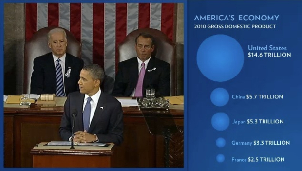
One thing’s for sure: there’s something wrong with that bubble chart. Uh oh.
Below is the full SOTU for reference.
[State of the Union via dy/dan | Thanks, Kyle]
 Visualize This: The FlowingData Guide to Design, Visualization, and Statistics (2nd Edition)
Overall I was impressed with the simplicity and clarity of the visualizations used during the State of the Union. While the bubble chart suffers from the radius vs area distortion, and the infographic showing students failing out of high school was difficult to read, I thought most of the charts were well-done. The lack of chart junk impressed me, considering how often it creeps into presentations like these. And knowing there would be biases in the charts, I was impressed that the Troop Levels In Iraq chart used a zero axis (though many of the others didn’t).
Considering that the State of the Union aims to persuade, and not necessarily provide a balanced view, the charts were within my expectations. I think they added to the message and visually reinforced the President’s speech. Though I view any information from politicians, whether spoken or visual, with a skepticism, and these charts were no different.
I compiled all the visualizations from the speech into a blog post with links to the parts of the enhanced video where the visualizations are used. If interested, check out:
http://blog.fastfedora.com/2011/01/2011-state-of-the-union-visualizations.html
I’m very disappointed in our president for allowing the use of this misleading diagram; it IS wrong.
These bubbles should be sized so that their areas represent the values. I redrew the bubble for the US using the China circle as the base. Have a look at http://www.vwmaps.com/clients/obama_bubble/vwmaps.png
The red bubble on my graphic has an area that is larger than China’s by a factor of 2.56 (or 14.6/5.7).
1st impression: “looks good and presentation nice”
oh dear im english,who are the stoborn “elephants” & the stupid “donkeys”? should have included a “R” and a “D” next to the oppropriate image.It seems that americans from this think that either everyone knows or should know.Or perhaps american gegraphical knowalge of this planet is not a mulitnational planet but rather “Planet America” (just being extreme to make the point,please dont take things as an attack or anti american)
The dropout visualisation should have been split to 2 represantations.
MyOverall rateing 8 out of 10 (it was good)
Shocking!!
Adition to my comment:
I think the dropout representation was done like that by design:designed to deceive.
Do not try to deceive people (as a trickster trying to draw your attention to what the left hand is doing while the right hand is performing the “Magic(deception)”,Just present the facts as they are.
As an american ctizen living and working in Australia its not been easy to keep up with american politics. I’m well aware of the constraints put on the president, and the government he represents, by congress. I could not help think that as positive as the State of The Union Adrees was, will President Obama succed in what he talked about so eloquently.
Excellent point Martin. As a further elaboration on your correction, I’ve corrected the entire chart and the Tax Cuts for the Wealthiest Americans chart which suffered from a similar problem. I linked to your comment for those interested in further elaboration. You can see the updated charts at http://blog.fastfedora.com/2011/01/2011-state-of-the-union-visualizations.html#16 .
Perhaps because I’m French and upset to see my country in the bottom of the chart ;-) I also recalculated the figures on the basis of population (which should always be the case in order to compare to china)
US: 47,288 $ per capita
Japan: 41,706 $ per capita
Germany: 40,332 $ per capita
France: 37,993 $ per capita
China: 4,260 $ per capita
This gives another point of view.
i missed a lot of “context” for the data Obama was giving. But i would approve anything he says since he always manage to make me cry.
Even with Edward Tufte appointed to a White House advisory board a 2D bubble chart with a huge lie factor and non-normalize data source makes it to the State Of The Union speak…
What do you think is the reason for this kind of errors in highly scrutinized and proof read material?
With the US GDP blocked out I had my students guess what the GDP should be based on the graphic. One group of my students came up with a guess of 28.5 trillion by replicating China’s circle and placing four of them in the circle. So they figured 5 times China. Only 13.9 Trillion off. Is that a lot of money?
Thanks dy/dan http://blog.mrmeyer.com/
dy/dan – glad your blog popped up in my “recommended items” on google reader and I forwarded it to Nathan. I was pretty shocked because it’s such a clear difference. And honestly – I probably wouldn’t have ever thought about it, even though I’m in this “business” (visualization, BI, etc).
Well, at least no one can accuse him of not believing an American Exceptionalism – “I swear baby, that’s 9 inches”!
The jobs chart looks familiar…and was discussed previously on flowingdata.
https://flowingdata.com/2010/02/17/road-to-recovery-is-the-recovery-act-working/
I find the comments on the bubble chart a bit naive to be honest… Its a choice of representing the data (radius), which to my opinion is not as good as using the area but you can’t say it is wrong can you?
It has everything to do with using the charts to deliver a certain message, representing data in a certain way helps doing that whether it’s misleading or not. So even Tufte can’t avoid the needs of real life ‘ strong communicating charts’ ..
It’s a design choice, but it’s a bad design choice. I mean, you’re arguing that it’s okay to mislead people with data, and to me that’s wrong.
Im just pointing out that its not a ‘right-or-wrong’ question in my opinion. There is always room for interpretation; what proportions do you use for a chart? what data range are you using? which colors? etc. etc. .. it all has to do with the message you want to put out.
Same thing goes with the words you choose to communicate a message. There are many different ways of saying the same thing that all sound very different (you could have done that better, you did that not so good, you could improve what you’ve done, you did a bad job)
I might not approve of the usage in this particular case, but I do think it is naive to say it is surprising that it is used in this way and that it is wrong.
Language works because we’ve agreed on the meanings of sounds and spellings. So when you say ‘tree’ I know that you’re referring to a something that grows out of the ground and is tall. And when you claim that something that walks on four legs and says “meow” is a ‘tree’, I can say you’re wrong.
Similarly, chart readers will intuitively use the relative areas of graduated circles to infer the value. So to answer your question, yes, I do believe I can say that the bubble chart is wrong.
I also showed another group of my students the picture with the US bubble missing and told them that they were competing to be the President’s top data analyst and needed to create a correct bubble size for the GDP of the US. Only one group of students chose area to find the radius. All other groups chose to use the diameter (which gave the SOTU representation). We had a pretty good discussion about which graph was better and why? And also a discussion about if they were the President which bubble would they choose? Did not judge the President. I was very careful not to let my beliefs on the matter show. I wanted them to make up their own mind. I did however tell them that the accepted practice among mathematicians is to represent bubble size with area. Am I wrong?
@Daniel – Did your students come to a consensus?
They were very forgiving of the President and thought that he may not have known. They were not aware that the size of the circle should be figured with area, and since most of them did not use diameter the first time either they thought it was OK for the President to use the graph he used. They did say however that President Obama should fire his analysts, because they did feel that the area representation was the better choice.
did not use area the first time