Data visualization and all things related continued its ascent this year with projects popping up all over the place. Some were good, and a lot were not so good. More than anything, I noticed a huge wave of big infographics this year. It was amusing at first, but then it kind of got out of hand when online education and insurance sites started to game the system. Although it’s died down a lot ever since the new Digg launched.
That’s what stuck out in my mind initially as I thought about the top projects of the year. Then I went through the archives. There was a ton of great work, too. So much so that I’ve gone with the top ten data visualization projects of 2010, instead of the top five.
One of the major themes for 2010 was using data not just for analysis or business intelligence, but for telling stories. People are starting to make use of the data (especially government-related) that was released in 2009, and there was a lot more data made available this year (with plenty more to come). There were also more visualization challenges and contests than I could count.
So here are the top 10 visualization projects of the year, listed from bottom to top.
10. Asteroid Discovery
Scott Manley of the Armagh Observatory visualized 30 years of asteroid discoveries. It’s a straightforward animation that shows planets and asteroids orbiting the sun, with waves of twinkles as discoveries are made. I especially liked the contrast between human and automated discoveries.
9. Driving Shifts Into Reverse
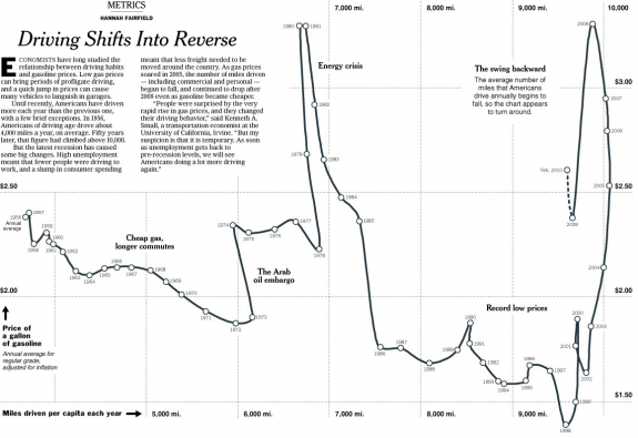
Hannah Fairfield, former editor for The New York Times, and now graphics director for The Washington Post, had a look at gas prices versus miles driven per capita. The chart could’ve easily been an x-y scatterplot, but the extra step was taken to connect the dots so to speak. Points were ordered by time, and turns were clearly explained graphically.
8. The Evolution of Privacy on Facebook
This weekender by Matt McKeon of the IBM Visual Communication Lab explored the changes of Facebook privacy policies over the years. It came right after Facebook had made another update to push for a more public profile. Click on the interactive, and see what becomes public and how many people can see your postings.
7. What Online Marketers Know About You
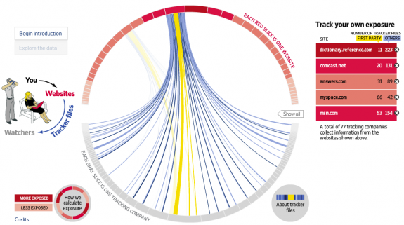
Along the same privacy lines, this project from Andrew Garcia Philips and Sarah Slobin (plus five data gatherers) of The Wall Street Journal explored what online marketers know about you. I wouldn’t say the visualization itself was super advanced, but thoughtful reporting and company breakdowns really made the whole piece work.
6. Education Nation Scorecard
The Education Nation Scorecard, by Ben Fry-headed Fathom Design, brought together sparse education data, at the national, state, and local level, in a single application. You can easily search for your own school or area to see how it compares to the rest.
5. Nature by Numbers
Nature by Numbers by Cristobal Vila isn’t a typical data visualization piece. It’s more of a demonstration of mathematical concepts, but it’s a beautiful work that must be watched to fully appreciate. You will have a new found appreciate for Fibonacci, guaranteed.
4. Tracking the Oil Spill
The BP oil spill was the center of public attention for a good part of the year, and The New York Times did a great job at keeping us updated on all aspects of the spill. This included where the oil spread, what land areas were affected, and effects on wildlife.
3. Polymaps
JavaScript keeps getting faster and is becoming a viable route (over Flash) for visualization on the Web. Polymaps, by SimpleGeo and Stamen, is an open-source JavaScript mapping library that lets you build interactive maps from scratch. I haven’t had a chance to use Polymaps for a project yet, but I’m looking forward to it, and I am sure we will see a number of Polymaps projects spring up next year.
2. Journalism in the Age of Data
During his Knight Journalism fellowship at Stanford, Geoff McGhee interviewed visualization trendsetters on how they deal and what they do with data in Journalism in the Age of Data. Just about every well-known data practitioner (and their work) is featured in the hour-long video. The focus is on journalism, but the topics apply to all types of visualization.
1. Tourist Maps
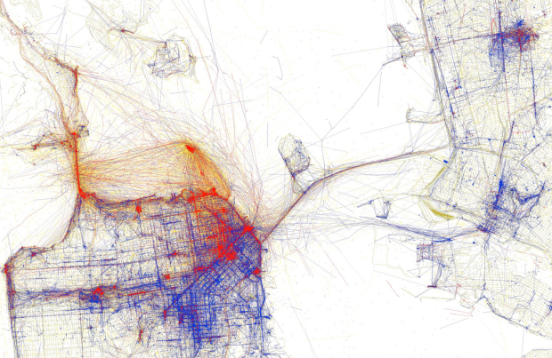
We’ve seen maps based on Flickr photos before, but most aren’t much more than pictures on a map. Eric Fischer took the next step and looked for where the tourists flock, all based on data available via the Flickr API. Tourist photos are marked red, local photos are marked blue, and photos where tourism could not be determined were marked yellow. He did this for over 100 major cities in the world.
The end result was maps with pockets of tourists and locals. Visiting somewhere new and want an authentic experience? Maybe head towards the blue.
Fischer also had a fine series on race and ethnicity.
And there you have it. Those are my top ten picks for 2010. It was tough ranking all of them, as many of these could’ve placed top honors on a different day. What are your picks for the year?


 Visualize This: The FlowingData Guide to Design, Visualization, and Statistics (2nd Edition)

Pingback: 10 Best Data Visualization Projects of the Year – 2010 « Another Word For It
My personal nummer 1 of 2010; http://9gag.com/gag/42903/
The web ads follow you these days. If you are looking for a web cam online and are on a food site, you would still find ADS related to the web cam there.
I guess this is what is depicted by the Picture 7 above.
Is there any way to stop websites from storing this personal search information?
there is a way to remove some cookies from the sites you browse: here’s a link to how
http://on.wsj.com/eIhBI3
Thanks for link)
Excellent visualizations, thanks! WRT #9, swapping time for x-axis would convey the information more intuitively, since most folks realize time is linear. http://www.asktog.com/papers/raskinintuit.html is a good description of my rationale. A bubble chart would be more effective, with the diameter indicating miles driven per capita, y-axis indicating price of gas, and time, familiarly on the x-axis.
The NY Times on gas prices (#9) is by far the best, most deeply informative graphic. The maps are visually striking, but don’t really provide much detailed information. I like Tourist Maps, it’s innovative on several fronts, but most of the maps strike me as being about visual appeal than usefulness.
Pingback: links for 2010-12-14 « Donghai Ma
Graphics always pinpoint the big story quickly.
Pingback: Twitter Updates for 2010-12-15 « Philip Fokker
Pingback: Laura Wismans » Blog Archive » De zoveelste top zoveel
I like the Facebook User-Relationship Visualization best: http://techcrunch.com/2010/12/13/facebook-intern/
Fantastic post. Nature by Numbers is so beautiful we’re sharing with our entire TEDxHuntsville attendee list. Cheers
Shades of Edward Tufte! They are all very nice! Visualizations can be very helpful in understanding data, but the I think the idea that “garbage in-garbage out” still applies. Also, from an instructional design point of view, any visualization has great potential to be distracting from the information one wishes to convey. Having said that, thanks for sharing these graphic representations of data.
I think the Facebook friendship relationship one is the best. http://techcrunch.com/2010/12/13/facebook-intern/
Too bad its not in this ranking.
Agree with Walt, that FB map is an awesome infographic — stunning darkness in Russia & China…
Pingback: The Gulf Oil Spill as a Topic for Classroom Inquiry - NYTimes.com
Pingback: Flavorwire » What’s On at Flavorpill: The Links That Made the Rounds In Our Office
“Driving Shifts Into Reverse” is my favourite when it comes to the presentation of the data. It’s clean, simple to understand and shows you trends and connections that would’ve been hard to observe in the pure data. Awesome job.
I also like the tourist map, simply because the idea is so great, and because it’s yet another example of how the immense volume of data generated by ubiquitos computing can be put to creative and inspiring uses.
BTW, thanks for the great job you’re doing with this blog!
Pingback: Interesting Reading #643 – Project Squid Skin, Ebook ripoff, $500 for your tweet, True beauty sleep and much more! – The Blogs at HowStuffWorks
Pingback: links for 2010-12-15 | Ex Orbite
Regarding ‘Driving Shifts into Reverse’ (#9), here’s a reproduction using an online JavaScript chart tool: http://chart.inetsoft.com/editor.html?img=JMysTqZB
Feel free to play with the data or the display.
Pingback: FlowingData’s 10 Best Visualization Projects of 2010 | VizWorld.com
Pingback: 10 Best Data Visualization Projects of the Year – 2010 « BI HELPER – Business Information/Ingelligence Helper
Pingback: Assorted Links of Curiosity 12.16.10 « BrothersFiasco
Pingback: Journalism in the Age of Data
Pingback: Zach Wise » Daily Digest for December 17th
Pingback: weekly notes: december 17, 2010 | post-rock paper scissors
Excellent! Thanks
Pingback: Twitter Weekly Updates for 2010-12-19 « Philip Fokker
Pingback: [On the Web this week 2] | Data is Huge
Pingback: Horizon 2010 Report: Visual Data Analysis | How I Learn
Pingback: PIA Blog / Productivity by Design » Notre revue de presse (20/12/2010)
Pingback: 10 Best Data Viz Projects of the Year -- BlogLESS: A Blog about Design Ethics
Pingback: Facebook, le beau et le moins beau | Karizmatic
Great visual data sets! Thank you
Pingback: Quick Links | A Blog Around The Clock
Pingback: LA revue des revues de l’année 2010 | Blogue de Samuel Parent
Pingback: Top 10 2010 | El blog de Cink.
Pingback: Links I Liked « Hands Wide Open
Pingback: Delvinia - 5 Most Viewed Articles on the Delvinia Link Pool: Dec 20 – Dec 26 «
Pingback: Data Vizualization: http://flo… | Chris’s Digital Detritus
Pingback: Links: Attractiveness, Parenting (Asian Style), Infographs & Depression « The Alterrealist
Pingback: Journalismus und Datenvisualisierung | logbuch@freiheitsgrade