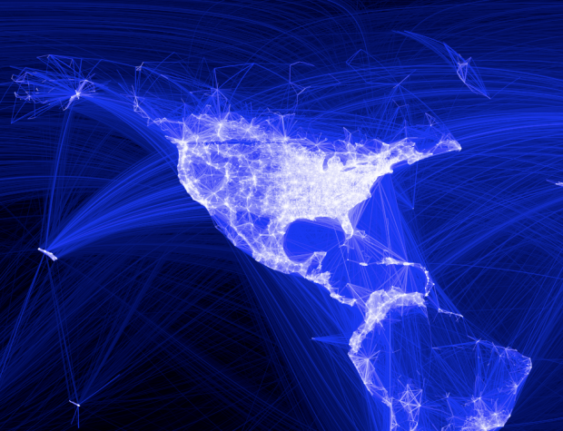
As we all know, people all over the world use Facebook to stay connected with friends and family. You meet someone. You friend him or her on Facebook to keep in touch. These friendships began within universities, but today there are friendships that connect countries. Facebook engineering intern Paul Butler visualizes these connections:
I defined weights for each pair of cities as a function of the Euclidean distance between them and the number of friends between them. Then I plotted lines between the pairs by weight, so that pairs of cities with the most friendships between them were drawn on top of the others. I used a color ramp from black to blue to white, with each line’s color depending on its weight. I also transformed some of the lines to wrap around the image, rather than spanning more than halfway around the world.
In other words, for each pair of countries with a friend in one country and a friend in the other, a line was drawn. The more friends and distance between two countries, the brighter the lines on a black-blue-white color scale. The “stronger” connections were drawn on top, so they are more visually prominent.
It might remind you of Chris Harrison’s maps that show interconnectedness via router configurations.
In areas of high density it looks more or less like population density. Or even more interesting, you can compare the above section to Ben Fry’s All Streets, which maps all the roads in the United States. Physical connections look a lot like digital connections.
Most interesting though, I think, are not the places that are lit up, but the relatively dark ones, where Facebook has yet to reach. There are still huge sections of complete black:

Check out the high-resolution version and more details on the process here. One interesting note for the R fanboys. This was done in your favorite open-source stat software for computing and graphics.
[Facebook via ReadWriteWeb]
 Visualize This: The FlowingData Guide to Design, Visualization, and Statistics (2nd Edition)
Pingback: Tuesday Morning Catch-up Links « Gerry Canavan
Those huge blank areas , are also black when you look at earth from space at night. No people == no facebook.
I would just think no facebook means no or little access to technology such as the internet. this is common in third world countries.
All that empty part of Australia though really is no people. The people who are out there sometimes do and sometimes don’t have internet access, but mostly, there just isn’t enough population density to make a mark on the map.
i cant beleav thise.
That was my thought, too, see: http://www.peteraldhous.com/earth_at_night.html (requires Google Earth browser plugin)
Pingback: Facebook's Social Network Graph | Test Blog
I think that countries like Brazil and China use different services than Facebook, hence their blackness.
In Brazil the orkut is more popular, yet. The “empty” in South America is the Amazon region, with much less people than the South/Southeast of Brazil.
Pingback: Facebook’s Social Network Graph | zlatinarocquefort
Pingback: FlowingData: 10 Best Data Visualization Projects of the Year 2010 « visualite
Reminds me of a certain map of global air travel produced a while back :)
Pingback: WikiLink Dump: Agenda Style | Terrace Agenda
Pingback: Quant artists Flowingdata have updated t… « interact with wordupresearch
Interstingly, it seems the macro-ties are heavily based on language, whereas the micro-ties depend on location.
Pingback: beautiful social network graph of Facebook
Pingback: Purgatory's Extranet » Blog Archive » Really Interesting Data Visualization Site
Pingback: Shining on Down Syndrome
Pingback: Infographic Of The Day - TDW Geeks
why are there networks in orbit? do astronauts (or even aliens) check their FB account as well?
Wheres China! Censorship lol.