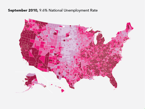
I took a look at unemployment rates about a year ago, and I got to wondering if it’s changed at all over the past year. Not really. It’s still stuck in the 9 to 10 percent range, according to the Bureau of Labor Statistics. It looks like it could be a while until things get better.

I’ve uploaded the processed data, and the Python script I used to generate these maps, which is a modification of the code from my previous tutorial on how to make these maps. The same series of maps that show month-to-month changes instead of the actual unemployment rates would be interesting.
 Visualize This: The FlowingData Guide to Design, Visualization, and Statistics (2nd Edition)
Not a very nice way to present data. A realistic map makes the ‘graph’ far too cluttered to be read easily. The BLS has really ought to hire some professional designers, I think!
Nathan,
A nicer way to present these data might be to subtract the Sept 2010 unemployment rates for each county from the Aug 2009 rates. Then do a heat map showing change. Otherwise, it’s impossible to compare the two time periods in any meaningulway. I’d love to be able to see if there is a systematic pattern in unemployment change in say, the south versus the north, the coasts versus the middle of the country, or in cities versus rural areas.
-Jeff
Good suggestion, Jeff. That was my thought after I had the above maps in front of me. Didn’t have the time though. Maybe someone will use this as a chance to go through my tutorial :)
https://flowingdata.com/2009/11/12/how-to-make-a-us-county-thematic-map-using-free-tools/
I think there are two errors in the current version of the SVG file that you linked to in your tutorial.
The errors are in state abbreviations:
Line 7108: NO -> MO
Line 15095: WIO -> WI
I’m not familiar with wikimedia, so I don’t know how to notify them or fix it.
I put together your suggestion, Jeff (using Nathan’s tutorial of course). Alabama is struggling.
http://drop.io/inup25f/asset/unemp-change-png
The bins used to color the various counties turned out to be tough since 95% of them lie between -2 and 2, but there are some counties that had unemployment rate swings of 10 percentage points. I suppose it’s possible to do a variable width bin, but I didn’t want to mess with it.
It’s also a little fuzzy because I don’t have any SVG touch up software near me, and had to jump through some hoops just to get it in an image format. I’ve got the original SVG or Python code if anyone is interested.
nice work, disrat. your map is much more useful. and christmasy :)
Oh that’s a great idea! I would be interested in seeing that too.
It would be nice to see these with the counties blown up to size proportional to their population. I’m not sure how to do that, but on these maps you can really only see rural counties with very small populations. It doesn’t give you a very good sense of where the most people are employed or unemployed.
Another tutorial?
Wow! While I agree there may have been a better way to present it, this still shows how crazy things are getting out there. Sometimes you feel like it’s only your community being affected, but seeing it as a nationwide thing really emphasizes the problem.
T. Cullen
Baltimore Investment Management
Nathan, quick question about the data. The file begins with Jul-09 values. Does “Jul-09” correspond to August 2009 unemployment, “Aug-09” to September 2009, etc?
Nevermind. By comparing maps I think I can see that the data is labeled in the obvious way; “Jul-09” corresponds to July 2009 unemployment data. But then, the data doesn’t include September 2010, does it?
I was going to use the Python code in the tutorial, but I couldn’t get Beautiful Soup to work.
So, I did something different. I made an interactive map using Python and tkinter.
Unfortunately, the only place I have to put this is on wordpress.com, which won’t allow me to upload a text file. So, if anyone wants to try the Python code, save this tkintermap31.doc file (direct link), changing .doc to .py (it’s only pretending to be a Word document).
There are some instructions for using it here.
I’ve only tried this so far on my XP machine — no access to a Mac until this weekend, unfortunately — so I’d be interested to hear if runs on a Mac. Also, I think you need Python 3.1. I tried it with Python 2.6 and it doesn’t work.
Oh, and I spotted another error in the SVG file. Line 189, change “AL” to “AK”.
This will be the last comment, I swear.
Here are images showing change in unemployment rate from November 2009 to December 2009.
Nathan thanks for the tutorial and pointers to the source data. The information about linking data up with SVG content was extremely helpful to me. I have built an interactive version that dynamically runs off the last 19 years of Labor statistics. It also shows annual incremental changes by state or county.
You can view it here:
http://visualisation.zoho.co.uk/usaunemployment/
Sorry, started a blog and needed to move this link.
It is now here:
http://lab.zoho.co.uk/lab/usa-unemployment/