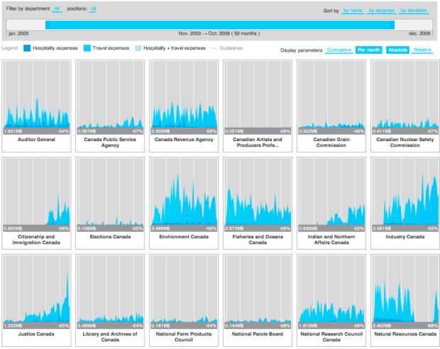
In an effort to make Canadian government expense data more accessible, FFunction designed the Expense Visualizer. A slider on top lets you filter by time, and small graphs show spending by different departments. Rearrange panels as you wish, and select among several scaling options as absolute values or relative. Bookmark your custom views or send them to others.
It took two years to make, but I’m pretty sure most of that time was waiting for all the groups to publish their data since the implementation itself is fairly straightforward.
A vertical axis probably would’ve been useful to see the values more easily. Or even better, a display of values as you rollover the graphs (like this).
[Thanks, Sébastien]
 Visualize This: The FlowingData Guide to Design, Visualization, and Statistics (2nd Edition)
Of course, it would have taken only ONE day with JMP software!
To be fair, one requirement is that it had to be explorable online, and it can save state, so if you come up on a view, you can share that customized view with someone with a link.
But yeah, someone swift with javascript could probably get this done in a day and a late night. That’s assuming properly formatted data, which is the important part here, which is a big assumption.
Actually, the two yeare are mainly because we wanted to have the share-with-URL feature, which we just didn’t have time to implement it ;) The application was developped in about 2 weeks overall.
Getting the visualization to work was actually the easiest part, the trickiest was extracting the data, providing it to the interface in a compact format, and making the interaction work properly.
One of the neat aspect of this interactive visualization is that you can just save the page and continue to use it — it does not require any server-side component, which is a feature often asked by clients (standalone, self-contained).