Instead of breaking up demographics by defined boundaries, Bill Rankin uses dots to show the more subtle changes across neighborhoods in a map of Chicago using block-specific data US Census.
Any city-dweller knows that most neighborhoods don’t have stark boundaries. Yet on maps, neighborhoods are almost always drawn as perfectly bounded areas, miniature territorial states of ethnicity or class. This is especially true for Chicago, where the delimitation of Chicago’s official “community areas” in the 1920s was one of the hallmarks of the famous Chicago School of urban sociology.
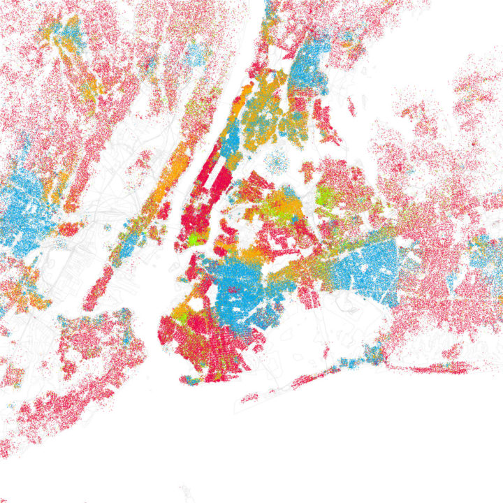
Each dot represents 25 people of the map color’s corresponding ethnicity.
Erica Fischer, who has made a map or two, takes the next step and applies the same method to forty major cities. Here are the maps for Los Angeles, San Francisco, and New York, respectively. Same color-coding applies. You definitely see the separation, but zoom and you much more subtle transitions.


[Erica Fischer via Data Pointed]

 Visualize This: The FlowingData Guide to Design, Visualization, and Statistics (2nd Edition)
Interesting. Any tips on which software to use for dot mapping (and how)?
I’d also be interested in where the data came from. He said Census 2000, but I couldn’t find much on the census website that wasn’t already aggregated/summarized. Is this something one would have to purchase?
the more detailed data is usually through FTP or one of their data browsers.
he most likely used ArcView or another GIS taking census block level data and simply creating a 1:1 dot density to normalize a distribution of people in a tight geography. blocks are good for this exercise b/c lakes and other unpopulated areas are their own unique geography.
Nathan, some of your readers may want to check out Dr. Richard Marciano’s project, “T-RACES”, which is the “Testbed for Redlining Archives for California’s Exclusionary Spaces”. http://salt.unc.edu/T-RACES/ The same kind of data is available.
“T-RACES was designed to preserve, analyze, and make publicly accessible online digital versions of historical documents related to the practice of redlining neighborhoods in the 1930s and 1940s in eight California cities. The documents include city maps, neighborhood descriptions, interviews, financial and banking documents, and detailed city surveys that are a valuable source of information on California’s history. The original materials are housed at the National Archives and Records Administration (NARA) and are part of the Civilian Records holdings. The website includes historical maps of 8 areas: San Francisco, Oakland-Berkeley, San Jose, Sacramento, Stockton, Fresno, Los Angeles and San Diego. The project will eventually be extended to include all the redlined cities of North Carolina: Asheville, Charlotte, Durham, Greensboro and Winston-Salem.”
Here is an interesting, related article that I just read in Newsweek. Atlanta has eliminated all of its public housing and has offered all the now former residents of public housing, a voucher good for 2/3 of rent (market rate) anywhere in the US (I don’t quite understand how that works unless Atlanta is actually trying to get their poor people to move away). Anyways, according to the article: “nine in 10 recipients remained within the city limits, mostly in high-poverty, high-crime ZIP codes.” There have and are clearly many practices, both historically and currently, which perpetuate racial segregation. And, at the same time, we should not underestimate the degree of self-selection even among the poor. From my own admittedly-biased middle-class perspective, if I were poor and really wanted to give my kids the best life chances, I would do whatever I could to try to live in a middle-class neighborhood. There are lower-cost and subsidized options in middle class neighborhoods (at least in Massachusetts). Yeah, my kids would have to deal with being the poorest kids in their school but so what.
http://www.newsweek.com/2010/09/12/atlanta-vouchers-don-t-solve-poverty-problems.html
This does not surprise me for many reasons:
1) The truly poor cannot afford even 1/3 of market rate, middle-class rental housing.
2) These people cannot afford to buy and maintain a vehicle and must stay close enough to walk to the place they purchase food, work, or have child care.
3) Moving expenses were not covered.
4) Credit ratings were not good enough to move into middle-class rental housing.
These are just the ones I can think of off the top of my head in 5 minutes. I know there must be more.
The dots are likely just randomly placed within the US Census block geography where the number of dots represents the number of people of that category (or in this case the number divided by 25 because he says each dot is 25 people). If you make several categories as layers (in GIS or graphics programs) then you can overlay the layers and produce this style map.
For more sophisticated mapping and dasymetric mapping look at the Synthesized Data for Census 2000 (http://www.epimodels.org/midas/pubsyntdata1.do;jsessionid=0a60c06530d8138ac9b331464b42a4afbf52b4e807d8.e34OaNaMax8QaO0ObNmTbN8Ob350n6jAmljGr5XDqQLvpAe).
Also note, there is USDA Agricultural Census data (on poultry) which is fascinating because they took county level data and geographically refined it through a model of where poultry houses likely occur (e.g. not on Federal Property, not in a lake, unlikely in a municipality etc).
Yeah, he kind of cheated a little bit there:
“That’s a flaw in my plotting. I took the easy way out and used the diameter of each block instead of the block’s actual bounds to choose the points to plot for it, so sometimes the points are outside the actual bounds.”
His method has to partially contribute to some of that beautiful diffusion along the borders (or perhaps all of it?). I actually like it since it gives a loose sense of racial presence, less than actual location of individuals’ housing.
Just some thoughts.
-N
I’m sorry – what I just said about diffusion is absolutely wrong – of course most of the diffusion comes from actually multi-racial neighborhoods… jeez I’m brain dead today.
These are beautiful maps. Here is another mapping of the same info (and in addition, other census variables besides ethnicities):
http://www.overviewecon.com –> Web/Mapping –> Nation-wide Census Maps
The databases behind the maps are slow, and the interface is only in its second iteration – I blame my day job :-)
Pingback: How Segregated Is Your City? [INFOGRAPHIC] /via @fastcompany #Amplify #RecoveryRelief « The Recovery Relief Blog
Pingback: Musings on map coloration | Meng Bomin
Pingback: Take A Look At How Segregated Your City Is
Pingback: Ethnicity by city block - great way to visualize ethnic community groups on map | .:: Ad Sheik ::.
Pingback: American metropolitan racial segregation mapped | Meng Bomin
Pingback: Infographic of the Day: How Segregated is Your City? | Fast Company
Pingback: Versailles is Turning Japanese & Chicago Shows Off Its Best Artists (I really think so) : Bad at Sports
Pingback: How the Washington Post Lies About Guns And Crime Through Omission « Lawrence Person's BattleSwarm Blog