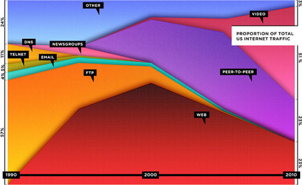
Wired has declared that the Web is dead in their September cover story, and they lead off with this stacked area chart showing the decline of browser-based consumption. Each layer represents a way to consume media via the Internet. Instead of the browser, the majority of US traffic, as estimated by Cisco, has shifted towards peer-to-peer, video, and tiny apps over browsers. Data accuracy questions aside, let’s not forget though that the number of total users is still growing, and that smaller portion using the Web is still billions of people.
My main concern is that the graphic only goes up to 2005. That’s ages ago by Internet time. What do the numbers look like now?
[via TechCrunch]
Update: Graphic now has correct timespan labels. So now it’s back to the debate of relative vs absolute values. [thx, Joanna]
Update again: What if the article had been about the growth in the number of ways we can interact with online media? Would we see this distribution differently?
 Visualize This: The FlowingData Guide to Design, Visualization, and Statistics (2nd Edition)
There was an error in an earlier version of the graphic. It shows 1990 to 2010, not 1995 to 2005.
-Joanna Pearlstein
Senior Editor, Research
WIRED Magazine
If that was actual data quantity rather than percent it would likely show that web consumption is still growing. It takes a lot of surfing & reading articles online to make up for one streamed movie from Netflix. To paraphrase, lies, damn lies & misleading graphics.
Of course, that “51%” of Video is YouTube, Hulu, and Vimeo.. Some decided web-centric properties.
It’s a classic case of skewing the Viz to match a sensational headline. I’m sure if it was “total bandwidth” instead of “Percentage of traffic”, the web would trend up.
Actually, you’d find Youtube would actually account for at least 60% of that. Vimeo is too limited in scope to ever be as successful as is Hulu, only for huge corporations and is allowed in the U.S. and only.
That’s why if Google decides to make Youtube HTML and uses its open-source format WebM it will account for a very, very large percentage of theweb and most probably signal a shift from h.264 which evil money-loving companies like Microsoft and Apple want.
Can we get the data set? I’d love to see what it looks like if you plot it as absolute traffic.
It is very likely that more up-to-date data just follow the same trend initiated circa year 2000.
My main concern, though, is how Wired dared to compare HTML (in general) with video and files shared through P2P networks (executables, compressed bundles of files, etc.).
In my opinion, that chart would be much more accurate if it compared “petitions” or “visits” or “views” or however we define accessing a “piece of content”. That is, a reading a blog post equals watching a video, and watching a video equals downloading an MP3 via P2P.
I guess the chart would look very different.
i.
I share the objection of lots of others here. It’s more a story about bandwidth-intensiveness.
An equally (in)valid interpretation of the same chart would be that because e-mail has shrunk to such a minuscule proportion of traffic (from about 4% down to near-invisible on the graph), no one is using e-mail anymore.
@lilbert i don’t think the chart is saying that nobody uses email anymore, but is highlighting the fact that with the huge increase in total bandwidth available and how much of that bandwidth is consumed by non-email services, email is pretty much invisible in the overall scheme of bandwidth consumption.
And here we have a perfect misrepresentation of the data, being used to make a specious argument.
http://www.boingboing.net/2010/08/17/is-the-web-really-de.html
yah. two caveats, i’m sure:
1) these are percentages, so, web use as an absolute number is probably rising.
2) this looks like “bytes” instead of “instances” — meaning a page view and a netflix streaming session both count as an instance.
basically, it’s something you can cut any way depending on your agenda.
m3mnoch.
Pingback: The Web Is Dead! or Editorial Visualization | VizWorld.com
Would love the dataset too. Good point above on the time consumption of a single movie vs. its equivalent in web-browsing.
Web browsing often isn’t even the goal, right? In many cases it’s a means to an end which is a purchase, information gathering, ordering a pizza, or otherwise. So in many cases we’ve been making these processes more efficient over the years with better search/directories/aggregators.
No need to browse for the sake of browsing.
And by the same argument email has ceased to exist…now what have i been doing these past few hours…
I already was not going to extend my subscription with Wired, and this chart just confirms that move. Just need to find another magazine to read now. Any suggestions?
@Chris H – Agreed. The chart on it’s own is just bad, coupled with that headline it’s misleading.
I can’t believe this whole time, we’ve been using the same amount of traffic for 20 years. Crazy!
As implied or said often – % of web traffic does not equal actual web traffic – which would skyrocket in all cases if graphed. Video growth vs. the web resents:
a) a desire to use online systems to deliver movies and television, changing the percentage but not absolute traffic level of web traffic, and
b) as a compliment to web traffic (most news/blog posts have video embedded).
Using this to say the “web is dead” is a gross abuse of statistics.
Pingback: That infographic from Wired showing that the web is “dead”
I too would be interested in seeing the source data, or at least a description of how it was compiled, in Wired article, it says: “Sources: Cisco estimates based on CAIDA publications”
Some CAIDA can be found at http://www.caida.org/data/overview/ , but I did not see any data sets that went back to 1990.
I also found some interesting papers at http://www.caida.org/research/traffic-analysis/classification-overview/ , there is a recent paper on “On Dominant Characteristics of Residential Broadband Internet Traffic”
Thankfully this paper describes the method of analysis, unlike the Wired article.
I think the combination of figures 5 and 8 from that paper could help explain where the numbers that Cisco used came from.
The TechCrunch article you linked to said the data came from Cisco VNI Data, so maybe a whitepaper like http://www.cisco.com/en/US/solutions/collateral/ns341/ns525/ns537/ns705/Cisco_VNI_Usage_WP.html is the source of the data.
Cool concept, but I’d love to see the data in more detail – what about blogs and news outlets? People are seemingly using more and more webmail rather than mail clients, etc.
In response to the 2nd update: Yes, percentages are a good way of showing the distribution of internet activities, although the scale to use is still contentious. I feel inclined to favour hits over bandwidth for this kind of comparison.
1) mass audience has come to the internet
2) bandwidth is not the time spent on different services
3) journalists should not use this kind of misleading titles.
How can one use a percentage graph to show web is dead?
Bandwidth is growing constantly. Website size should grow more slowly than bandwidth. Web usage might be saturated. None of that means the web is dead. Websites don’t take as much bandwidth per use as video obviously.
To avoid this distortion of shape the graphs should all be scaled to 100% at some point in time (I dunno 1990 / 2000 ? … I don’t care. So
we can more accurately see the growth of the use of the service over time.
If you graphed newspaper, radio, tv, and the web based on bandwidth one could get equally stupid results.
Simone said: “Mass audience has come to the internet.”
I think this is a point that bears repeating. Most users in 1990 were probably still computer-science types who were willing and able to use things like FTP and Telnet. Now that even people like my great-aunt are on the Net, it’s clear the user base has expanded to the less tech-savvy.
Of course those folks will opt for the simplest functions (e.g. video).
As a result, I’d be very interested in seeing a version that showed the absolute number of 1990 users vs. the absolute number of 2010 users. I would bet that the early adopters are still using FTP et al, so that the *percentage* change we see above can be largely attributed to the less sophisticated 2010 user base.
And my own personal pet peeve: why the shadows? Sheesh.
Wikipedia has some traffic data here http://en.wikipedia.org/wiki/Internet_traffic As several people have said, ignoring the volume of internet usage is misleading.
50% of the 95.45 PB in 2000 equalled 47.725 PB. Where as 23% of the estimated 2010 traffic of 21,380 PB is 4917.421 PB, a 103 times as much bandwidth is likely to be utilised by web traffic in 2010.
The other problem I have is that much of the video traffic will have been served on the web via sites such as YouTube, not hidden away in a walled garden web app.
I agree with the consensus….
The graphic is misleading but not so much as to outright wrong…
Would be nice to spawn off additional graphs from the original datasets…
(if possible) Any takers…?
Pingback: The web is dead, long live the web | Watchmethink's Blog
Pingback: Stacked area shows the Web is dead? | Quetag