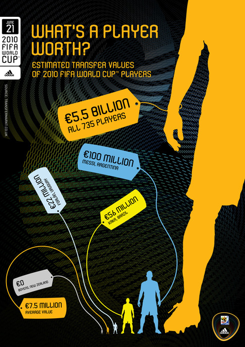
I really want to like this graphic on the “worth” of FIFA players. The colors pop and the topic is potentially interesting. There are some graphics 101 pitfalls going on here though. How can you make this display better? Leave your two cents in the comments below.
[via We Love Datavis]
 Visualize This: The FlowingData Guide to Design, Visualization, and Statistics (2nd Edition)
This graphic show how much entertainment oriented our society is. I wonder how much we invest in renewable energy research. Do you have any numbers/ graphics on that?
A notable omission is Cristiano Ronaldo at €93.5m which at least is the actual price paid by Real Madrid rather than the €100m guess they have had at Messi’s value. I assume the reason for this is that he is sponsored by Nike rather than Adidas. Stranger is the omission of David Villa who is an adidas player and was transferred recently for €40m to Barcelona.
Nice idea but could be much more comprehensive.
The biggest issue is surely the pointless inclusion of the ‘all 735 players’ giant, which just destroys the potentially interesting contrast in size/value between the individual players.
I don’t like the principle of comparing the worth of individual players with the sum of a specific set of players. It’s not comparing apples and oranges, but apples with a bag of apples.
also the concept of worth by transfer amount is a bit misleading, as many players contracts allow them to change between clubs without paying a transfer fee, which doesn’t mean they don’t cost anything to their club (monthly salary, bonuses, etc.)
let’s assume we have data on the worth of players
we can assemble an interesting dataset with many dimensions including nationality, status in national team, club, club league… and many records. There’s about 30k professional football players.
that dataset could be fascinating to visualize.
Need to cock my head to read Forlan’s data..
Should make it more reader friendly’s label .. and also MV’s comment make a point there..
The three most expesive (I wouldn`t say valuable) players are on Sapnish Liga. Interesting fact.
Totally agree with Jerome. I’d love to have access to a dataset including all that interesing figures.
Messi is not only twice as tall as Kaka, but twice as wide, so he has four times the area. Quite misleading.
Besides the upside down labels I’m wondering what else it violates. Oh also the twice as wide part does seem like it’s misleading. It does end up looking four times as large and is easy to miss.
The apples to a bag of apples I think is fine. I think the point of this graphic is not only to compare the players to each other, but to compare some players (Messi) to just..payments in football in general. In this case I learned that if 750 players are represented as a human, ONE of those players comes up to the calf level. This is probably part of what they wanted to demonstrate.
I guess though, by choosing a human as an object it allows them to not show us the whole person (avoiding having very tiny other people), since we can all complete that human image in our heads. I would have cut off the big guy much further down (maybe at his waist), so that you still get a feel for how big a piece of the pie Messi got, but can compare players to other players much more easily.
Didn’t Tufte say NOT to represent data of one dimension (transfer value) on 2 dimensions (area of the of the players)
It can be misleading if your not careful as Cody L. Custis points out above.
I believe Nigel Holmes said it too on his “Designer’s Guide to Creating Charts and Diagrams” — don’t have the book with me right now so if someone could check it that would be great. Maybe the first time they’ve agreed on something :)
Anything with bright colors on a black background is sexy and interesting. But the data? Like some of those players, not worth it.
Just in case some of you are interested, the source is http://www.transfermarkt.co.uk
Agree with much of what has been said above. Really don’t like it as a visualisation, the crooked labels just make it worse. The underlying architecture of the diagram is a bar chart and with bar charts you never include a plotted value for the Grand Total as it totally distorts the constituent category values. The images representing the values distort interpretation due to the use of area.
I have been compiling a number of collections of world cup visualisations in recent weeks, and included amongst these are a few examples of alternatives visualisations of player/team values.
Here is part 1 of 3…
http://www.visualisingdata.com/index.php/2010/06/visualising-the-world-cup-2010/
[Sorry for duplicate comment Nathan, think previous comment was intercepted due do multiple URLs]
The data I’d *really* like to see would be Total National Team Player Salaries (what they earn individually on their club teams, summed up per national team) compared against the Final Standings of how each team fared at the 2010 World Cup tournament.
For example, England and Italy undoubtedly have some of the world’s highest paid players, but both teams flamed out surprisingly early. Meanwhile we’ve got plucky Uruguay taking it to the semifinals, and it seems pretty unlikely those players earn, in the aggregate, anything near their current opponents in this tournament.
Anyone have this information? And what do you think would be a simple but punchy way to illustrate such data?
Liz
Unfortunately access to salary data at the majority of football clubs is very hard to source. Whilst you can take hints from the press about the earnings of most star players, it is probably harder to get close to the real wages of the less celebrated players and from the less popular teams (and thats before you get to most of the North Korean squad!). That said, I’m sure it would be possible to fairly accurately estimate the salaries – I’ve not seen anyone try it though.
The closest similar analysis I found (about two thirds of the way down here http://www.visualisingdata.com/index.php/2010/06/visualising-the-world-cup-2010-part-3/) was one that was displayed in a portuguese newspaper showing a bubble plot of each country’s squad valuation. This data would also be interesting to plot against FIFA rankings (http://www.fifa.com/worldfootball/ranking/lastranking/gender=m/fullranking.html#confederation=0&rank=193). I’d have to play with the data to decide on the best visual presentation approach, off the top of my head a simple scatter plot of ranking vs. value might be the simplest (avoiding the classic practical and interpreting flaws of the circular area plots).
The most revealing analysis would be to wait until the next release of the rankings (July) to include the weighted performance of countries in the World Cup. This will then emphasise the under performance of teams like France, Italy and England.