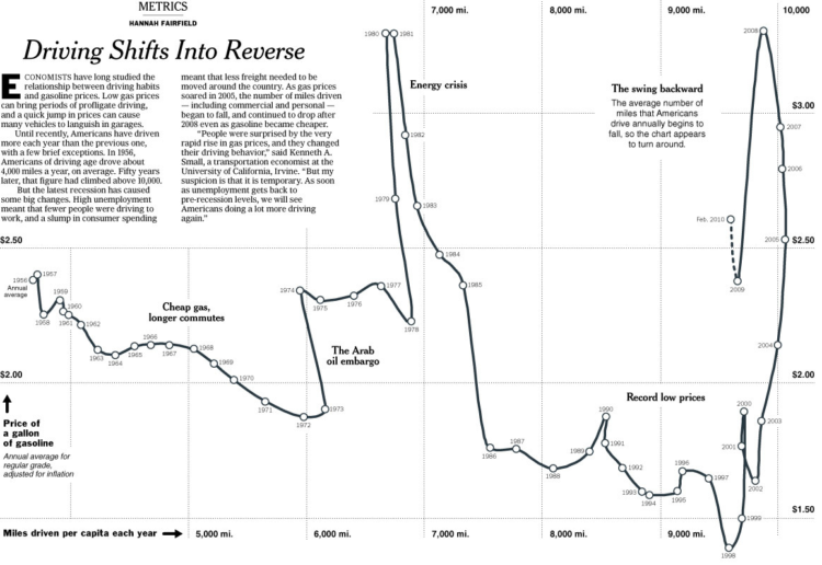
Hannah Fairfield of the New York Times looks at driving habits and gas prices over the past six decades. Miles driven per capita is on the horizontal, and the adjusted price of gasoline is on the vertical. The drawn path indicates order in time.
Americans have driven more miles every year than the year before, almost every year, but there’s been a swing as of late. High unemployment has meant less people driving to work, and less consumer spending means less freight moving across the country. As a result, the path appears to swing in the opposite direction.
[Thanks, Craig]

 Visualize This: The FlowingData Guide to Design, Visualization, and Statistics (2nd Edition)
It would be interesting to compare a graph like this with a similar one showing miles per registered vehicles or car owners, or something similar. Those might tell a different story.
“Amazing” what happens when you turn a standard-interval variable like time into a function.. or vice-versa, turn your dependent variables into standard-intervals..
Simple and very intelligent. I don’t know anything about the legitimacy of the data but the method is pretty awesome.
And an great opportunity for the data-obsessed to re-ponder those pesky differences between ‘fewer’ and ‘less’!
http://grammar.quickanddirtytips.com/less-versus-fewer.aspx
For you math folks, is there a way to describe this non-function mathematically?
Jonathan: this sort of thing is called a parametric curve. If p(t) is the price of gas as a function of time and d(t) is the per capita distance travelled as a function of time, then this is the curve given by
x=d(t)
y=p(t)
If the equations of d(t) and p(t) were simple enough, it might be possible to come up with an implicit equation for the curve (like the equation x^2+y^2=1 is the equation for a circle). That is unlikely to be the case here, but it doesn’t really matter: a lot of information, like the slope of the graph at a given point, can be found just from the parametric equations with a little first-year calculus.
@Ross: Thanks, that’s very interesting.
I’d love to see the overlay of this combined with the mileage of the average car on the road, too. Seems like that might be a pending factor, too.
Pingback: Miles driven vs. the price of gas