Big information graphics have been around for a long time. They’ve come in the form of maps, visualization, art, signs, etc. That was all on paper though. In the past couple of years, humongous, gigantic, and often really long infographics have found their way onto the computer screen, through blogs and news sites. Some are great. Some really suck. The volume is booming for both.
Let’s take a look at when this all got started, where the trend is headed, and how much we should really read into these things.
The Beginning
Like I said, information graphics have been around for centuries. Flip through Cartographies of Time for examples, or think back to the first time you saw a pictogram on a street sign. We’re talking about big, modern infographics though. For that, we turn to Google. Here are the timelined search results:

Notice the small jump in 2007?
We’re getting somewhere, but Google’s search results aren’t quite what we’re after. Search results are dated by the content’s place in time, not by when a graphic was actually made. Search results don’t necessarily point to an actual infographic either. It might just be an explanation or a quote about the term.
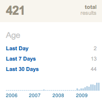
Instead we direct our attention to Digg – where a lot of infographics go to die or live on to go viral.
A search for infographics that have hit the front page of Digg shows a surge in 2009.
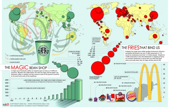
Three years before, in 2006, was the first submission to go popular (on August 21), that contained ‘infographic’ in the URL, title, or description. It got 3,226 diggs and evoked 153 comments. To this day, I still find this graphic on the ubiquity of Starbucks and McDonald’s in my suggestions box:
It is indeed big. Even at today’s resolution standards, it almost fills my entire screen.
[Funny fact: the above, along with a series of others, were created by Jonathan Harris (under the guise of now defunct Flaming Toast), who you might know from We Feel Fine and I Want You to Want Me. We all have to start somewhere, right?]
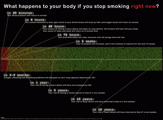
There were four times as many infographics that hit the front page in 2007 as there were in 2006. A whole four of them. The most popular that year, by Wade Meredith, was a timeline that explained what happens to your body when you quit smoking.
The middle portion is Meredith’s own experience with quitting the death stick, and lines point to important stages during the quitting process. It got 2,587 diggs and 169 comments. The actual blog post took on a life of its own, with over 4,000 comments.
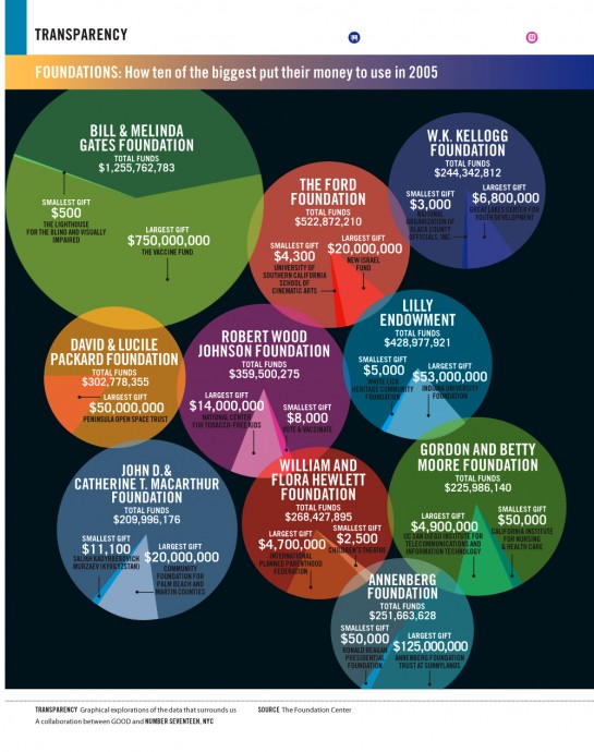
Good magazine also started publishing their weekly transparencies around this time. They pushed their first one out in December 2006, at least the first one that’s available online. Issue 002 (I can’t find 001) showed a bunch of bubble slash pie charts that show where major charity foundations donate their money to.
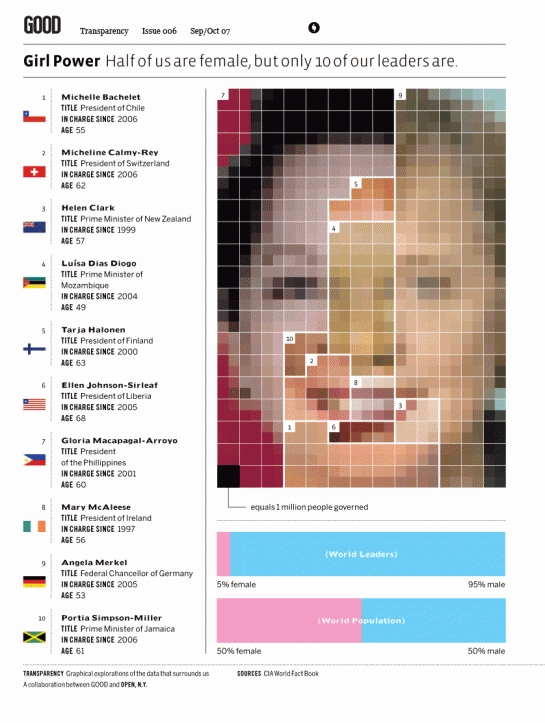
It took six tries for one of the transparencies, a story of female world leaders, to make Digg’s front page in August 2007:
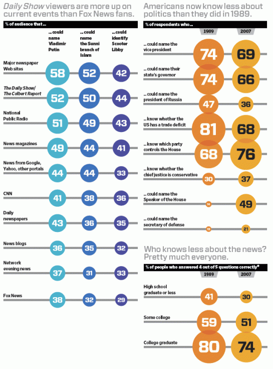
From what I can tell, Wired also started putting out infoporn around this time too, although not as regularly as Good. This is the first one I found, which shows how much people know about the world:
In 2008, again, there were only four infographics that made the front page, the most popular being this one from The Onion, which earned 1,218 diggs:
Of course during these early years, there were plenty of other people making graphics that weren’t popularized on Digg.
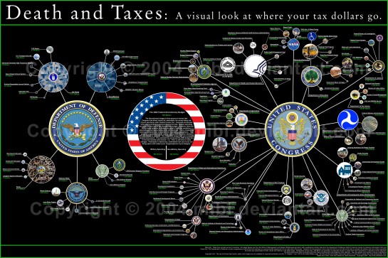
Jess Bachman (WallStats) published his first edition of Death & Taxes way back in 2004. It later became a big hit after BoingBoing posted it almost two years later.
This is important in the timeline. As Jason Lankow of Column Five Media (who themselves have the infographic create-and-promote program down to a science) puts it, Jess is “the original master of the blogroll infographic.”
The Boom
This is when it gets interesting. Up to this point, we’ve seen a lot of big graphics, but the ones we’re used to seeing nowadays are the really long infographics that fit neatly into the content column of a blog. Well, I guess you can call 2008 the birth of the long infographic.
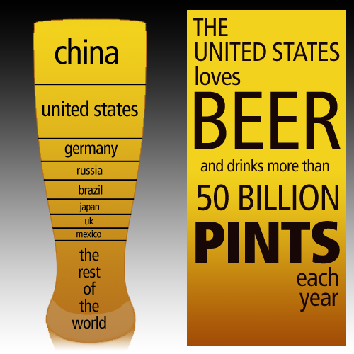
In late 2008, Jess, with Column Five, created a series on beer. It’s not a long one quite yet though. It’s eight graphics designed around a single theme:
Soon after, the same group published a long infographic for Mint that looked at United States debt as an individual household.
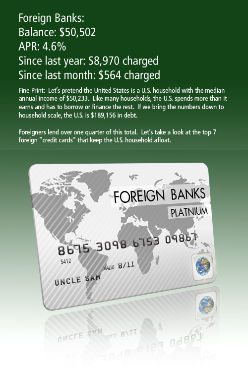
(Click the image to view in its entirety.)
And so it began…
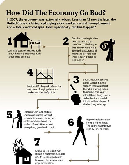
While in 2006 through 2008, there was never more than four infographics that went popular, there were 225 just last year. In January 2009 there were eight. In December 2009, there were 34. Now in 2010, there are just under 50 that go popular per month. Go to Digg at any time of day, and there will most likely be at least one submission labeled as “infographic.” At this rate, there will probably be over three times as many big infographics that go popular this year than in 2009.
Purpose and Audience
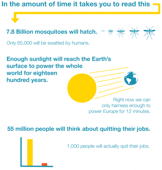
These are the top five most dugg infographics this year:
- 1 Pixel = 1 Million Dollars
- Picturing the Past 10 Years
- Why Does a Salad Cost More Than a Big Mac?
- 15 Things You Should Know About Breasts
- In the Amount of Time it Takes You to Read This…
Notice the first two don’t link to the original sources. The second is an op-chart from The New York Times, and I can’t even find where the first one came from. The third, which links to Good, is actually from the Physicians Committee for Responsible Medicine (I think). The last two are more comics than anything else.
This should tell you a couple of things right off the bat. First, a lot of digg users don’t care about where graphics come from. They’ll upload it to imgur, and just submit to digg. Attribution is really an issue for a different post (and a different blog) though.
More importantly, it demonstrates why people go to digg and other social media sites. They’re not looking for something to make them ponder their existence or explore the edges of the universe. They’re looking for – and digg users, correct me if I’m wrong – humor and entertainment. It’s a general audience that doesn’t care a whole lot about data. They just want to see pretty pictures, and if those pictures happen to show a little bit of information, then all the better. Oftentimes, it just has to be amusing. No thought required.
Hence the success of sites like The Oatmeal:
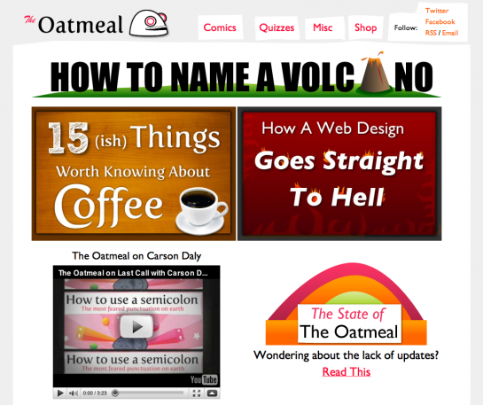
So while we like to poke fun sometimes, these big infographics achieve their goal in driving traffic to the sites they appear on. Let’s not forget that the only reason big infographics continue to thrive is because millions of people like them. I can tell you firsthand that whenever I post a big infographic, whether my own or someone else’s, there is almost always more views than usual.
Of course, a lot of garbage sites have sprung up as result that pitch credit cards and sell insurance, but that’s nothing new. Scammers have been around since the beginning of the Web. We’ve managed to gain a sense of what’s fake and what’s real. It shouldn’t be any different with these graphics.
The Evolution
This isn’t to say that all the big infographics are perfect or that it’s okay to put out crappy work. There’s a lot of the latter. People are simply learning how to analyze and display data, and on the flip side, consumers are growing more accustomed to looking at numbers. Remember when the Web was filled with blinking buttons, brightly colored backgrounds, and Comic Sans? Just think of this as the prepubescent stages of infographics on the Web.
As consumers of infographics, you should be critical of them and take everything with a grain of salt. There are going to be mistakes along the way. Don’t be so quick to call something a complete failure though, and if an infographic is completely off, offer something more useful than ‘fail.’ Nothing is going to improve with that type of comment.
As designers, always strive to improve your skills and do more with your graphics than show the numbers straight up. Look for patterns and relationships. Don’t force anything, but keep an eye out. Most importantly, don’t just create for linkbait’s sake. It shows in the work if you do, and many people are already fed up with it.
As long as both groups keep up with their ends of the bargain, the evolution of these big infographics could easily be really good. In the meantime, I’ll do my best as your filter, only pointing you towards the high quality stuff and some of the bad from time to time, for learning’s sake.


 Visualize This: The FlowingData Guide to Design, Visualization, and Statistics (2nd Edition)

Great post, as ever.
What are your thoughts on over-infographicing?
In the UK we’ve had a set of seven, 20 page printed, ‘Factfile’s’ from one of the newspapers, a newspaper that is beautifully designed, and on the whole uses its graphics exceptionally well.
However, these Factfiles are 20 solid pages of infographics, and it seemed to me that the visual relief that infographics tend to provide was soon replaced by a headache from trying to find a heading for each graphic buried in the midst of patches of colour and ‘amusing illustrations’
i think it’s less about over-doing things and more about designers (and data scientists) learning to show a lot of information and data effectively.
I echo the sentiment, @Robert. Nathan did an excellent write-up. He’s also incredibly prolific.
Nathan, How do you have time to crank out all these excellent blog posts and still go to school and work (and/ or be a graduate course teaching assistant)?
Personally, and I know no one asked but… I still love infographics. I’m one of those people on Digg from back in 2007 who sent fan email to Jesse Bachman when his work was featured by Mint.com. There were some great, and ENORMOUS scale charts by Jesse, I recall one of U.S.-China Trade Deficit. But I think the infographic information overload can also be considered “chart porn” or “data porn” at times, esp when one becomes desensitized by so much of it. Some infographics don’t seem to be motivated by more than the desire to use a visual with colors, when a black-and-white quadrille grid chart would’ve been more effective at conveying the information or conclusion it suggested.
Along the same lines as @Robert’s question, how would you classify these “mindmap” visuals, Nathan? They were used (of course… rolling eyes) at SXSW a few months ago. Also, Austin Kleon, of Austin, TX, did an interesting mindmap of Edward Tufte and his “Envisioning Information” book. Are mindmaps bona fide data visualizations or something else? Process flow diagram? Data porn?
I’m blessed with a flexible research group and adviser, no TA’ing, and cool FD readers send me suggestions. Plus it’s fun for me, so it never feels like work :).
Mindmaps… I think they were devised as a way to brainstorm, and then somewhere in the timeline, people started using them for something else i.e. presentations, so something that was meant to be unorganized has grown into something to show organization.
Hi Ellie – I like your perspective, and I’m genuinely curious to hear more about what you think on the use of color being perhaps less effective than a black and white grid or chart. I see those comments a lot (but usually not by someone as polite and reasonable as you are), and I’ve always wondered about this. Some people feel very adamant that the use of color and elaborate visuals takes away or distracts from the message (and I certainly see how it can)…but I feel pretty strongly, at least for me personally, that the use of color and good design is what draws me in to engage with the data/information in the first place, while I would tend to look at a long article/massive excel sheet and have a shorter attention span with it unless the topic was naturally interesting to me.
Are there some learning types that genuinely do better with something in black and white or plain text (other than the obvious benefit of readability of text vs. unreadable neon colors or something like that)? Because some people demand that the information is done on a black and white grid and they seem to be pounding their fist on the desk and spitting up bile when they do it. I personally wonder if the backlash is more of a “lipstick on a pig” type response where people (and this is indeed a good thing in some cases, as Nathan mentioned, it shows that people are getting more comfortable looking at and criticizing data) look at the prettifying as an attempt to overcompensate for the lack of integrity in the data (or perhaps some less malicious version of that scenario).
Really insightful post, thanks for the write-up. I love what you said about looking for patterns and relationships. . .I think that is what draws me to the more complex interactive data visualizations. While I do often enjoy Good Magazine transparencies, they don’t intrigue me and keep me exploring the way pieces like those by Stamen, Vargas, Wattenberg. . .etc.
You may want to check out Wired’s infoporn section in your analysis…
Pingback: The Boom of Big Infographics / what consumes me, bud caddell
This reminds me of a recent post on infosthetic about why junk charts are more useful than plain graphs.
http://infosthetics.com/archives/2010/04/why_chart_junk_is_useful.html
I was a big follower of Tufte’s ideal about designing clean and powerful information graphics. For me a visualization should be elegant and only show pattern in data. Any superficial decoration was not needed, in fact, it would ruin the message. But as we become more overloaded with information, I realize that most people just don’t care. Just like you mentioned, Nathan, many of us are reading for fun. Among dozens of graphics that I see each day, only one or two grab my attention and they are usually data porn rather than serious graphics. I guess we may one day get tired of all these superfluous graphics, bur for now, I am enjoying them.
Cheers ,
V
Pingback: H&K London’s Blog » Blog Archive » Web Curios
Pingback: links for 2010-05-07 « Onlinejournalismtest's Blog
Pingback: In Case You Missed It… « Curious Thoughts From Curious Minds
Pingback: » Blog Archive » A moda dos infográficos gigantes
Pingback: Things I Learned This Week – #19 | dougbelshaw.com/blog
I love infographics. However, as there is more and more info to be consumed, I find that we are almost becoming as confused by the graphics as we did with the raw data now!
Pingback: imarsCreative le blog » Archive - Web Collection 6
Pingback: La storia dell’infografica
Pingback: el poder de las imágenes « salud comunitaria
Info porn? Lol! Thank you, Good and Wired :D
Pingback: Beautiful data « Décoller
Pingback: THATCamp 2010 » Blog Archive
Pingback: Jason Lankow -
Pingback: Health 2.0 News: DNA Robots and Collaborative Prezi Editing « ScienceRoll
Pingback: Techlife » Infograph-ick!
Thanks for this great article…I used it in my syndicated column Techlife, as a great example of infographics for my column on the subject http://bit.ly/bnEz8O. I do think the trend of the overly large infographics is an oddity…The Oatmeal is a great site that parodies this well.
Pingback: How To Use Infographics for SEO & Linkbait | SEOptimise