In another step towards open data and all that jazz, the World Bank released World Development Indicators 2010 today, which is meant to serve as a progress report of the world.
The WDI provides a valuable statistical picture of the world and how far we’ve come in advancing development,” said Justin Yifu Lin, the World Bank’s Chief Economist and the Senior Vice President for Development Economics. “Making this comprehensive data free for all is a dream come true.
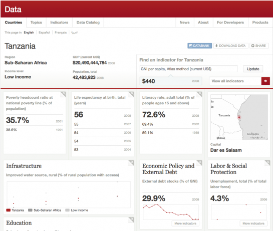
More importantly though, this comes with the launch of the freely available online database and public API to 1,000+ indicators. There used to be a big fee for this data. I can’t speak for the API, but the website is well-designed. It has profile pages for each country, links to download the indicators in Excel and XML, and hey, are those graphs implemented in HTML5? I spy <canvas> tags.
Here’s the profile page for Tanzania.

All in all, it’s very well done. It reminds me of an Everyblock for the world. I wouldn’t be surprised if some inspiration came from there. It’ll be exciting to see what comes out of phase 2 of the project and what developers do with the now easily-accessible data.
Does anyone know who lead the design on this? (Update: Designed by Development Seed. It looks like they’ve got a few other interesting projects under their belt. thx, @cairnsim)
Update: World Bank President Robert B. Zoellick speaks about the Bank’s new open data initiative (below).


Wow, they did an amazing job.
Pingback: World data released « PierG (aka Piergiorgio Grossi)
Pingback: Daily Links for April 20th | Akkam's Razor
I’m the production artist for the print edition of the WDI, have been every year since 2003, and I just wanted to say I feel all warm and fuzzy to see it mentioned here. I lay out the printed book (text, tables, and figures), not the website, so I can’t take a scrap of credit for the work you’re complimenting, but I do love it when the world takes note of this undertaking!
@Elaine – i read about that, but got lost in all the online stuff. nice work on that too :)
Pingback: World development indicators now free - Aaron Schiff
I wish the uncertainty estimates were included in the online database where applicable. I checked some of the original reports that this data is from and they included uncertainty (quite substantial uncertainty in some cases), so it’s a shame that it’s been dropped from the WDI.
Also, it would be nice to have a synopsis for how each indicator was modeled. For instance, I imagine that in a lot of countries with sparse data they modeled a lot of this stuff on GDP etc, so if you include several of these indicators in a single model you risk violating assumptions of independence.
That said, it’s really great to have all of these in a single, easily accessible location. Makes quickly testing out simple hypotheses much easier!
Pingback: Shared Items – April 20, 2010 | Joseph Nathan Cohen
Pingback: When Data is Not Art : AnnMaria’s Blog
Pingback: Infographic of the Day: Here’s the Keys to the World Bank’s Data Vault | Web Design Cool
Wow, great news. Thanks for spreading the word, Nathan.
Pingback: Infographic of the Day: Here’s the Keys to the World Bank’s Data Vault | Stocks!
Pingback: World Bank’s Open Data Initiative | Open Data Network
Pingback: Best Links of the Week « Modern Pensées
Happy to see the world bank doing this release. Been comparing the figures of the world bank and the cia world fact book, some interesting ones there
Pingback: Jason Lankow - Just another WordPress weblog
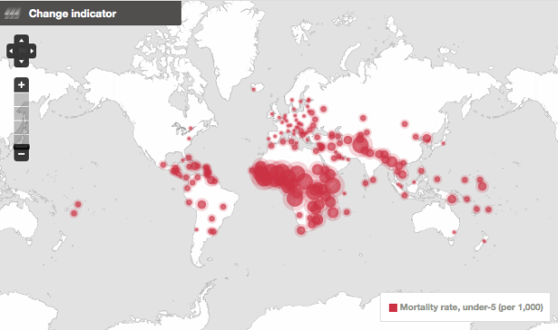
Such a shame they chose that map projection. Mercator projections can be ok in some situations, but when combined with devices to show relative amounts via area, it creates misleading visual grammar.
That is surprising. In the printed WDI and other World Bank publications they use the Robinson projection, which shows area more accurately.
Pingback: [citation needed]» Blog Archive » in brief…