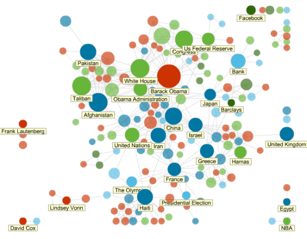
All news is connected in some way or another. News Dots from Slate shows just that.
News Dots scans all articles from major publications—about 500 stories a day—and submits them to Calais, a service from Thompson Reuters that automatically “tags” content with all the important keywords: people, places, companies, topics, and so forth. Slate’s tool registers any tag that appears at least twice in a story.
Bubbles are sized by how much the corresponding topic is written about, and connections are made when topics are mentioned in the same article. Click on a topic to see the matching articles in the sidebar.
How everything is placed I’m not exactly sure. I’m guessing distance represents some abstract measurement of relatedness. You guys have any better guesses?
 Visualize This: The FlowingData Guide to Design, Visualization, and Statistics (2nd Edition)
I suspect distance is somewhat arbitrary and is about readability. Isn’t that the way all these network-viewing software work ? (I might be very wrong, of course).
i guess most of the time, yeah, but sometimes distances represents something like similarity or strength of relationship.
I have been reading about network graphs lately and arbitrary placement of nodes (and therefore arbitrary distances) for the sake of readability are encouraged. Having played with these graphs a little I think it is the right call.
IMHO, a better way to represent strength is to create a dichotomous “connections strength” variable and use that to create “transparent/solid” links. Use the histogram of connections to decide where a reasonable cutoff is. For example, “more than 5 connections” is 1 and “less than 5 connections” is 0. Then make the connections that are 0 transparent (or light blue). Keep the connections that have the value of 1 solid (or dark blue).
I guess, it is a form of Multi-Dimensional Scaling (MDS) to convert a data matrix to a data table with a reduced number of variables, as the PCA does. It is also called spatialization which make a map out of a non-geographic dataset.
Pingback: News Browsing by Network Analysis | FUTURISTIC GROOVES
Pingback: Dreamz Of India — Blog — Live Sexcam Frauen