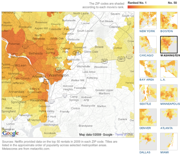
Some movies are popular everywhere. Others are popular only in certain regions. The New York Times, in a nice team effort, maps rental popularity by zip code for large regions in the US.
Select a movie and get the maps. The darker the region, the higher in rental rank on Netflix. Regions are colored if the movie is in the top 50. The above, for example, maps the popularity of Wanted.
Browse a little more, and you’ll notice some interesting patterns. Look at this split in Washington for Frost/Nixon.

Then here’s the same region for Lakeview Terrace.

I bet there are some demographics that correlate strongly with that divide in movie interest.
There are also movies that are popular – except in the city centers. Paul Blart: Mall Cop anyone? I’m guessing no if you live in the city, unless you live in Los Angeles. I suppose you need a more refined palette to understand the complexities of a fat man falling down. For the record, Paul Blart is in my rental queue.


Great job, NYT. I think I just spent a good hour browsing this one. How’s that for engaging data? Give it a try for yourself. Can you find any interesting patterns?
[Thanks, John]
 Visualize This: The FlowingData Guide to Design, Visualization, and Statistics (2nd Edition)
The times did an excellent job with the visualizations on this one. However, I do wish they had some editorial content to accompany the visuals.
I did notice one anomaly which makes me think that Netflix needs to rethink how it protects its customers privacy.
Zip code 11371 in NY appears to be limited to Laguardia Airport. As such, there are not many (any?) residences in this zip code.
The top ten titles in this zip code are out of step with the rest of the map. The top ten includes:
Romancing the Stone
Crocodile Dundee 2
Godzilla’s Revenge
Man Woman and the Wall
The Midnight Meat Train
Oz
The fact that there are any movies showing up in this zip code could be the result of workers at LaGuardia getting their movies sent/billed to work. It could also be that there’s some residences that actually fall into this zip code.
Either way, it’s hard to believe that the movies common to more than one person in this zip code contain Crocodile Dundee 2. I think it’s likely that this is the queue of a single person. This is troubling from a privacy perspective if this person hasn’t explicitly opted in.
@Noel – Nice observation. I was wondering the same thing about regions by zip code since some zips are only for a single address, like a post office. I wonder what other “individual” queues are revealed in these maps..
As a Dallasite, I noticed a similar pattern with DFW, although not as prounounced.
Crocadile Dundee 2(!) Somebody at LaGuardia has got good taste!
Nathan, perhaps not so great a visualization.
ISetht appears (so far as I can tell) that the data is quite flawed, making it a flawed visualization. I explore the point in a blog article: http://intelligent-enterprise.informationweek.com/blog/archives/2010/01/distorted_netfl.html .
Seth
Hi Seth,
I think your review has some valid points, but I beleive it over emphasizes the negatives. I do agree that the Times could have done a better job explaining what it was they were visualizing (e.g., how were the stats calculated), as it would probably have helped to justify the decisions they made.
In regards to your post:
A. I think comparing movies regardless of release date is valid. The point of the visualization (I think) is to show movie tastes of regions limited to the year 2009. The fact that the Bucket List was released and probably did better in 2008 is not really relevant to what people were watching in 2009.
B. While it’s true that using geographic regions which vary in population/area like zip codes can result in maps that, when looked at as a whole, give an inaccurate picture as to what’s happening within the populace. However, I think for the average person you want to present something that’s familiar and digestible (e.g., not a cartogram). Zipcodes are a familiar geographical demarcation roughly equivalent to neighborhoods and are therefore a valuable way for the average human to understand geographic data.
Noel, wow, the relevance of the variable yardstick — that the Times & Netflix were comparing a movie out less than three months against one out for a full year — seems self evident to me. A movie that comes out early in the year has extra months to accumulate rentals. A fair yardstick would’ve been, say, the following:
Whatever movie came out last in 2009, take the amount of time it was out and look at the top 100 over that amount of time following the release of each.
Get it? The data, as reported in the Times, is skewed.
Hi Seth,
I disagree. I don’t think the representation is skewed because a specific range is mentioned up front, in this case, the year 2009. You are right that a movie released Jan 1, 2009 has a distinct advantage in the rankings over movies released before or after, but that’s an issue any time you pick a specific time range to compare things that start and end at different dates.
To take a similar example from box office receipts:
If you looked at the box office for the weekend of Jan 11, 2009, you would see Bride Wars was the 2nd most popular movie that weekend. Any movie that was released in the weeks before or at the last day of that weekend would be at a disadvantage in the rankings. However, that’s not relevant to what people actually watched in that particular weekend. In that particular weekend, the forgettable movie Bride Wars was more popular than Twilight (Twilight was number 12 that weekend). However, Twilight made almost 10x the revenue of BrideWars running up to that weekend. To say that Twilight was more popular that weekend because of its past success would be inaccurate.
In the same way, what people watched in 2008 is not relevant to what people watched in 2009.
I think what irks you is that the 2009 rankings don’t necessarily correlate to how popular a movie was overall. However, I think that’s a problem with your expectations, not with the data or the way its represented.
I looked at O’Hare and the same seems to be happening there. “Year of the Dragon” and “Somewhere in Time” in the top 5?
you can see the boundaries of the 60666 zip here:
http://maps.huge.info/zip.htm
The best way to use this data and visualization is to compare within, not across, movies. For the reasons Seth delineated. If you do that, what time of the year the movie was released is less important. Having said that, the dynamics of movie rental (for example, where do sleeper hits start?) would surely be interesting as well, and may confound the patterns we see in the visualization.
Manhattan zip code 10020 is another case of of a very narrow group. This is Rockefeller Center minus the GE Building. Its estimated population in 2008 was one. Typical Manhattanite, unfortunately – his (or her) queue doesn’t differ much from the neighbors across Fifth Avenue.
Nice post, Nathan. As Eduardo suggested, I would definitely like to see some temporal information to be able to assess the dynamic of rentals. Perhaps to see where “hot spots” start and the subsequent “ripples”.
Does anyone know if the Netflix recommendation engine utilizes geographic information. The geographic segmentation across various movies definitely suggests it should be used.
Did Netflix release this data? I didn’t see that mentioned in the NYT article. I would like to do my own analysis.
The graphic says Netflix provided the data, so I’m guessing no, unfortunately.
Pingback: com3.es | Best in Blogs: Words of Year/Decade; Conan’s Meme Team; Tweeting for Haiti
Pingback: Netflix vs Google Maps via NY Times « Bytes Hotdish
Pingback: Favoriter pÃ¥ nätet – January 17, 2010
This map (the NYTimes version) was covered by my local news when it came out. They just mentioned the Seattle area and not the nation, but still… cool.
Anyway one thing I think would be cool is if you could “reverse” it. If you could enter the movies YOU watched over the past year and have netflix tell you where you should live. “Your rental queue is most like those in zipcode 54321.”
Going one step further, doing a visualization on THAT… namely assuming 10% of people rent movies out of line with their zipcode and that those 10% have zero “friction” in moving… how long would take for this “resettlement” process to stabilize?
Pingback: Favoriter pÃ¥ nätet – January 21, 2010
Looks like an opportunity missed to me. As I commented over at the Junk Charts blog, It would be interesting to see correlations between types of movies rented and some socio-economic factors. Here an xy graph would really shine. And it would be interesting to see how strongly rental rank was correlated with metascore (i.e. critical rank). The average metascore of the top 20 rentals was 59.85; compared to (gasp) 59 for the bottom 20 rentals.
Pingback: Favoriter pÃ¥ nätet – January 25, 2010