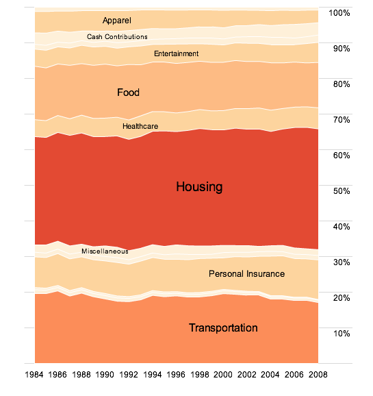
How has consumer spending changed over the past 25 years? Do we spend more on some things and spend less on other than we did in the early 80s? In this interactive, based on data from the Bureau of Labor Statistics, you can explore just that.
Some stuff hasn’t changed all that much. Entertainment for example, is up less than a percentage point for the average American, and that change is just recently.

Apparel, on the other hand is a different story. Spending portion wasn’t that high to begin with, so the 2+ percentage point drop is significant:

Take a look at the interactive to explore for yourself.
 Visualize This: The FlowingData Guide to Design, Visualization, and Statistics (2nd Edition)
How did you do this? I’ve been wanting to create something with this structure for a while, but wasn’t quite sure of the best way to proceed.
a tutorial is coming. keep an eye out
God job, but What About Taxes, ….? look at the real picture of gross income and then break down these sub-categories….when you take income taxes, payroll , and then the sales tax we pay, …you’ll puke lol
Nathan, sorry for being so inpatient: which framework did you use for this visualization (flare, axiis)?
Great visualization by the way, looking for your tutorial…
@Djam – yes, flare. tutorial coming tomorrow, i think.
Nice visualization. Which category includes spending on communications? Internet, telephone, mobile phone?
We are slaves
Good job, Nathan.
Unfortunately the data is on a yearly basis (admittedly, this is the right scale to track this type of data) but an interesting view would be to see how consumer expenditure has changed over the past 18 or 24 month. This would reveal how the recession has changed our behavior and what industries are affected the most.
Nathan, on the interactive page, you say, “How does the average American spend his or annual income?”
Have you somehow re-weighted the Consumer Expenditure Survey weights by the number of people within each household?
If you did not, then this visualization answers the question, “How does the average American *household* spend its income?”
you’re right, anthony. fixed.
This is fabulous. Have you seen Elizabeth Warren’s work? She tracks the same data over a longer period, since the 1960s I think. Great video at http://www.youtube.com/watch?v=akVL7QY0S8A
(A nit: shouldn’t this be “last 25 years…”?)
yeah… i’m not so good with the numbers :)
What about taxes? Taxes are a huge part of American’s expenditures and local taxes vary a lot between municipalities and states. Still, it’s a critical part of the graph that’s missing.
I am with you on this one. It’s so foolish to just leave that out. I am very curious as to where the average person is today in relation to the past. Not only that, taxes are a HUGE chunk out of my check every week!!!!
Would love to take a peek under the apparently placid surface of “entertainment” spending. Has spending on CDs been replaced by spending on technology platforns? DVDs? Going out to cinemas/concerts/etc?
Makes me curious how the change in distribution of spend relates to the change in some of the sectors prices to get an idea of whether the actual volume of apparel, food, tobacco & alcohol are changing.
I personally find this type of data display very difficult to understand (similar to pie charts). In fact, my first thought was, ‘there’s no way people spend more on entertainment than housing,’ not immediately realising that the entertainment value wasn’t actually 90% (where it shows on the scale).
Challenges:
– Can only see the value of one region and one year at a time, so no numeric comparison possible
– Can’t easily visually compare the value of one item to another which is not next to it
– Have to hover over regions to find out values, which is poor for accessibility and requires the user to ‘uncover’ information rather than infer
– Cannot order by descending/ascending values (would have to be averaged?), so stuck with alphabetical which isn’t terribly useful (not difficult to find something in a list of only 9 items)
Just my 2p.
I’m surprised how stable it is, and the little change. The biggest shift was in apparel!
Can you take it back, how far does the data go? I’d like to see our spending on food prices back to the 40s, and beyond… when we had drastically different distribution models.
Adam
unfortunately the data for the consumer expenditure survey only went back to 1984. otherwise i bet that difference in generation would’ve been really interesting to see.
Pingback: Shared Items – December 2, 2009 | Joseph Nathan Cohen
This is a great visualization and very easy to understand. Reminds me of the baby names explorer tool.
http://www.babynamewizard.com/voyager
yup, worked off job voyager, inspired by baby name.
I suspect the apparel shift is strongly driven by the shift in clothing manufacturing from the US to Asia, as well as the advent of discount clothing chains such as Gap, Old Navy, Kohls not to mention the rise of the mass merchants (Wal-Mart, Target). People don’t buy American-made clothes in department stores anymore.
May I ask what application you are using to generate the visualization? I am always struggling to find good tools to make charts/graphs from (other than excel).
Pingback: Friday Links: Let’s All go to the Movies! | Vicki Boykis
Pingback: Where Does the Money Go? « The Reformed Broker
Pingback: Daily Research » Shared Items - December 4, 2009
I’m actually quite shocked by how stable the amounts are.
Would have thought that with the rise in gaming and possibly home cinema (was VHS as expansive as DVD in the US i know it wasn’t in the UK) over those years would have made a difference to entertainment. Either that or cinema has taken a huge hit, would be interesting to see if these could be further sub-divided.
Great!!
When exploring it, my instinct is to click again on the single sector I have zoomed in on, in order to make it go back to the full graph – but that doesn’t work. Took me a moment to figure out how to get back to the main graph.
Would also be nice to have a key worked in there somewhere. What are cash contributions? What is the boundary between food and entertainment?
Super job… I CAN’T WAIT for the tutorial!!
Pingback: Economic Visualizations this Week: Consumer Spending & Unemployment « bill | petti
Pingback: US consumer spending over 25 years — a push « Carsons Post
Pingback: A week of digital life December 9th | The Juicy Cow
Pingback: 11 Ways to Visualize Changes Over Time – A Guide « f.majakovskij