The Bureau of Labor Statistics released the most recent unemployment numbers last week. Things aren’t looking good for the unemployed, I’m afraid.
I showed my younger sister the maps. Her response: “It looks like the country is bleeding.”
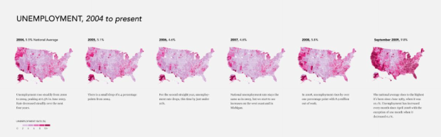
While the recession is “over” the unemployment rate rose to 9.8% in September from 9.7% in August. That’s 214,000 more people who are jobless in the United States. The last time unemployment was this high was back in June 1983 when it was 10.1%.
Check out the more detailed view here:

From 2004 to 2007, unemployment was actually decreasing, but things went sour in 2008, and we’ve been trying to bounce back ever since.
Update: See the step-by-step tutorial on how you can make a map like this with your data.
 Visualize This: The FlowingData Guide to Design, Visualization, and Statistics (2nd Edition)
All thanks to the outsourcing of US jobs, the manufacturing of US products – overseas.
The Einsteins that be thought it would be great to replace skilled workers with cheaper labor to product “less expensive” products, that we’d eventually pay MORE for, while those displaced workers took unemployment checks, couldnt afford their mortgages or health care (which is not being taken advantage of via the ‘a good crisis should never be wasted’ postulate). And, other workers who eventually DID find employment are asking if you want extra creme in that latte or fries with your order.
The result? Your bleeding nation and it IS a perfect depiction of what is going on – as it represents each of us, individually.
Unemployment is a lagging economic indicator, it rises after recessions have ended. Here is a chart showing unemployment rates against recessions: http://economagic.com/gif/g1650206016802510858253642597271203.gif
either way, until it catches up, it sucks for the unemployed
Yes…It does suck for the unemployed
Interesting article. I’m happy to see the BLS publishing charts at the county wide level. A few months back I ran an article comparing BLS supplied unemployment data (at the state level) against the stimulus package. You can check it out here:
http://newswithnumbers.com/2009/08/03/tracking-the-stimulus/
Funny, there are two anomalies that aren’t bleeding that you would expect to see — Texas (low regulation, no income tax) and the VA-MD Washington DC cluster. The second REALLY has no excuse.
Your area is unemployed to keep the DC crowd employed.
Uh, boy did you miss the mark on that one. The reason Texas isn’t ‘bleeding’ is BECAUSE it’s a low regulation, no income tax state. It’s scary to me that people can’t figure that out.
–Matt
I didn’t miss the mark. That’s the reason that I gave. It’s a natural function of economics. There’s nothing natural about DC being insulated.
Matt… did you not READ what Phelps said? Way to make yourself look silly… anyway, I disagree with both of you. It still doesn’t look that great in Texas compared to Nebraska and North Dakota. Those states have the least amount of red/pink.
I live in CA… where things are super F’ed up. I haven’t worked full-time in over a year… I’m considering Taco Bell at this point.
Also, here’s another poser — Michigan is almost all 10+ red, even across the lake. That stops literally at the Northern border with Wisconsin. I don’t know enough about that region to know how the two compare; is Wisconsin that much more laissez faire than than Michigan, or is the breakpoint actually pretty high on how far you have to go with unions/regulation to kill unemployment?
As a lifelong DC metro area resident, I can tell you that the Federal government workers there, on average, are very very spoiled and do. nothing. for society.
Nationwide, Fed workers average salaries are $70k/year (more than $100k/year if you include benefits—-and my oh my, they have the best there too).
Average non-Federal worker salary? About $35k/year.
They are greedy at the Federal trough for sure but it’s the system that is broken and well beyond repair. The irony is that they are mostly a bunch of one-world-government, globalist types, who are killing themselves through their agenda to incorporate the planet.
The only jobs (in bulk) being opened today are for the military and for any agency which can be used to control the populace (DHS, FBI, FEMA, etc.).
They know what’s coming…. “official” (deceptive) unemployment is 10.2%. That’s what’s know as the U-3. Useful only for comparison purposes to other U-3 numbers. The REAL unemployment rate is the U-6, currently the gov’t (are we getting it? not your friends!) has the U-6 at 17-18%, BUT, even this they fudge. They use an unrealistic component to it (death rate I believe) to make it “softer” than it really is.
Bob Chapman of TheInternationalForecaster.com has current U-6 as of this past Friday (11/06/09) as 22.4%.
Folks, that’s a GREATEST depression number.
This all by design by the globalists and their international banksters. Watch for pandemics of the strange kind (look at Ukraine now…something bad happening there, and it ain’t the flu.)
Pandemics, martial law, it’s all coming BY DESIGN.
Have you read “Atlas Shrugged?” That novel is the globalist’s “esoteric” message (meaning a message for them, the “elected”…NOT for you and me) to their fellow travelers as to HOW America will be destroyed. All by design. All on purpose.
If it feels depressing and overwhelming, that’s because it is without the armor of Lord God in Heaven. The globalists have their god lucifer that’s why they they are winning the “battle” so far.
We are not fighting flesh and blood….we need to put on the armor of God to be saved from the evil coming, the evil that is HERE….
Please don’t dismiss this warning….your eternal soul is at stake.
Any chance we can get something to zoom in even further than the zoomable version you shared? I am curious to look at a few counties around where I live, but can’t really make them out from the zoomable version.
hey gabe, you can zoom in a little further now. hope that helps.
Pingback: Unemployment, 2004 to Present – The Country is Bleeding | VizWorld.com
Pingback: The Cure « State of My Union
what if the colors were green? would she have said the country is growing?
welp.. so much for the b.s. stimulus bill and continued bailouts of freddie and fannie and other banks. oh what, don’t worry, the unemployment rate is plateauing.. however, anyone who is well informed has stopped drinking the kool aid and realized unemployment will continue to rise till the third quarter 2010. But really, who cares? billions, trillions? its all the same.. f.u. retards, hyperinflation will then be the number 1 issue. however, with all this being said, america needs health care reform asap, lets continue to spend trillions of dollars to reform a system that will inevitable bring tyranny to the american people. utopia for all. p.s. i plan on making my money in the next five years and moving to an undisclosed island to watch shit hit the fan. God bless america and f the ppl who seek to steal liberty of the ppl.
The answer is: more deficit spending!
Make our kids pay for it! Yes! It worked for our parents! Oh wait..
Am I seeing this right? It’s total jobless (11% of total US population and where they live) as opposed to per capita in each area? I dunno, just trying to understand the map because I was under the impression there weren’t any massive differences in total jobless until you got into certain states, and most states would show as being a similar shade if the data were shown a little bit differently.
Showing a slow moving statistic over such a short time is misleading, why did you choose to only go back to 2004, 6 years of data is an odd number? Could it be that you didn’t want to include the data from the early Bush years that showed the rapid increase in unemployment started in 2000 (around the time the housing bubble burst), which then slowed by around 2004 and then accelerated again around 2008 (when the banking system imploded with fraud)? Cherry picking an oddball number of years is a sign that your twisting the data to make a point and based on a lot of the comments I’d say you’re playing to the right. What would we see if you took it back 9 years or better yet 50 years?
Having spent a large part of my professional life as a Geographic Information Systems (GIS, Mapping software) programmer I have a real love of Maps and how they can inform people with a single glance. It always saddens me when I see someone using them to mislead instead. Whether intentional or not, this map is obviously painting a picture that people on the far right will use to confirm their belief that the Obama administration is the cause of the unemployment uptick when in fact he inherited the sliding economy from his predecessor who inherited it from his predecessor and the real cause of the increasing unemployment may have predated them all. Raw data displayed in a map like this is cool but without the professional analysis and interpretation of what it means, it’s just begging to be misinterpreted.
The thing with the unemployment rate is that it does not count people who are not looking for work (who may have given up). One who expect the rate to increase if a significant number of people who had given up looking in the recent months, are now returning to the hunt.
So a rising rate is something that would be expected coming out of a long recession.
First, nice map with some interesting data.
But on the comments from Phelps,
“Texas (low regulation, no income tax)” … “a natural function of economics.”
Which map are you staring at? In the counties of Texas where there are more cows than people the state is not bleeding but unless your color blind the areas where Texas has its population centers is bleeding just like every other densely populated area.
And you may want to on your professor who taught you that “low regulation, no income tax” equates to low unemployment as “a natural function of economics”. Sadly this sounds more like the brain dead Reagonomics rather than any real world study of economics.
Here is a clue from that bleeding map, Alaska, Florida, Nevada, South Dakota, Texas, Washington, and Wyoming all have no income taxes and in most cases are not highly regulated like some areas such as California or New York. You may notice that all of these states are bleeding readily from all their densely populated areas.
In fact, the only areas not bleeding like a stuck pig are those with sparse populations. There is no relation what so ever to tax rates or regulation.
It amazes me how blinded people are today by their bizarre uneducated politics. The facts are bludgeoning these people over the head and yet they still can’t see the truth staring back at them.
The red areas of in North Dakota, South Dakota and Nebraska (a single county) are NOT population centers. They correlate to the Indian Reservations. The consistent red area in southern SD is the Pine Ridge Reservation. Unemployment in these rural reservations has been a long standing problem. According to a speech Clinton gave in 1999 the unemployment on the Pine Ridge Reservation was 75%.
Nice maps. What tool do you use to chart county data like that?
The white county lines makes the east coast and their small counties look a lot better off than the west coast. Other than that nicely done maps.
Pingback: Profondo rosso : Tau Zero
There is no legend for this map explaining what the different shades mean. That would be useful…
The legend is on the detailed view. Way to skim.
after depression, people will become stronger in mind!
this provides a useful macro time series view. It would be nice to have more granular time series data (e.g. week) and show the “bleeding” by using a slider bar to move the time dimension up to current. And for the grand finale, allow the user to move a little ways into the future to see how things may be getting worse or may be getting better
When are you going to add a 12, 14, and 16 percent?
Would we be able to do something like this for China?
Pingback: onlain » Blog Archive » Gráfico sobre el desempleo en los Estados Unidos
This is a great viz but it made me want to see unemployment over a greater period of time. I downloaded the BLS data set since 1948 and made this viz: http://www.tableausoftware.com/blog/60-years-unemployment. There is no doubt the past two years have been difficult, but unemployment in this decade compares favorably with historical levels – even the 1990’s. Hopefully we can see a big jump in employment soon, like in September 1983.
The USA has too much of other priorities :(
http://www.organizednews.com/readarticle.asp?id=99
How about a scale? Is dark red good or bad? It’s not information without this sort of context.
jay, the map up top is only part of the full graphic. see the complete graphic linked at the bottom of the post.
Pingback: Wisconsin is Bleeding, Are the Band-Aids Working? | News With Numbers
Just did a mash-up comparing this graph with the stimulus spending graph. Surprisingly Wisconsin turns out to be much worse off than you can glean from either graph independently. Check it out: http://newswithnumbers.com/2009/11/16/wisconsin-is-bleeding/
Pingback: VatulBlog: Making US Unemployment Maps
Has anyone loaded the plots into a sequential player to animate the changes?
I did here:
http://newswithnumbers.com/2009/06/18/the-unemployment-rate-2/
but it only goes through April 2009. I haven’t updated it since.
I looked at Michigan on purpose to see how it had fared in this time period – very badly, as expected. I wasn’t looking for it, but letting my eyes relax, I noticed that things were never better in Alaska. Large portions of the interior of the state have had high rates all along, but many counties/regions dropped out of the 10+% range over the course of the sample years. Wonder why.
this is neat