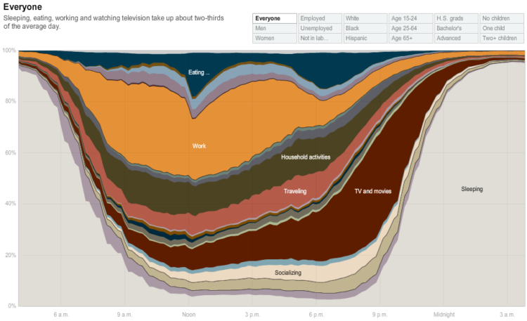
From Shan Carter, Amanda Cox, Kevin Quealy, and Amy Schoenfeld of The New York Times is this new interactive stacked time series on how different groups in America spend their day. The data itself comes from the American Time Use Survey. The interactive has a similar feel to Martin Wattenberg’s Baby Name Voyager, but it has the NYT pizazz that we’ve all come to know and love.
Explore time use by gender, race, age, education, and employment. View all activities (e.g. work, traveling) or select a specific action to drill down into the graph. From there, you’ll find time aggregates that you can compare against depending on what filter you’ve selected. For example, the data says the unemployed sleep about an hour more than the employed:

That’s not entirely surprising. But I was surprised that the average employed person gets almost eight and a half hours of sleep per night. I always thought America was sleep deprived on average. Go figure.
Anyways, check out the interactive for yourself. It’s well-executed, very well thought out, and most importantly the material is really interesting.
[Thanks, Michael and Chris]

 Visualize This: The FlowingData Guide to Design, Visualization, and Statistics (2nd Edition)
I”m not a demographer and don’t typically spend a lot of time on the BLS site. This data is very interesting. Thank you for this post.
They really made some progress with the interactivity this time. It’s much easier to see data points in this version of the stream graph than in the stream graph they did representing films. Definately a fan of this one.
I really liked the two articles on Junk Charts about this:
http://junkcharts.typepad.com/junk_charts/2009/08/degrees-of-likeness.html
http://junkcharts.typepad.com/junk_charts/2009/08/degrees-of-likeness-2.html
would be interesting to see which day of the week this is, or even better, to see this graph expanded over a week.
In addition to considering variation by day of the week, I wonder in general what the distribution of sleeping hours look like: right-skewed?
Pingback: neat-o graph shows how americans spend their day
What a great visual! I am between employed and unemployed, working and retired – gives me a good idea of what others are doing and the life I want to lead. Thank you!
P.S. I am soon to be re-employed with a school in great need. It would be so powerful to be able to set up this kind of data analysis with student participation and data. Anyone willing to help me set this up?
The interactivity rescues this and it is pretty cool, but in general I find these kinds of charts infuriating in their popularity these days. A rise or fall in one measurement causes the graph of all other measurements to rise or fall, even if those items are holding steady. This makes these kinds of presentations of data really misleading.
For instance, look at the “TV and Movies” measurement, or the “Personal Care” one. Can you guess at which point those items max out? Now mouse over and see if you were right. I doubt it.
Perhaps the coolest thing about this, then, is how the interactivity shows how such graphs are intuitively misleading…
i don’t think it’s all that misleading. the purpose of this stacked time series is compare proportions over time. So when you’re looking at all activities at once, you’re comparing percentages at each given point in time as opposed to trying to figure out how a single activity plays out. Then when you’re interested in a single activity, you click on it to drill down for that individual view.
I made a similar visualization a few months back, http://justintalbot.org/?p=85 (click on the image)
I ended up splitting the data by weekday/weekend since that was the dimension that seemed to have the most interesting variation.
You can also type in words to get more detail than in the NYT version. For example, type “child” in the text box to get all activities related to children.
Hi,
Can anyone tell me what software is used to produce these kind of ‘organic’ interactive graphics? What I mean by this is the kind that immediatly adaptd itself according to mouse moving (often on slide bars) or by clicking a button (but you actually see the morph instead of just the image changing).
Thanks
Pingback: Draw a Picture? (or, Check out this data on metal bands) « The Other Side of the Coin ™