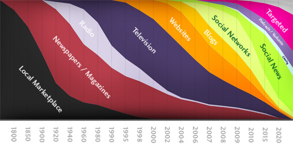
This graphic on the history and future of information has been making the rounds. Several people sent it to me a while back, but it didn’t seem quite right, so I didn’t post it; however, this post from PZ Meyers compelled me to take another look. Meyers says:
Some days, I think other people must be aliens. Or I must be. For instance, there’s a lot of noise right now about this article analyzing the future of information and media that, if you read the comments, you will discover that people are praising to an astonishing degree. I looked at it and saw this graph [above graphic]. And my bullshit detector went insane. It’s supposed to be saying something about where people are and will be getting their information, but there’s no information about where this information came from, and it’s meaningless!
Yikes. Take out the boxing gloves. Looks like we’ve got another clash between the technical and the design-ish and mainstream crowds. The comments from both sides are also pretty interesting with one group saying how visually appealing and informative the graphic is with the other group criticizing the graphic for failing in every way.
Good or Bad?
Clearly the graphic is not based on any real data or metric. It goes off history and probably a lot of Wikipedia entries, and then shapes and sizes go off feeling. So as an analytical graph, it doesn’t work. But what about as an opinion in graph form? Does it work then? What do you think? Is this graphic a crime against all that is good in visualization or does it work for what it was trying to do?
[Thanks, Patrick]
 Visualize This: The FlowingData Guide to Design, Visualization, and Statistics (2nd Edition)
this so called graphic is a total mess. it misses the naming of the y-axis. it misses the overall-performance (not only the percentage in relation to the total). it compares apples with banana (we are all media, arn’t we?). it’s designer loved the style more than the content (or wasn’t aware of it – both). probabely didn’t actually know what to show. colorsheme (is there any?) does not guide the information (mixes colors with noncolors), timeframes inbetween indicated years are not equal, distances are – a no-go! typograhphy? all the way downhill. shadows in the upper and lower area are meaning – what? back to school, folks.
I have a very very poor graphic which illustrates how as time has progressed the size of the chunks of information we pass back and forth has increased and then the space between those chunks has in turn been filled by other channels. My graphic is bad because a) I’m a bad designer and b) I did it in powerpoint (shudder).
It’s more meaningful and useful than the one above though.
Actually, I think this chart might help techies and designers unite, because everyone can agree it’s terrible. The deceptively varying x-axis scale, the completely made-up numbers, the gratuitous gradient… Ouch.
As a visualization, with no real numbers behind it, it gives a general feel of the magnitude of our changing lives. The main thing which is obviously silly is that most of us still get a fair amount of information from the local marketplace. News about our schools and community, where to get a haircut, etc., is still largely word of mouth. It will be a long, long time before you can find out who is sleeping with whom in your office by twitter faster than at the water cooler.
I don’t see anything to love about this graphic… frankly I don’t “get” it, and I’m a designer. It’s visually all over the place and hard to read… what is the top of the chart signify? The wording is all over the place, different angles etc. which bothers me as there seems to be not thoughtful reason for it. Several of the measurements (Local Marketplace (grocery store?), Targeted (what, mailings?) I’m not even quite sure what they even mean. Suffice to say, I’m not impressed. Bad data + bad graphics = chartFAIL
I’ve seen this graph making the rounds, as you say. I will agree that it is pretty, but that is about it. It’s very misleading in a number of ways. The data is based on opinion; there is no pattern to the y-axis; the group being reported on isn’t even identified. Is this for a 100 people, all of a single country, the world?. (There is no way that social networks are equal with TV if it is any bigger than the designer’s peers.)
I think it’s bad even as an opinion graphic in that those who aren’t information savvy may take this as fact without digging deeper into what they are looking at.
The graph works only in this: if the designer was trying to get wide spread recognition. In that case, it succeeded.
Otherwise: fail.
As a means of conveying data the graphic falls short in ways already mentioned; I feel no need to rehash them here. However, I am left to wonder if this idea might work in a more abstract sense. As more of a general model. Certainly the subject matter is worth exploring. And I see a story worth telling. The question is the seeming lack of data. So if the data is not available, could we not use this graphic—admittedly having aforenoted problems—as the starting point for a more abstract visualisation of the story?
The x-axis, too, is completely arbitrary. The intervals are 50,50, 20, 20, 20, 20, 10, 5, 3, 2, 2, 2, 2, 1, 1, 1, 5, 5, which is very misleading.
I think the failure to present a logical scale on the X axis of this chart is a problem. Notice that at different parts of the chart each unit of length on the X axis represents either 50, 20 10, 5, 3, or 2 years of time. I believe that the compression of dates around the 1990’s and 2000’s tells a story of the acceleration of change in media whereas in the chart the only thing that I see upon first glance is a fragmentation and diversification of media channels.
Among the many things wrong with this is it shows old technologies going to zero. Old media don’t completely disappear. And between “Local Marketplace” and “Newspapers / Magazines” there were these things called books that the designer perhaps has not heard of.
The main way that this graphic fails, like most of its type, is that it is structurally misleading to the eye. Because everything is stacked, it looks like everything declines even when only one item is actually declining. Thus, while TV is maintaining a constant share for some time, it looks like it’s crashing. And “social media” looks like it’s crashing even when it is actually increasing it’s share.
So forget all the (true) technical ways in which the graphic is junk. Even as an opinion, or conceptual aid, it is worse than junk.
This illustration is dishonest because it is masquerading as a graph of real data, complete with little anomalies to make things look more realistic.
To choose one example, the value for “Local Marketplace” is almost unchanged from 1960 – 1980, in contrast to the time periods around it.
I’m fine with using graphics to convey the gist of an argument. But this is a conceptual illustration pretending to data analysis, and that’s not OK.
Is it just a little bit wrong that what bothers me most is how the author/designer says that newspapers were invented in 1800?
Okay, fine, maybe the modern form of newspapers was just coming into recognizable shape about that time, but discounting pamphlets, newsletters, and almanacs wholesale gets on my nerves more than it should.
The only thing I get from the graphic that is of any use is the sense that the waves of change are happening more rapidly than they did in the past. Beyond that, it just doesn’t provide any enlightenment on much of anything.
That fact that each new item starts at the top is what bugs me the most. Why would newspapers, in the early years of adoption show up at the top. I’d prefer to see overlapping bell curves, or something like that, that show each medium starting small, gaining popularity and then waning as something new takes over. That would at least feel more intuitive.
Beyond that, unless this is somehow rooted in fact or data, it’s really just opinion visualization, not data visualization.
That graph isn’t crime, it’s an entire RICO rap. The rap sheet:
1. Identity theft. This tries to pass itself off as quantitate information. It’s not. It’s a subjective interpretation, for which there are perfectly valid forms such as drawings, water colors or even finger paints.
2. Wire Fraud.
3. 2nd Degree Murder against Edward Tufte’s corpus. In particular, Tufte says a designer should strive to minimize the “ink to data” ratio. Given that this diagram is all ink and NO data, it has an infinite ration.
@tyler, I just wanted to say your comment is hilarious. Particularly point number three.
Ahem; as you all were.
It should have been highly stylized or made to look like a sketch, to indicate that it shouldn’t be read as real data. As just an infographical vision, I like it a lot. Makes the singularity feel like riding an avalanche.
If it is talking about people connecting, it leaves out books, pamphlets, mail, and email.
If it is talking about marketing and advertising, it leaves out display ads, phones and direct mail.
A study by Deloitte from January of ’09 shows “Types of Advertising Most Influential on Buying Decisions” with very different proportions:
http://www.mediapost.com/publications/?fa=Articles.printFriendly&art_aid=99040
(BTW, this was a red flag: the article claims “information overload” is a new concept from roughly 2004. The term was actually popularized by Alvin Toffler in 1970 in the bestseller, “Future Shock”. Also, the article’s rosy view of the death of newspapers is not shared by me.)
Back to the graphic. I agree with just about every criticism of it. So I will concentrate on what it does well. It shows a succession of some forms of communication.
The graphic is attractive and conveys some useful information, even if we dont know de source of data, if any. I believe that the piece works as a mirror for the personal experiences of some people, it conveys the image, in a timeframe larger than a life time, of the way our sources of information has changed over time. The graph may be false, but it is sound, if you arrive to understand it;
The message: every media is ephimeral, their life is increasingly shorter, and technology is the main driver of change;
The interesting thing isnt in the graphic but in the readers mind
Well, this is a nice looking graphic with no accurate data.
It is not really informative. If there is an analogy to news I´d say this is an opinion article, not a hard news article.
When this article opened on my reader, showing the graphic, I went slightly cross-eyed for a moment. This reaction made me wonder about the slope of the lines.
I read about sparklines in Tufte’s _Beautiful Evidence_ over the weekend, and he writes about how slopes in a graphic should average 45 deg. over its length(p60). Just a SWAG, but this graphic probably ignores this principle as well.
This discussion doesn’t do the orginal articale justice and to all the people shouting FAIL try to read the the articale and see the graphic (read: not graph) in that context.
I agree with Thomas Baekdal that this might be a possible future for sources of news.
To disguess wheater this is a good or bad graph when it’s actually a graphical visulatiation of trends is irelevant in my eyes. Trends is very hard to quantify (if not impossible) so if you could illustrate the future trends for where people get their news I hereby challenge you!
@Tim – trends are totally possible to quantify – and it’s common practice.
@Nathan – You should use 30 secs to re-read my comment. I didn’t say it not done or it’s not commen practice but I said that it’s hard and allmost impossible (though some companies try and history is full of examples where they have failed miserably. Just take the opinion measurements up to an election).
If you can quantify trends answer me this question: How many people in the work at this moment thinks that TV is their primary source for news?
You can do an approximation of it but never give an accrurate quantity (simply because you can’t bother every single person in the world).
Taken the approximation into account I still think that the visualication that Thomas did together with the articale is a good guess for the future trends of sources for news.
@Tim – Right, that’s what sampling is for. Nielsen ratings are samples, and we use statistics to make an approximation. We know that if we sample properly and enough, the law of large numbers will kick in. As for quantifying trends, well, that’s just time series analysis.
@Nathan – It would be nice to get your point of view in this discussion instead of commenting on small pieces that doesn’t satisfy your 5 open questions in this post.
there’s no data, so it cannot be (data) visualization. It’s just a diagram.
still it claims that face-to-face, written and broadcast information dissemination will disappear within 10 years, and be entirely replaced by new paradigms that will appear every year.
As CATS would put it, hahaha.
I like the idea of an “opinion in graph form”. Thanks, Nathan, for that reframing!
It’s an interesting way of illustrating one’s prediction to show the waves of change that are happening in communication. Just another viewpoint albeit a messy one.
The chart isn’t that bad. I have nowhere to start in verifying or refuting the data, but if you care about what it is trying to say, you will figure the graph out. If you don’t care (or don’t trust the data) you won’t give it a real look and say its sloppy.
The top of the y axis could read “New / Burgeoning” and the bottom of the y axis could read “Old / Dying”
Then in any given year, there is a cross-section demonstrating the distribution across various media.
For instance, in 1900 about 25% of people got their info from Newspapers/Magazines and %75 from the Local Marketplace with Newspapers being newer (higher on the chart).