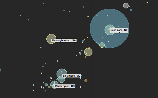
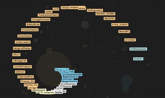
In the promotion of its speedy javascript, Google announces the Chrome Experiment. As part of the Experiment, design group Use All Five give us Small Talk, which is a social weather map that uses tweets that contain terms like rainy and sunny. Circles are sized by number of tweets, and tweets are colored by dominant weather tweet, so what you get right now is very blue on the east and sort of orange in the west. Oh how I long for the sun.
The cool thing about this (and the other projects from Chrome Experiment) is that it’s implemented in javascript.
Pan and zoom…

Click on the bubbles…

Yes, javascript just keeps getting faster and more impressive. It’s no longer just a way to show dynamic status messages and popups. It’s much more than that. Javascript is becoming a viable visualization solution.
[Thanks, Levi]

 Visualize This: The FlowingData Guide to Design, Visualization, and Statistics (2nd Edition)

Love flowingdata – great feed.
As more and more of these maps come out, my concern with these them is that no matter the subject, the size of the bubbles tends to always reflect the size of the city and not the intensity of the interest. Each new map is starting to look like every other map. New York, Chicago, LA will always yield big bubbles; Maine, Wyoming not so much.
Anybody out there have a thought as to how to normalize the data on these maps so they show per capita tweets? Is the quality of the data good enough to normalize? For instance, does Minneapolis, MN represent downtown? the county? southern MN? Is this something worth pursuing?
Food for flowingdata thought.
sounds like a job for…. http://axismaps.com
re javascript – not sure if you’ve coered it here yet – sorry if you have.. but John Resig has ported the processing library to .js – which means that you can now prototype and (at least try to) publish interactive visualizations online without the need of flash..
http://ejohn.org/blog/processingjs/
cool that it’s live data, like the weather is now but than visualized, I don’t mind the size of the bubbles though
Keith, you are correct. These maps may be misleading.
As a matter of fact, all maps are misleading in some way or another. It’s all in the development, display and interpretation of the data. That’s why there’s been so much growth in the geospatial technologies field in the past five years or so.
There’s a science behind standardizing those statistics according to the information you are trying to convey. A classic starting point for learning about this topic is the book “How to Lie With Maps” by Mark Monmonier.
Do you want to see percentage per capita tweet figures? What about sprawling cities versus consolidated populations? Then you might want to look at tweets per square mile. But, what about Twitter participation density? That information would alter those figures as well.
Just a few more flowingdata points to ponder…
Pingback: Artistic Data | alex j. mann (.com)