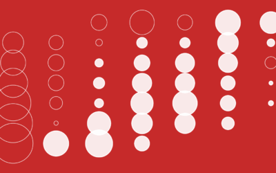
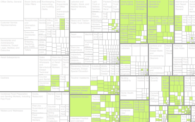
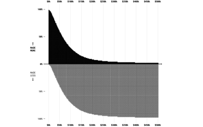
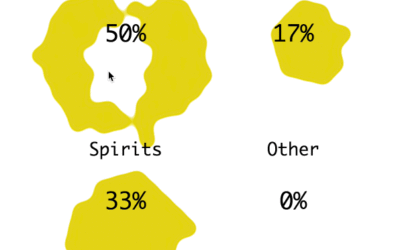
Some of the best stuff comes out of student projects. During the Screendesign workshop in Fachhochschule Potsdam last summer, students were asked to collect, analyze, and visualize personal data. Topics ranged from haircuts to movie consumption to telephone habits. The assignment was largely inspired by Nick Felton’s Feltron Report:
I loved every single issue of the Feltron annual report. From the first time I saw it I was convinced it was a great topic for a personal project – or for a university course. So the project setting became “personal annual report”. Since a long time, I’m interested in visualization methods from journalistic infographics to scientifc information visualisation – so I’m convinced it’s a great and important topic to encourage people getting involved with. And it is a field that never stops evolving, where you are never about to reach the ground, no matter how deep you dive (yeah, this is for interactive media or even media in general, but it feels stronger to me when it comes to data visualization).
I really like to see courses like this centered around visualization and then the results from some inspired students. It goes to show how this area is growing. I just wish I got to take these types of courses.
[Thanks, Christophe]


Lots of cool images in there. A great way to engage students too, collect their own data sets, good practice and introspective too.