If I’ve learned anything about designing information graphics, it’s that attention to detail and small changes make a mediocre graphic into a really useful and usually more attractive one. It’s what sets New York Times graphics apart from those in other publications and especially those in academic papers. Something like a short annotation can add context or a line shifted slightly to the left can make data look less cluttered.
Case in Point
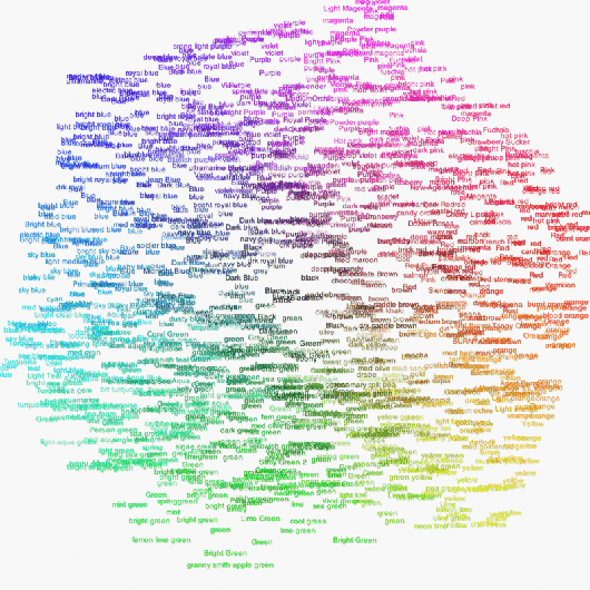
Take Martin Wattenberg’s redesign (above) of Dolores Lab’s original color cloud (below) for example. The original was on infosthetics, so I’m assuming everyone’s already seen it, but just to be clear, people were asked via Amazon’s Mechanical Turk to classify colors on a color wheel. The visualization shows how people labeled different shades.
The original is kind of nice to look at and under close inspection, even provides some interesting tidbits. In the redesign, it’s pretty clear how color was selected and looks a good bit prettier. All it took was a change in background color and a change in scale by frequency.
Statisticians haven’t really picked up on the usefulness of design yet, but they will eventually if I have anything to say about it.
 Visualize This: The FlowingData Guide to Design, Visualization, and Statistics (2nd Edition)
I never heard the nyt in context of infovis. Do you have any address to get an overview?
wow… that is fantastic. Something else to take out of it is that all the elements of good design apply to all sorts of design – aesthetic or “infosthetic”. Stronger contrast in color with the black bg, variation and contrast in size of the words…
Unfortunately I think it obscures the bit of information I found most intriguing, specifically, which colors have the most variance in their responses. I’m not surprised how many people used “green”, but how many different colors people call green.
invert the sizes on the redesign, and maybe that’s what you want.
@steffen Matthew Ericson’s talk about info vis at the NYTimes was very good. His slides from the talk are on his site..
@steffen Matthew Ericson’s talk about info vis at the NYTimes was very good. His slides from the talk are on his site..
@steffen Matthew Ericson’s talk about info vis at the NYTimes was very good. His slides from the talk are on his site..
@Nathan: I was thinking you’d have to redo it with the sizes representing the size of the variance structure. This way colors whose perception varies little are small and colors whose perception varies a lot are large, regardless of how many times each name was used.
@Nathan: I was thinking you’d have to redo it with the sizes representing the size of the variance structure. This way colors whose perception varies little are small and colors whose perception varies a lot are large, regardless of how many times each name was used.
@Nathan: I was thinking you’d have to redo it with the sizes representing the size of the variance structure. This way colors whose perception varies little are small and colors whose perception varies a lot are large, regardless of how many times each name was used.
Nice post Nathan. I’ve created an interactive 3D color name explorer using the same data. You and your readers might enjoy:
http://www.neoformix.com/2008/ColorNamesExplorer.html
Nice post Nathan. I’ve created an interactive 3D color name explorer using the same data. You and your readers might enjoy:
http://www.neoformix.com/2008/ColorNamesExplorer.html
Nice post Nathan. I’ve created an interactive 3D color name explorer using the same data. You and your readers might enjoy:
http://www.neoformix.com/2008/ColorNamesExplorer.html
@Jeff: very nice!
Why are you so mean?
Jeff, that’s fascinating!
Regarding the “study” itself, I would be interested to find out the classification names attributed by the same person. In other words, how would someone who looks at blue as “electric blue” classify a red or green. Pure curiosity.
I’d love to see this done solely on colorblind subjects!
I’d love to see this done solely on colorblind subjects!
This is very cool. Being color-blind, I am sure I see this differently than most others!
Pingback: Networking the rainbow « The Arbitrarian
I don’t think it’s completely straightforward, Nate.
“The original is kind of nice to look at and under close inspection, even provides some interesting tidbits. In the redesign, it’s pretty clear how color was selected and looks a good bit prettier.”
In the redesign, what stands out are the NAMES of the colors of the rainbow, rather than the alternate names. So while it stresses that people know the rainbow colors, nothing more subtle is obvious (to me). Where are the colors between blue and purple in the redesign? Maybe the background color is washing them out? Or is that the scaling?
In the original, I see a color wheel, and I can pick out individual names.
That said, I’d much rather look at the redesign, from an aesthetic perspective.
It takes care to distinguish art from beautiful-with-meaning. I think the redesign leans to ‘art’, losing some meaning. Any sense in that to you?
I’d like to see more redesigns of this image, exaggerating various features. I wonder what we’d see.
One other non-trivial change was made: the redesign uses only lower case. I find that a bit more restful. The change in case may have been facilitated by the change in frequency scale, since the greater variety of sizes helps isolate individual color names while in the original the initial caps were more critical for that isolation.
Pingback: Rolling Out Your Own Online Maps and Graphs with HTML/CSS | FlowingData
Pingback: Find Your Dream Home (or Fantasize) With Trulia Snapshot | FlowingData