I just created a new Twitter account, and it got me to thinking about all the data visualization I’ve seen for Twitter tweets. I felt like I’d seen a lot, and it turns out there are quite a few. Here they are grouped into four categories – network diagrams, maps, analytics, and abstract.
Network Diagrams
Twitter is a social network with friends (and strangers) linking up with each other and sharing tweets aplenty. These network diagrams attempt to show the relationships that exist among users.
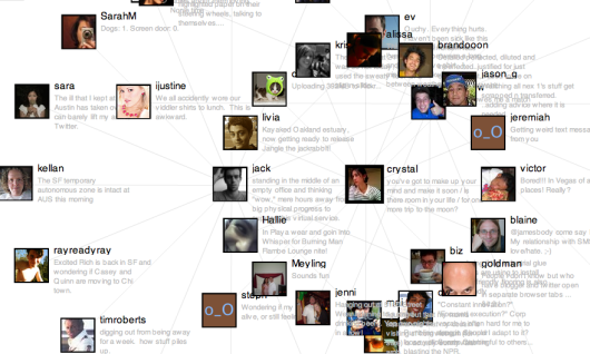
Twitter Browser
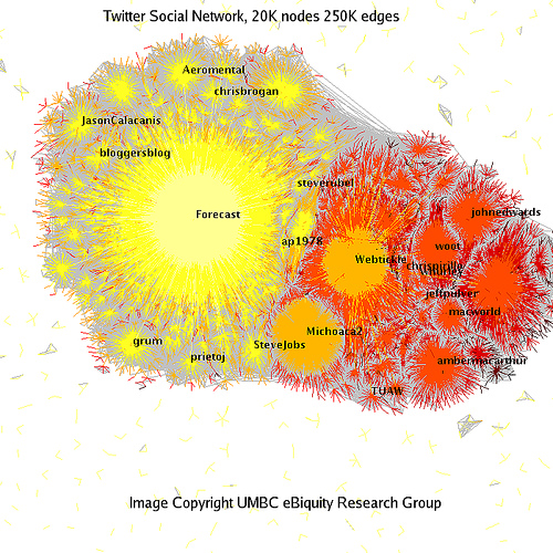
Twitter Social Network Analysis
The ebiquity group did some cluster analysis and managed to group tweets by topic.
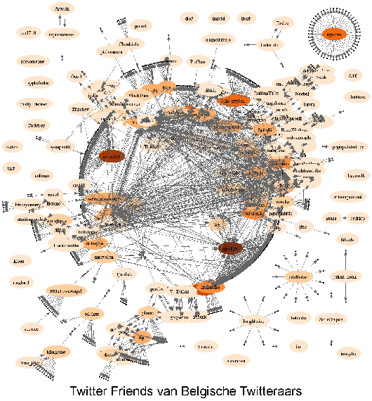
Twitter Vrienden
Twitter in Red
I’m not completely sure how to read this one. I looks like it starts from a single user and then shoots out into the network.

Twitter Network

Maps
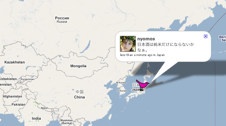
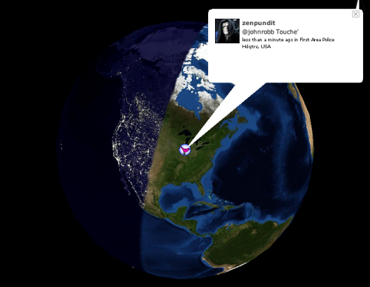
When you create a Twitter account, you can enter where you are located, so in my case, I put New York. Because Tweets often have location attached to them, maps naturally lend themselves to tweet visualization.
TwiterVision
Yeah, it’s a Google Maps mashup, but a bit better than what you’re used to seeing.
TwitterVision3d
It’s TwitterVision taken to the next dimension.
Analytics
Maybe you don’t care so much about the relationships or locations, but what you’re really after is what everyone is Twittering about. These analytic visualization serve as a Twitter zeitgeist.
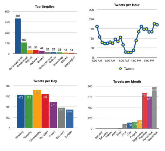
TweetStat
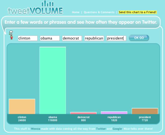
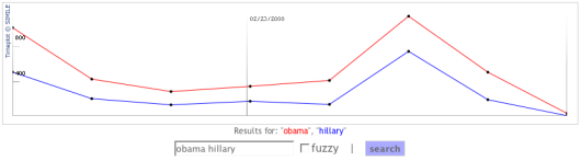
TweetVolume
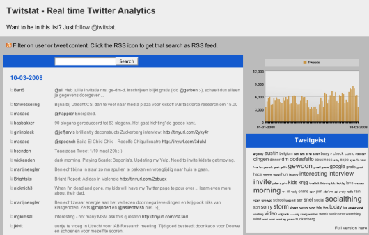
TwitStat
TwitterMeter
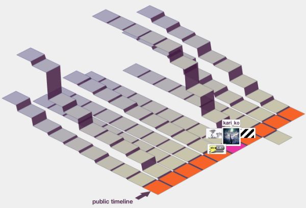
Abstract
They’re not quite maps, not quite network diagrams, and not quite analytic tools. Rather they all follow some metaphor and encourage exploration.
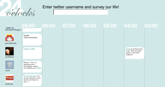
24 o’clocks
Is it just me, or does this sound like a really good name for a band?
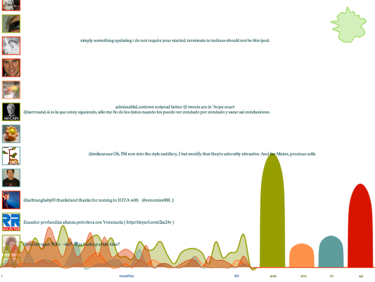
TweetPad
Created at the Visualizar workshop, it’s actually more than just curves. In fact the blobbies are meant more for background while the main event is playing with the tweets.
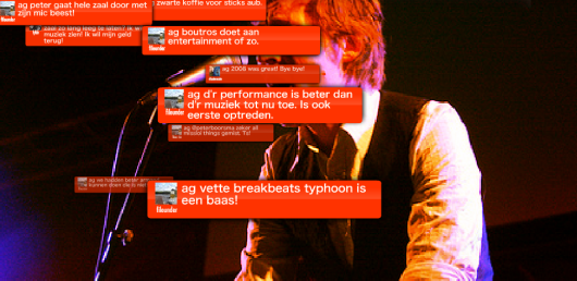
Twitter Fountain
Twitter Blocks
Created by the folks at Stamen. I posted about Blocks when it came out.
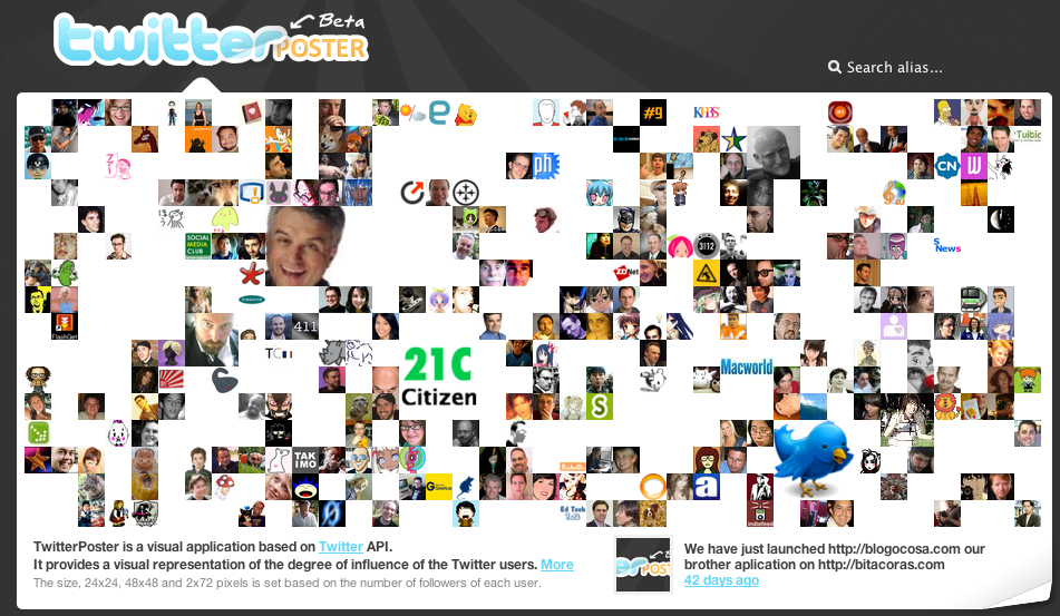
TwitterPoster
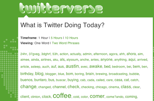
TwitterVerse
A lot, huh? All of these were made possible by the Twitter API that allows developers to access Twitter data for free. Did I miss any other Twitter visualizations? Please leave the link in the comments below.
Follow Me On Twitter
So now that you know what Twitter looks like, you can head on over and “follow” me; or if you don’t have an account yet, you can create one in a few seconds.
If you don’t know what Twitter is or wondering what the point is, here’s a short video explaining Twitter in “plain English.”
 Visualize This: The FlowingData Guide to Design, Visualization, and Statistics (2nd Edition)
Pingback: Holy Moly » Blog Archive » Twitter Linklist 17 Ways to Visualize the Twitter Universe
Pingback: links for 2008-03-13 :
Nice collection! On a peripherally related note, it looks like nobody has yet collected the data that I’m currently obsessing over: I want to figure out the largest set of Twitterers you can create such that all members of the set follow all other members of the set. (Note that that’s not the largest set that *only* follows one another, necessarily.)
It’d actually make for a beautiful visualization, too…
Pingback: 17 meios de visualizar o twitter | GOMA DE MASCAR | Quando explode faz pop!
@whitney: hmm, that would be interesting to see. time to start linking up and following like a mad man.
Pingback: 17 modi per visualizzare Twitter : Catepol 3.0
Pingback: 17 formas de visualizar tu universo Twitter | Bitperbit
Pingback: Hello. My name is … » Archive » links for 2008-03-14
Pingback: Magnetbox - links for 2008-03-14
Pingback: 17款Twitter相关数æ®å¯è§†åŒ–的工具 | å¸•å…°æ˜ åƒ
Pingback: links for 2008-03-14 « Mandarine
Pingback: adaptive path » blog » Peter Merholz » Conversation with Julie Peters, Brand Manager, Virgin USA
Pingback: AlanLe.net » links for 2008-03-14
Pingback: Visualising Twitter | Ugh!!'s Greymatter Honeypot
Pingback: le blog à Ollie » Liens du jour
Pingback: Better Communication Results » links for 2008-03-14
Pingback: links for 2008-03-14 | mad dog in the fog
Pingback: “17 Ways to Visualize the Twitter Universe” « Graduation project Jori de Goede 2008
Pingback: 17 frenéticas formas de ver Twitter » Esquizopedia
Pingback: Web 2.0: 17 formas distinas de explorar Twitter - Bitelia
Pingback: Wayne State Web Communications Blog » Blog Archive » [Friday Links] The PI Day Edition
Pingback: beyond tellerrand » Vizualizing Twitter
Pingback: Daily Links | Akkam's Razor
Pingback: rascunho » Blog Archive » links for 2008-03-14
Pingback: 17 Ways to Visualize the Twitter Universe
Pingback: links for 2008-03-14 « lieblinks
Pingback: 17 ways to visualize Twitter and its Tweets | money news blog
Pingback: Twitterati: Get Yer Analytics Here!
Pingback: Sean’s Mental Walkabout » Blog Archive » links for 2008-03-15
Pingback: Dancing Monkey Mania » Blog Archive » links for 2008-03-15
Pingback: Visualize the Web - Nerdcore
Pingback: Explore formas de visualizar a informação através do Twitter » em_Face :: botando a cara na web
Pingback: links for 2008-03-15 | Moewes.com
Another up and coming is Hashtags: http://hashtags.org/
Pingback: TISCAR :: Periodismo -:- Blogs -:- Educación » Formas de visualizar Twitter
Pingback: 17 Ways to Visualize the Twitter Universe |
Pingback: 17 maneras de visualizar Twitter - esTwitter.com
Pingback: Delicious Links - 20 links - tools, gamers, workhacks, code, links « // Internet Duct Tape
Pingback: QuickLinks vom 13. März bis zum 14. März — instant-thinking.de
Pingback: Visualisez votre réseau Twitter ! | Another Pinky Punky
Pingback: Sunday links « Then again, I might be wrong
Can I say “Awesome List!” Really nice post you got here. Keep up the good work mate.
Pingback: 17 Ways to Visualize Twitter « En el Medio
Pingback: Tracking the Buzz: How to Monitor your Brand Effectively | Social Media Trader
Pingback: Twitter-Visualisierungen at franztoo
Pingback: frEdSCAPEs 3.0 » Blog Archive » TouchGraph | Products: Google Browser
Pingback: BLADDA » Blog Archive » Twitter in beeld gebracht.
Pingback: Stilgherrian · links for 2008-03-17
Pingback: Ambiome[Dot]Net » Les liens du jour : CSS, twitter, RSS et vie priv
Yeah, cool visualizations.
Yeah, cool visualizations.
Pingback: Easy way to let people Twitter your blog posts - TinyURL plugin
Pingback: Easy way to let people Twitter your blog posts - TinyURL plugin usable for tweets!
Another interesting Tweet Map – http://www.mytweetmap.com
Another interesting Tweet Map – http://www.mytweetmap.com
Pingback: MacroHW » Blog Archive » 17 frenéticas formas de ver Twitter
Pingback: Visualizing Twitter « Charlotte-Anne Lucas
Pingback: links for 2008-03-18 | Chris Dalby Untangles Networks
Pingback: AKA Riptide Furse » Krossbow’s del.icio.us bookmarks for March 18th - Add me to your del.icio.us network!
Pingback: links for 2008-03-19
Pingback: 17 Ways to Visualize the Twitter Universe | David Bisset: Web Designer, Coder, Wordpress Guru
Pingback: links for 2008-03-19
Pingback: FutureGov » Useful links » links for 2008-03-19
Pingback: links for 2008-03-20 « daizhixin’s blog
Pingback: Weekly Points of Interest 2008-03-20 at Experience Matters
Pingback: Bookmarks for March 19th through March 20th | dois pontos, barra barra
Pingback: Icio Week 12(b) - Twitter Posts « Unique-Frequency
Pingback: grockwel: Research Notes » Blog Archive » FlowingData: 17 Ways to Visualize the Twitter Universe
Pingback: The Best Tools for Visualization
Pingback: 17 formas distintas de explorar Twitter - ¿Que miras?
Pingback: InternalComms · Twitter, como un telegrama
Pingback: rob zand » Blog Archive » links for 2008-03-29
Pingback: Darren Herman - Marketing, Advertising, Media and Technology Blog » Blog Archive » links for 2008-03-30
Pingback: This Month In SEO - 3/08 - TheVanBlog
Pingback: Twitter - An Upcoming BIG Player in Social Media « SEO Ahmedabad: A place to learn & share all about SEO
Pingback: Brian Griffin - Twitter Visualization
Pingback: MKTG2032 Links Post 11: Analytics, SEO, Semantic Web patterns « Mktg2032’s Weblog
Pingback: Utilidades para Twitter III at Pisito en Madrid
Pingback: Twitter: Redes, Video e Sondagens | Networks, Video and Polls « O Lago | The Lake
Pingback: Trabajando con la API de Twitter desde PHP
Pingback: Blog Clippings » eCuaderno
Pingback: rein:MEOW » Blog Archive » èª å¥½ç‰©-twitter週邊æœå‹™ 20+
Pingback: Love, Hate, Think, Believe, Feel and Wish on Twitter | FlowingData
Pingback: Simone Brunozzi » Blog Archive » Twitter Power!
hey – you can also add http://dipity.com too – they have some cool timelines that can mash up your twitter feed with your flicker feed (among others)
Thanks for including Twitterfountain in your list. Perhaps a little explanation might help make it even more interesting: Twitterfountain allows you to visualise Tweets that contain any keyword you choose, and shows Flickr-images in the background, based on any keyword you select. It is easily embeddable as well.
Here is 18, 19, and 20…
http://www.thenetworkthinker.com/2008/07/twitter-maps.html
Enjoy!
Here is 18, 19, and 20…
http://www.thenetworkthinker.com/2008/07/twitter-maps.html
Enjoy!
Wow great visualizations some day ill do one :)
Wow great visualizations some day ill do one :)