Statistical graphics are kind of stuck in a static funk where you create a plot in R, Excel, or whatever, and you can’t really interact with it. If you want another graphic, you manually create it. Hence, Jeffrey Heer and George G. Robertson investigated the benefits of using animation in statistical graphics.
Transition Challenges
They experimented with several kinds of animated transitions like sorting, filtering, visualization change, and scaling. In the case of visualization transitions (e.g. scatter plot to bar graph), the designer has to make sure each visual cue correctly transitions to the new symbol of comparison. If there’s an incorrect transition, someone using the tool could (and will) mistakenly perceive a non-existent correlation. Yuck.
Their Results
A tool called DynaVis was designed to experiment on 26 users. Enthusiasm and usability notes were positive while the most convincing of the results was probably the measure of memory. The comparison of static graphics to animated produced interesting results shown in this chart:
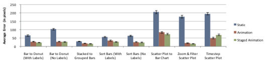
The main thing to note here is that the error rate with static graphics (in blue) was way higher than for the animated graphics.
More Complexity
[W]e belive our results provide compelling evidence for the use of animated transitions in data graphics and that the presented design principles can be fruitfully applied in crafting additional effective animations.
This challenge of course gets even harder as you bring in more (complicated) data and more complex visualization techniques. What design considerations are there for a transition from one animated visualization to another animated visualization; or static to animated? I sense interesting answers ahead.
 Visualize This: The FlowingData Guide to Design, Visualization, and Statistics (2nd Edition)