
Histogram
It looks like a bar chart, but it reads differently. The baseline is continuous instead of discrete categories, which allows one to see distributions.
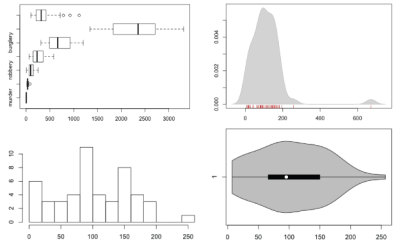
How to Visualize and Compare Distributions in R
Single data points from a large dataset can make it more relatable, but those individual numbers don't mean much without something to compare to. That's where distributions come in.

Do Movie Sequels Live Up to Their Originals?
The third installment of Pixar’s Toy Story is making a killing at the…
