Visualization
Showing the stories in data through statistics, design, aesthetics, and code.

Most popular GIFs used to express emotion in different countries
People often use animated GIFs to digitally express caricatures of emotion or reaction.…
Favourite maps from 2017 →
Cartographer picked his favorites. Better late than never.…
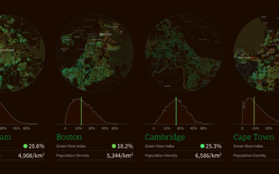
Mapping perceived canopy tree cover in major cities
Treepedia, from the MIT Senseable City Lab, estimates perceived tree cover at the…
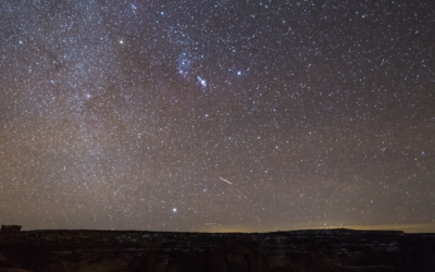
Time-lapse shows night sky at varying levels of light pollution
One of my favorite childhood memories is the time I went camping and…
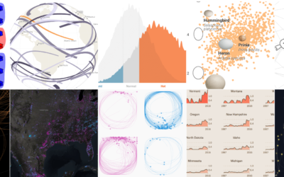
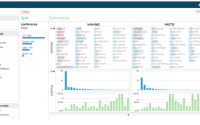
10 Best Data Visualization Projects of 2017
It was a rough year, which brought about a lot of good work. Here are my favorite data visualization projects of the year.
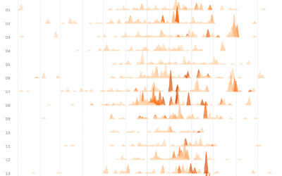
Charting all the major California wildfires since 2000
Based on data from CAL FIRE, Erin Ross, for Axios, plotted California wildfires…
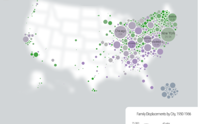
Family displacements through urban renewal
Hundreds of thousands of families were displaced in the 1950s under “urban renewal”…

Ed Sheeran’s creative process explained with music visualization
The New York Times is back at it in explaining the creative process.…
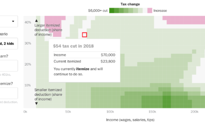
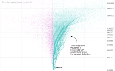
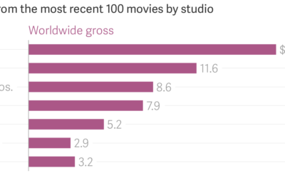
Tax calculator that considers where you live
Here’s a different look at tax cuts and increases from Reuben Fischer-Baum for…
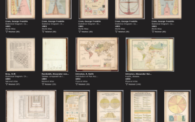
Rumsey Collection with a data visualization subject tag
The David Rumsey Map Collection, known for its many browsable historical maps, now…
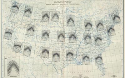
Multivariate map collection
I heard you like maps. Jim Vallandingham put together a collection of maps…
Tracking ballet dancer movements
Research group Euphrates experimented with lines and a ballet dancer’s movements in Ballet…
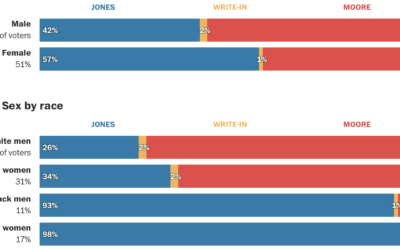
Alabama voter demographics
Democrat Doug Jones won in the senate race against Republican Roy More last…
Data visualization for analysis and understanding complex problems
Enrico Bertini, a professor at New York University, delves into the less flashy…
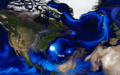
Simulation shows swirling of smoke, sea salt, and dust around the world
NASA. Data. Good.
Tracking the aerosols carried on the winds let scientists see…