Visualization
Showing the stories in data through statistics, design, aesthetics, and code.
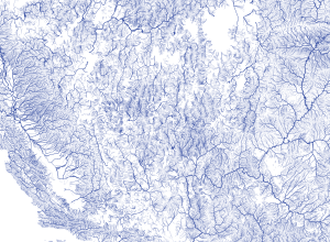
Mapping all the rivers in the United States
Inspired by Ben Fry’s All Streets map, which showed every road in the…
Earth’s skies with Saturn’s rings →
Illustrator Ron Miller imagined what Earth’s skies would look like if we had…
Contrailz: Detailed flight patterns at major airports
Alexey Papulovskiy collected flight data from Plane Finder for a month, which essentially…
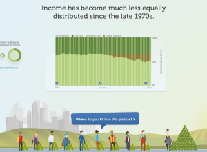
Income inequality, real and personal
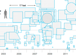
In a different take on the income inequality issue, the Economic Policy Institute,…
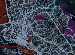
The Insanely Illustrated Guide to Your First Data-Driven TileMill Map
TileMill makes it easy to make custom maps. Here’s a detailed, illustrated tutorial…
Mapping Twitter demographics
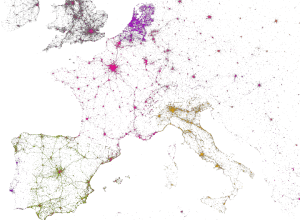
MapBox, along with Gnip and Eric Fischer, mapped 3 billion tweets and a…
A high resolution tour of the vegetation on Earth
NOAA visualized global vegetation over a year, and the result is beautiful:
We’ve…
Animation shows flow of attendees during a conference
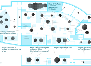
When you go to a conference, there are typically several talks going on…
Sniffing out Paul Revere with basic social network analysis
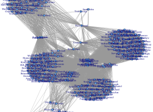
It’s just metadata. What can you do with that? Kieran Healy, a sociology…
Price of Damien Hirst spot paintings →
Damien Hirst is an artist known for a number of works, one of…
Easy mapping with Map Stack
It seems like the technical side of map-making, the part that requires code…
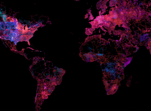
State of the OpenStreetMap
OpenStreetMap, the free wiki world map that offers up high quality geographic data,…
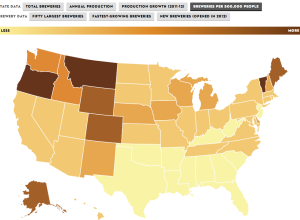
Rise of craft beer
The Brewers Association just released data for 2012 on craft beer production and…
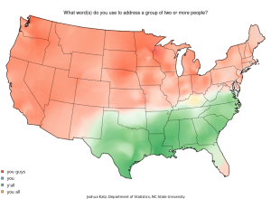
Map: Vernacular across America
When you talk to different people across the United States, you notice small…
Stupid calculations
Josh Orter takes back-of-the-napkin math to the next level with Stupid Calculations, which…
Map of London fire engine callouts
Using data from the London Fire Brigade, James Cheshire mapped 144,000 incidents in…

