Visualization
Showing the stories in data through statistics, design, aesthetics, and code.
Olympic event explainer videos
Winter Olympic events are filled with subtleties that if you know about them,…
Olympic events placed in New York for scale →
The New York Times published a fun piece that places Winter Olympic events…
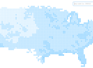
Places in the US with the most pleasant days per year
We’ve seen plenty of maps the past few weeks that show how bad…
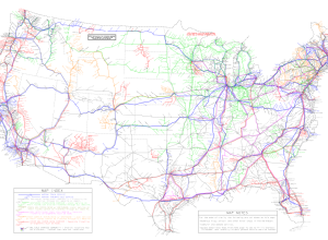
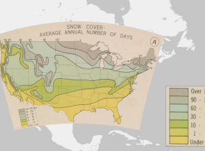
Digitally revamped atlas of historical geography, from 1932
In 1932, Charles O. Paullin and John K. Wright published Atlas of the…
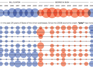
History through the president’s words →
The Washington Post visualized the use of specific words throughout the years during…
What a computer sees while watching movies
Benjamin Grosser visualized how computers “watch” movies through vision algorithms and artificial intelligence…
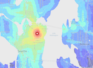
Public transit times in major cities
Last year, WNYC made an interactive map that shows transit times in New…
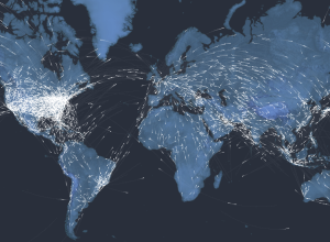
A century of passenger air travel →
Kiln and the Guardian explored the 100-year history of passenger air travel, and…
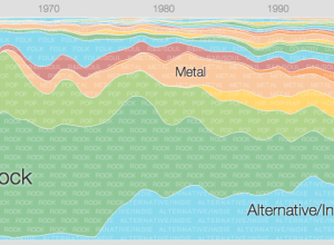
Music timeline of plays and history
Two Google research groups, Big Picture and Music Intelligence, got together and made…
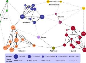
Lexical distance between European languages
Using data from linguistics research by Kostiantyn Tyshchenko, Teresa Elms clustered European languages…
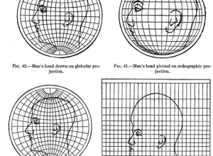
Map projections illustrated with a face
Most people, at least those who visit sites like FlowingData, know about map…
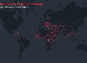
A visual exploration of refugee migrations
Hyperakt and Ekene Ijeoma visualized migrations over time and space in The Refugee…
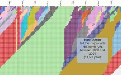
Cherry picking years for random sports statements
When you watch sports, it can sometimes feel like the stat guy pulls…
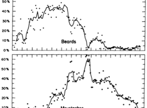
Facial hair trends over time
In 1976, Dwight E. Robinson, an economist at the University of Washington, studied…

