Visualization
Showing the stories in data through statistics, design, aesthetics, and code.
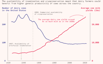
More milk, fewer cows
For Works in Progress, Jared Hutchins explains how milk production increased per cow,…
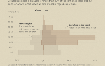
How mpox virus spreads
For Reuters, Arathy J Aluckal, Jitesh Chowdhury, and Vijdan Mohammad Kawoosa illustrate how…
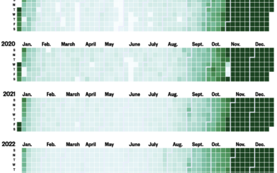
“All I Want for Christmas Is You” spreads to earlier months
For NBC News, Joe Murphy shows the play rate on Last.fm for Mariah…
Words that do not appear in literature
Word clouds show key terms or phrases that appear in a body of…
Sitting vs. standing jobs
Some jobs require a lot of standing, crouching, and climbing, whereas other jobs…
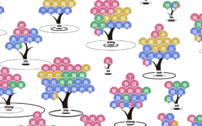
Chinese names lost in translation
Liuhuaying Yang aims to clarify the names and sounds that get lost when…
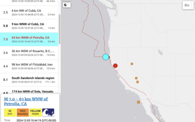
Tsunami alert, because earthquake off coast of Northern California
The folks up here received one of those loud emergency alerts a few…
When internet cables break under the sea
The network that connects the world still relies on surprisingly thin wires that…
Your name shaped under a trend line
Add another graphic to the baby name genre of visualization. Karim Douïeb put…
Higher margins with fewer hospital staff, not the best mix
Many hospitals in the United States are for-profit, which itself is not a…
China jumps to car exports leader in just a few years
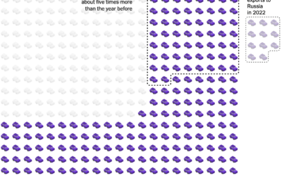
China exported next to zero vehicles in 2010, but from 2020 to 2024,…
Material requirements from EV batteries
To make batteries for electric vehicles, manufacturers require materials from all over the…
3-D print of John Snow cholera map
You know the John Snow map that highlights a cholera outbreak in London,…
Movie runtimes framed by life expectancy
Memento Movi, a mini-app by Michael Condouris, is what you get when you…
Rainbow Sky, the colors mentioned on Bluesky
Martin Wattenberg drew up a live visualization that shows colors mentioned in Bluesky…
Tree blanket color-coded by local temperature
Speaking of data blankets, the knitting club in the area I live has…


