Visualization
Showing the stories in data through statistics, design, aesthetics, and code.
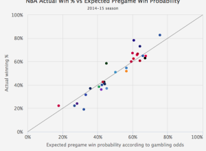
Gambler’s perspective on sports team win probabilities
Michael Beuoy’s win probability model plotted on FiveThirtyEight starts all NBA teams at…
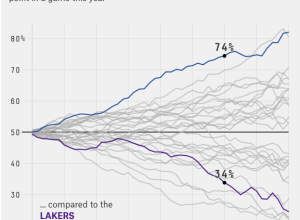
Every NBA team’s chances of winning, by game minute
Michael Beuoy made a win probability model for NBA teams and games, based…
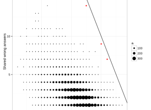
Identifying cheaters in test results, a simple method
Jonathan Dushoff had issues with students in his population biology class cheating on…

Bayes’ theorem explained with LEGO bricks
Bayes’ theorem is covered in introduction to statistics and probability courses, but I…
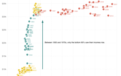
Top 1% earners versus bottom 90%
Quoctrung Bui for Planet Money plotted average income for the top one percent…
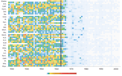
Impact of vaccines throughout history
Not that anyone who does not vaccinate their kids cares, but Tynan DeBold…


Algorithm-generated song, based on income data
In the first song of his music experiment Data-Driven DJ, visual artist Brian…
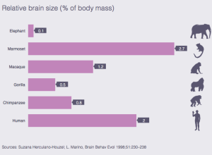
Human brain size compared to animals’
Mosaic provides a simple comparison of brain size in a handful of animals…
Job gains and losses over time
Andrew Van Dam and Renee Lightner for the Wall Street Journal provide a…
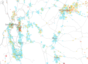
Vaccination rates for every kindergarten in California →
The New York Times mapped the vaccination rate for every kindergarten in California.…
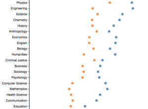
Professor ratings by gender and discipline
Based on about 14 million reviews on RateMyProfessor, this tool by Ben Schmidt…

Baking units demystified
A handy chart by Andrew M.H. Alexander. Treemap conversion from one gallon, down…
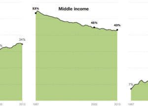
Shrinking middle class
The Upshot has a detailed, chart-filled summary of the shrinking middle class, categorized…
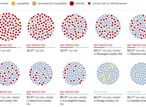
Vaccination rate and measles outbreak simulation
You’ve probably heard about herd immunity by now. Vaccinations help the individual and…
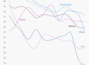
Where and why men outnumber women
There are an estimated 60 million more men than women on this planet,…