Visualization
Showing the stories in data through statistics, design, aesthetics, and code.
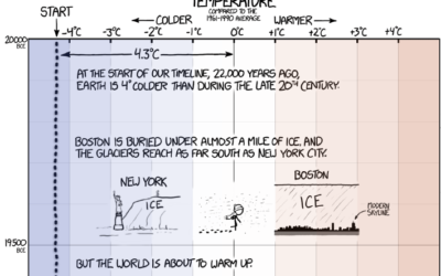
xkcd: Earth temperature timeline
In classic xkcd-fashion, Randall Munroe timelines the Earth’s temperature, dating back to 20,000…

Watch bacteria evolve resistance to antibiotic
Scientists at Harvard University setup the MEGA-plate, essentially a giant petri dish, with…
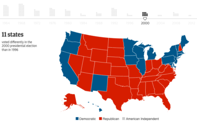
Swing states are a relatively new thing
Here’s a fun one from the Guardian. They go over the change in…
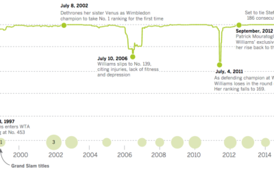
Serena Williams, greatest of all time
Serena Williams, who plays tonight in the U.S. Open semifinal, might be the…
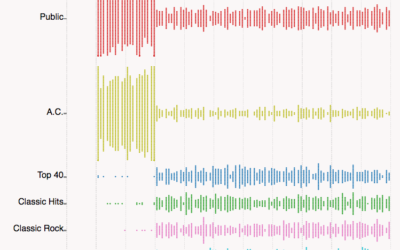
Radio station frequencies, by genre
In most areas in the United States, lower FM frequencies are reserved for…
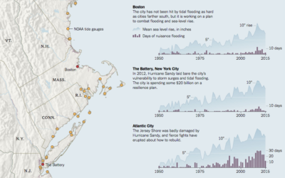
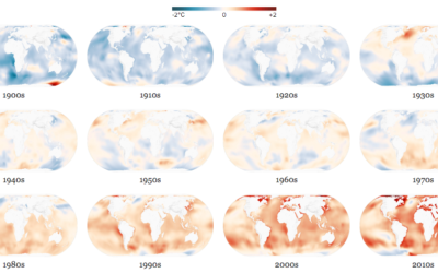
More global warming, more flooding
Water levels are rising, and naturally, the coasts are feeling it. Jonathan Corum…


Out of state, public education
Nick Strayer for the New York Times shows the flow of college freshman…
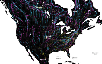
Animal migrations in animated map
The Migrations in Motion map, by Dan Majka from the The Nature Conservancy,…

Composite Olympic moments
One more Olympics-related piece for the road. The New York Times used photo…
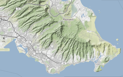
Global terrain maps from Stamen
Missed this one from last month. Stamen announced the release of a whole…
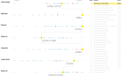
Heptathlon rankings with parallel coordinates
The Guardian covered the rankings for the women’s heptathlon, specifically how Nafissatou Thiam…

Long-exposure bird flights
Using a long-exposure photography technique, Xavi Bou captured bird flight patterns in his…

Generate your own fantasy map
Martin O’Leary made a Twitter bot, Uncharted Atlas, that posts automatically generated fantasy…
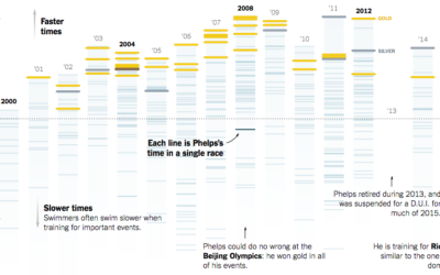
Michael Phelps race times since his first Olympics
That Michael Phelps. He is a crazy man, in the best possible way.…