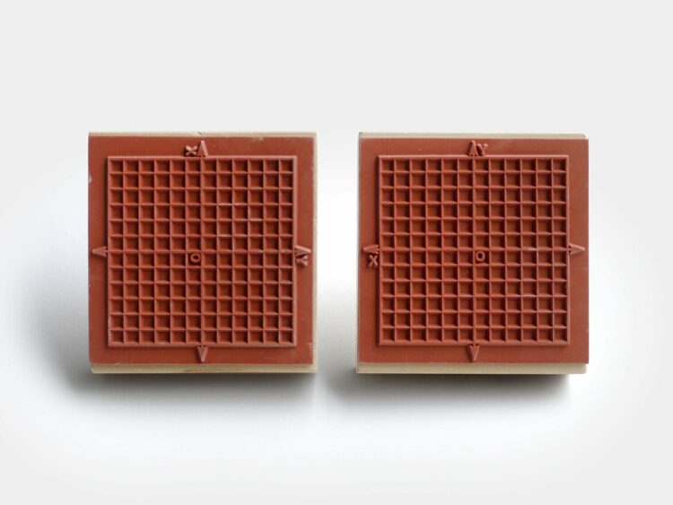
For graphing on the go, Present & Correct offers a rubber stamp with a grid and x-y-axes. I think I need this.
Become a member. Support an independent site. Make great charts.
See what you get →
There’s a 6 percent figure from the CDC that could be easily misinterpreted. Here’s what it means.
See how different probabilities lead to different outcomes with an interactive chart.
We keep getting bigger. Watch overweight and obesity rates move up over several decades.
I have yet to see a full episode of Doctor …