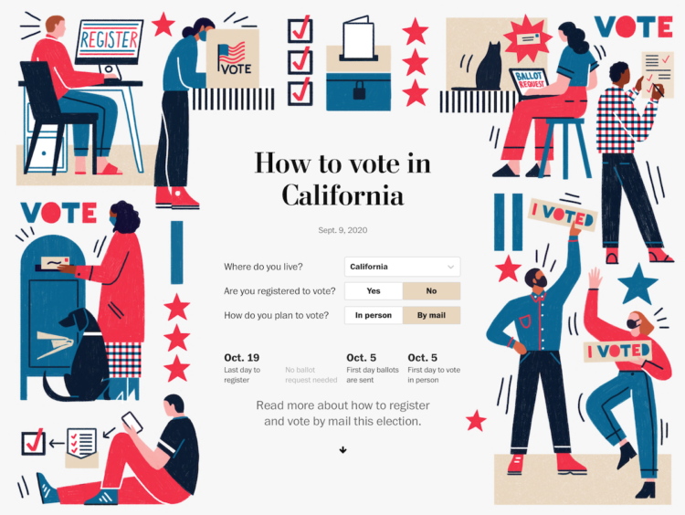
The Washington Post provides another straightforward voting guide, based on where you live and how you plan to vote.
Election season is always interesting graphics-wise, because all of the news outlets are starting with the same data and information. But they all show the data a little differently, asking various questions or using different visual approaches.
Things are just getting started, but contrast this Post piece with FiveThirtyEight’s voting guide. The former zeros in on the your voting scenario, whereas the latter still gives some space for the overall national view.


 Visualize This: The FlowingData Guide to Design, Visualization, and Statistics (2nd Edition)
