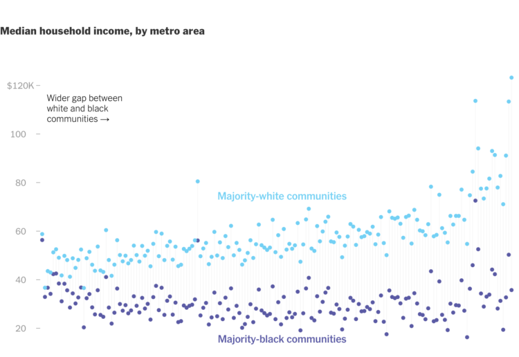
New York Times Opinion compared several demographics, such as unemployment and income, between majority-black and majority-white neighborhoods in the United States.
They come back to the zipper chart technique where the dots start together and then separate to emphasize the gaps. Horizontally, dots are sorted by smallest to largest difference.
 Visualize This: The FlowingData Guide to Design, Visualization, and Statistics (2nd Edition)