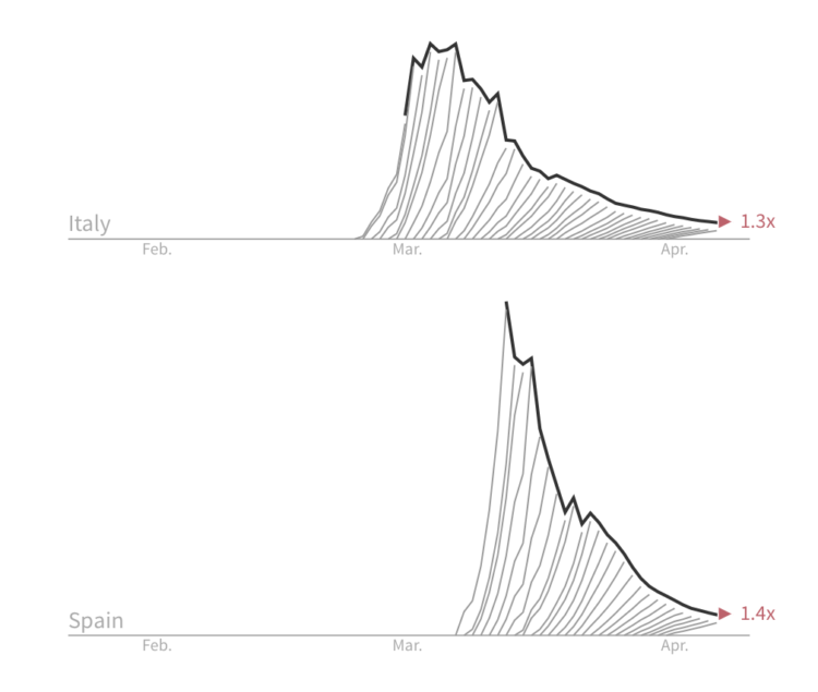
For Reuters, Jon McClure looks at the death counts for each country from a different angle. “Each line measures how much the number of fatalities grew in seven days.” The goal is to “break the wave” to get the rates down.
The charts are a combination of flattening the curve and the daily updated charts from The Financial Times showing death tolls. I have a feeling the geometry will confuse some people, but I like the metaphor.


 Visualize This: The FlowingData Guide to Design, Visualization, and Statistics (2nd Edition)
