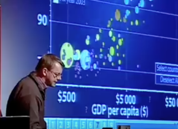
Rewind to 2006 when Hans Rosling’s talk using moving bubbles was at peak attention. Researchers studied whether animation in visualization was a good thing. Danyel Fisher revisits their research a decade later.
While they found that readers didn’t get much more accuracy from the movement versus other method, there was a big but:
But we also found that users really liked the animation view: Study participants described it as “fun”, “exciting”, and even “emotionally touching.” At the same time, though, some participants found it confusing: “the dots flew everywhere.”
This is a dilemma. Do we make users happy, or do we help them be effective? After the novelty effect wears off, will we all wake up with an animation hangover and just want our graphs to stay still so we can read them?


 Visualize This: The FlowingData Guide to Design, Visualization, and Statistics (2nd Edition)
