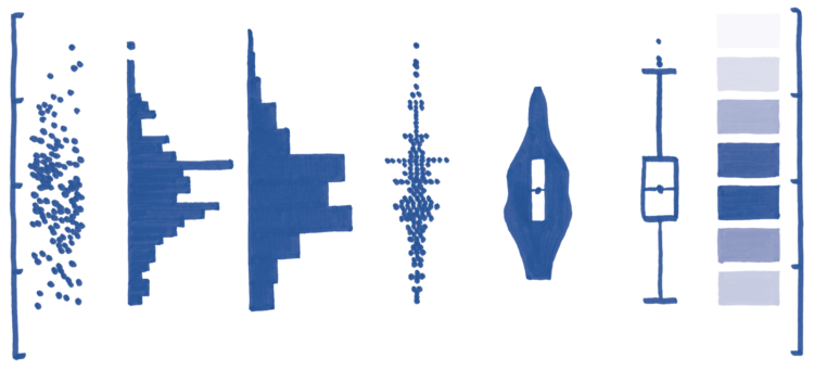
RJ Andrews has a visualization design book coming out in January called Info We Trust. He hand-drew about 300 graphics for the book. One of the reasons:
I decided very early that Info We Trust would not use any existing images, mine or others. Found examples work fine for certain books. They are also convenient, the work is already done! But found images bring baggage too. You might choose an existing work to highlight one aspect of its design. But the reader will see other facets too.
I’m intrigued. On the upside, you get a consistent visual flow. A focused point of view. On the downside: the possibility of a view that is too focused. I have a feeling there will be more upside than downside. [Amazon pre-order]


