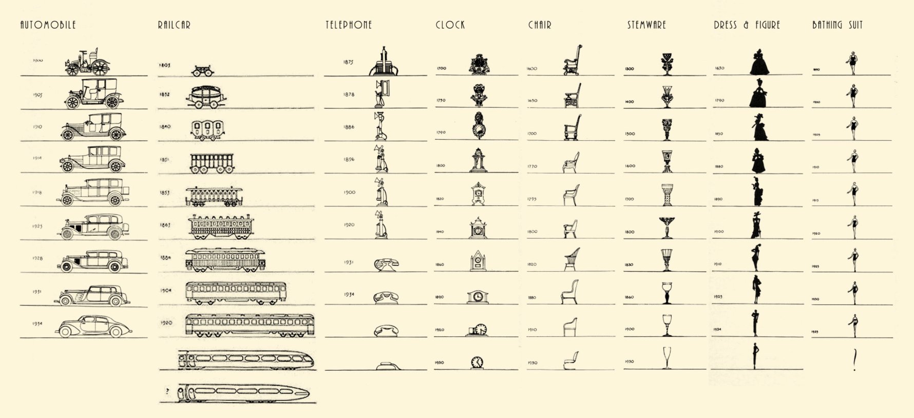
Vintage chart shows the evolution in design of everyday objects
May 31, 2018

By Raymond Loewy, this chart from 1934 shows the shifts in design of the car, telephone, and clock, among other things. I assume someone is already working on updating this one to the present. [via @michaelbierut]

Become a member. Support an independent site. Get extra visualization goodness.

See What You Get

Favorites

All the Household Types in the U.S.

No need to restrict ourselves to the most common types. There are thousands. Let’s look at all of them.

Where Bars Outnumber Grocery Stores

A closer look at the age old question of where there are more bars than grocery stores, and vice versa.

How We Spend Our Money, a Breakdown

We know spending changes when you have more money. Here’s by how much.

One Dataset, Visualized 25 Ways

“Let the data speak” they say. But what happens when the data rambles on and on?