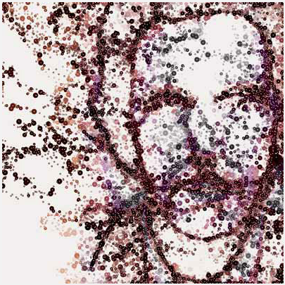
Wired Magazine recently did a feature on data-driven art.
The above image is Jason Salavon’s work that shows U.S. population by county. The technically-minded readers might be thinking, “I don’t get it. What am I seeing here? I don’t even know what county has the greatest population.” I understand where you’re coming from, but hey, it’s art not a status update.
Get past that that analysis-only state, and you’ll appreciate the beauty that comes out of the data. It’s art spawned from data the creator had no control over. The data tells a story of form and patterns, which is very different from a person telling a story with data.
Alison Mealey’s project, A Little Unreal and Alex Dragulesco’s Spam Architecture are also featured. Beautiful work.


[via FlowingData group | Thanks Iman]

 Visualize This: The FlowingData Guide to Design, Visualization, and Statistics (2nd Edition)

I recently had the chance to meet Andy Huntington, and saw some of the sculptures he’s doing based on sound data from different sources. Maybe you’ll like them too: http://www.extraversion.co.uk/projects/cylinder.html.
Nice post ;)
I recently had the chance to meet Andy Huntington, and saw some of the sculptures he’s doing based on sound data from different sources. Maybe you’ll like them too: http://www.extraversion.co.uk/projects/cylinder.html.
Nice post ;)
Pingback: 21 Ways to Visualize and Explore Your Email Inbox | FlowingData