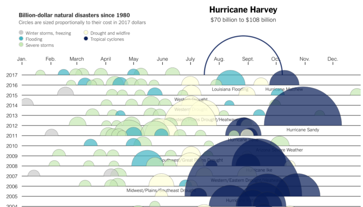
Kevin Quealy for The Upshot charted the estimated cost of Hurricane Harvey, along with the cost of storms past, going back to 1980. I like the animated bands for the Harvey estimates — kind of like a neon light.
If you’re interested in the data, you can grab it from NOAA.

 Visualize This: The FlowingData Guide to Design, Visualization, and Statistics (2nd Edition)